January 2008 Archives

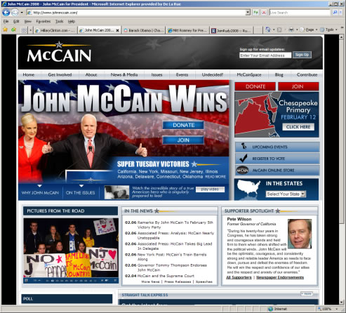
John McCain: The website uses a lot of black and blue. Red and yellow are used as secondary colours. Like Clinton's website, the American flag is faded into the header's background, but it does not look very appealing in grey. There is also a primary photograph of McCain and his wife superimposed onto a bright American flag with shouting text overlaid on top of it. The military-like star and yellow stripes in the logo are repeated in the section headers. The website contains the general candidate information, a blog, supporters, photographs, event listing, video, and a contribution form.


mccain.jpgOverall, there are a few design problems with this website.

·        The typography is not consistent throughout the website.

·        The photographs are very grainy; a grainy photograph of a section of a bus is incorporated into the design.

·        The elements in the layout are not all consistent, such as the headers, which are different sizes and colours.

·        The information is presented in a confusing manner; it looks as though it were thrown on the screen without much thought of hierarchy or best use for space.


Overall, the website seems to act more as a collection of information about the candidate instead of trying to sell the candidate. There is not a Spanish translation of the website, and the website is focused more on victories and the campaign over an attempt to get users involved in the campaign and to sell the candidate. Futhermore, the website appeals to an older audience looking for information. In an attempt to appeal to a younger audience, the website hosts 'McCainSpace', which sounds as though it may be similar to MySpace. There are no apparent links to the networking websites like MySpace or Facebook, which limit the exposure of the candidate. (Upon further browsing, I did discover links to networking websites, but these are not immediately apparent and only appear in a subpage.) Although the website has a link to its community, it does not sell it. In fact, it is not entirely clear what a 'McCainSpace' is and what it has to offer. Overall, this website is not presented very well and it does not try to sell the candidate or encourage people to keep using the website. 5/10

Earlier, we looked at how typography is used in the pre-elections. Let's take a look at the websites for the candidates in the pre-election for president. This week and next week, I will go through the candidates one-by-one.


Hillary Clinton: The website uses a lot of blue with pale blue, white and red as the secondary colours. The header contains the logo stylised with the American flag with an American flag faded into the blue background. The text within the main photograph is large and acts as an advertisement. The navigation, 'contribute' and 'join' buttons are also large, demanding attention and hopes that the user will browse through the website. In some ways, the large and shouting text and smiling photograph of Hillary tries to hard, but the layout and choice of colours also maintains a conservative approach.


  At first glance, I am drawn to the large red buttons which beckon me to contribute; I gather that this is the most important thing that the website wishes to achieve. One good feature is the Spanish translation of the website (a large link for this appears in the upper right-hand side of the layout), which will appeal to the Spanish-speaking American public in a bid to get their vote.


While providing general information about the candidate and links to blogs (online journals) and videos, the website also appeals to a younger audience with links to Facebook, YouTube, MySpace, and other networking websites.


The website also contains its own networking software where users can plan events, browse events, create blogs, and call others to get support. This feature will keep visitors returning to the website as well as assist the campaign. There is also a store where merchandise for the election can be purchased.


Overall, the website is presented well and the information is easy to locate; more advanced users will keep returning to the website to manage and view events, make phone calls, and network with others. 9/10


hillary.jpg

Typography in American Elections Campaigns

| No Comments | No TrackBacks

Typography provides a meaning and an understanding about a product or a company; this is done unconsciously. It affects how the product or company will be sold to the consumer. In the corporate world, millions are spent on branding, and choosing the correct type is part of the process. The presidential candidates need to sell themselves to the public in order to get elected, so their choice of typography is not chosen by accident.


In the 2004 presidential election, there were comments in the New York Times which compared Kerry's and Bush's logos. According to the article (and by taking a look at both logos), Bush's typography was stronger and bolder and conveyed a sense of movement. It does not take much imagination to concur that Bush's logo would have shown up better on bumper stickers than the weaker Kerry's logo.  http://www.nytimes.com/2004/10/09/opinion/09dadich.html?_r=1&th&oref=slogin


Where election campaign typography makes the most difference is in pre-election campaigns where there are several candidates who are virtually unknown to most of the population. Unconsciously, we decide what a candidate is going to be like, and part of this is based on their choice of typography.


Each candidate has his or her own approach to the typography that they are using to sell themselves to voters in the pre-election campaign. The following article provides an interesting discussion to the typography used in the campaigns and a brief analysis. This article can be read here: http://www.boston.com/bostonglobe/ideas/articles/2008/01/27/what_font_says_change/

Liverpool: The birthplace of the Beatles and home of several more musicians which have accumulated several number one hits in the music charts. Liverpool is the year's European capital of music and culture. To celebrate, several concerts and events are taking place in the city. One of my freelance projects was to help create the website for the Number One Project. The concert has just been, and it brought back old hits and new ones. The culture was amazing, and it looked as though the crowd had an amazing time. Yeah for music! 

Setting up IIS Email Using CDONTS

| No Comments | No TrackBacks

CDONTS is a component for sending emails in Active Server Pages (ASP) through Microsoft Windows NT Server. CDONTS has been replaced with CDOSYS on newer versions of Microsoft Windows servers. Although it has been replaced, some web applications are still using it and may need to use it if their websites are installed on older web servers, and developers may need to set it up on newer development web servers for testing purposes before deploying to the live web server.


Below is an example of the ASP code needed to configure and send an email using CDONTS.

Dim objCDO

Filename = "pic.gif"

            Set objCDO = Server.CreateObject("CDONTS.NewMail")

            objCDO.BodyFormat = 0

            objCDO.MailFormat = 0

            objCDO.To = "test@myemail.com"

            objCDO.CC = "test@myemail.com"

            objCDO.From = "test@myemail.com"

            objCDO.Subject = "Hello Test"

            objCDO.Body = "Body test"


            filepath = Server.MapPath("attachments\" & filename)

            objCDO.Attachfile filepath, filename, 1

            End if


objCDO.Send

            Set objCDO = Nothing


To configure CDONTS to work with IIS on versions of Microsoft servers newer than NT, download and install the CDONTS.dll to your C:\windows\system32 directory. Once the file is saved to the location, you will need to register this file on your computer. To do this, open up a command prompt (go to 'Start>Programs>Accessories>Command Prompt' and type:

            regsvr32 c:\windows\system32\cdonts.dll


Once CDONTS was set up, the emails were being saved to my Intetpub\mailroot\Queue folder, and they were never being sent. I downloaded a couple of pages to check the installed components and test sending an email, and there weren't any failures. CDONTS looked like it was set up correctly.


To configure IIS to send emails correctly, every website I looked at to solve the problem claimed to change the settings under 'Relay'. This can be accessed from right-clicking onto the SMTP server node in IIS, selecting 'Properties', viewing the 'Access' tab and clicking on the 'Relay' button to be taken to the screen where a new IP address or domain of the mail server could be added. This did not make a difference. Instead, go to the 'Delivery' tab and click the 'Advanced' button. In the text-field labelled 'Smart Host', type in the email server's domain name. Restart the SMTP node in IIS, and you should start receiving emails; no emails will be placed in the Queue folder.

Designing with Comic Sans

| No Comments | No TrackBacks

Comic Sans is a font that has traditionally come shipped with computers using Microsoft operating systems. Since there were only a few fonts shipped with Microsoft operating systems (Arial and Times New Roman included), Comic Sans became a popular font used in design. It is over-used, and it's just ugly. The font does not have authority; it cannot be taken seriously. It looks 'comical' and annoying like a group of clowns trying to be funny. Now there's a website dedicated to this font, rather dedicated to banning this font from existence. While I do not like Comic Sans, wouldn't people just find another font to use everywhere and inappropriately too? To read more about Comic Sans, its inappropriate use, or to support banning the font, go to http://www.bancomicsans.com. Oh, and we should ban screenbeans too.

Happy New Year; I hope that 2008 is the best year for all of you. It's been a good start for the year for me with a new job (started last month) and a new house - my very first house *fingers crossed* later this month. I have been busy so more changes to my web site will be coming sometime. Until then, you can view my updated résumé/CV.

Archives

Recent Comments

  • jenn: Thank you. read more
  • Murge: Amazing post. read more
  • Herbert: good post. site read more
  • Frank Quake: Hey, This is great when you said that I had read more
  • Chappy: You mention peptides here? I have had first hand experience read more
  • jenn: Thanks! I love the work. I have got more recent read more
  • Fanakapan: Thanks for the write up. This was some of my read more
  • jenn: Yes.... but that's only for the islands. Mostar and Montenegro read more
  • jenn: Hello, the code is not mine to hand out. I'll read more
  • pantich: More info about the best day trips from Dubrovnik can read more
OpenID accepted here Learn more about OpenID