Romney: The website uses a lot of grey and blue; red and white are used as secondary colours. The header is a solid blue containing the logo, which appears to be dark pink when compared with the bright red used elsewhere on the website.
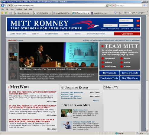 The website offers general information, video, blog, a Spanish translation (to get the support of the Spanish-speaking voters), and networking tools to let users assist in the campaign. There is also a page for the candidate's five brothers, who each have a blog.
The website has other features to appeal to younger audiences with the ability to sign up to receive news via mobile phones and links to networking websites such as MySpace, YouTube, and Facebook. The design is consistent, and the primary objective of the website seems to be to get users to sign up to assist in the campaign and contribute; these are the most prominent features of the website. However, there are some major problems with the usability of this website, which ultimately fail this website when its viewed in some browsers.
- The main photographic image takes a little while to load and a Javascript error is thrown when trying to load.
- Javascript errors appear when trying to access the drop-down navigation. This renders the navigation completely useless in some browsers, such as Internet Explorer 7.
- The code for the blogs on the front page is visible; it looks as though tags were not properly closed.
Although the content and visual design are generally good, the usability problems permit this website from being accessible by all users. 1/10
Leave a comment