Rudy Giuliani: This website uses washed-out blue and a medium-grey to light-grey gradient as the primary colours while red is used to draw attention to the candidate's name, make a contribution, or join the supporters. The candidate's name appears faded out in the background of the header.
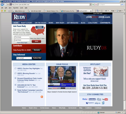 First impressions of this website do not strike my confidence. The photographs are grainy, and the main photograph of the candidate looks unhappy and miserable. Does this man really want to run for the presidency? Besides the poor choice of photograph, the top half of the main page is designed well. The bottom half of the page looks as though little thought was put into it. The headers and content are basic, poor, and uninspiring. The 'Stay Connected' section appears as though it were tacked on as an after-thought. It appears as if it is an attempt to jump on the networking websites bandwagon and appeal to the younger audience.
The website consists of general information, video, blog, and a section on assisting in the campaign, but there is much less content on this website when compared to the others. The website is not as advanced as the other candidates' websites. Subpages are very basic and lack content.
From a coding perspective, the website is also very poor. There are numerous JavaScript errors, and these annoyingly popped up each time I browsed to a new page. The website looks as though it were set up to get supporters, but with the design and coding problems and the lack of content to keep users coming back, it fails miserably. 2/10
Leave a comment