Mike Huckabee: This website uses a lot of dark red; blue, white, and yellow are the secondary colours. The colours (pale blue and dark red) do not really work together, and the red is too bright to look at for too long. A large, bright red navigation bar with white text is not the best feature of the website.
The website hosts general information and a blog. Contributions and assisting in the campaign feature prominently on the website with examples of ways that users can assist. The 'Contribute' button is large and red, and the front page hosts a bar with the total amount of money needed and contributed to the campaign. The 'sign up' form also features prominently.
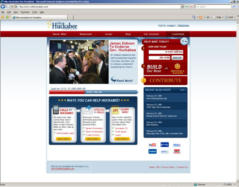 Overall, the website appears to try too hard in its search for supporters and obtaining money, but there is little in the way of content to sell the candidate to new users. The interactive networking features of the website appeal to a younger, tech-savvy audience, but the website lacks the content to get the support of new users, and the design could be less bright and bold by minimising the red colour. 5/10
Leave a comment