A few months ago, I noted the cupcake craze. This post follows on from the cupcake craze to examine some of the best cupcake bakery websites and logos.
The primary colour scheme for cupcake websites and logos tends to be muted pink and rich brown. Some well-designed websites and creative logos are below.
Websites:
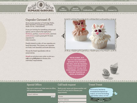
http://www.cupcakecarousel.co.uk/
Varying shades of green and gray, with a hint of muted pink, really work well. This website looks modern and classy. There's a strong use of photographs as well, and these rotate on the homepage to showcase the products.
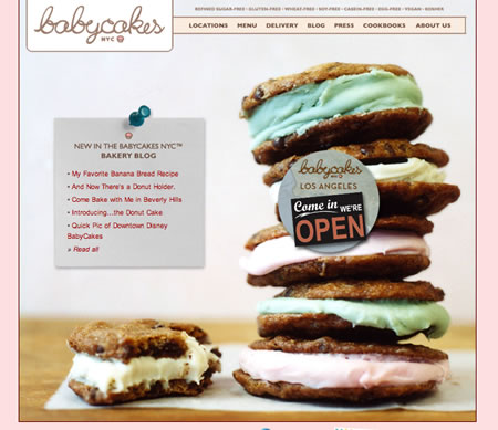
http://www.babycakesnyc.com/
The photography is excellent. The website is a little simple; I think they could have spiced it up a little by using the border effect as in the website below this one. The site background is a different colour on different pages (pink, blue, yellow, gray). I really like the logo too.
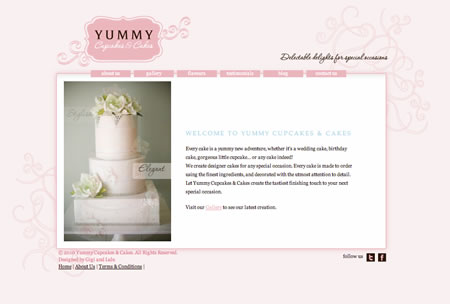
http://www.yummycupcakes.com.au/
Despite the photo on the homepage, this website specialises in cupcakes as well. I particularly like the background swirls and the logo.
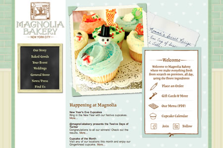
http://www.magnoliacupcakes.com
The illustrations, handwriting, and colours give this website a traditional feel with a modern twist. The website has many photos, and these rotate to show a wide selection of cupcake decoration. I love the subtle use of illustration on the website, such as in the borders and dividers. The only negative aspect (in my opinion) of the website is the 'chalkboard' left-hand navigation. This feels out of place with the rest of the site.
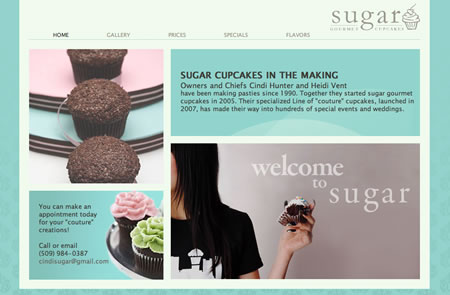
http://marilynbianchi.com/sugar/
Good photographs and colour combination really make this simple website stand out. The turquoise patterned background is a fresh alternative to using pink and brown.
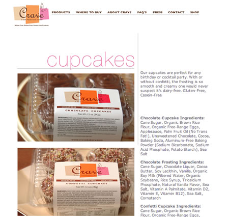
http://cravebakery.org
A simple layout is all that is needed with excellent photos to sell cupcakes. I also really like the logo; the colours in the logo change depending on what page you are on. The colours go well together, and it's a nice touch.
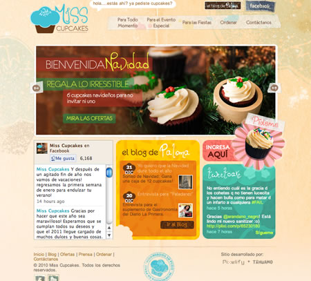
http://misscupcakes.pe
This website has a 'magazine' feel, and I like the patterned/textured background. Little features, such as the bite out of the middle box, are also fun. Great photographs too.
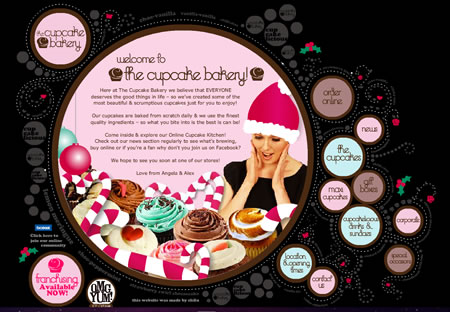
http://thecupcakebakery.com.au/
I love the interactivity and design of this Flash website. It's very organic, clean, interactive, and 'fun'. They also have a nice Christmas theme.
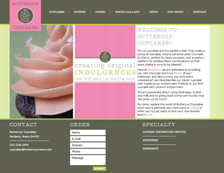
http://www.buttercupmaine.com/
A great colour choice of bright pink, sage green, and spring green/yellow. These colours really make the website look modern and classy. Although a simple website, it has everything you could ask for. Contact information and an ordering form on the home page, and nice photographs of the cupcakes.
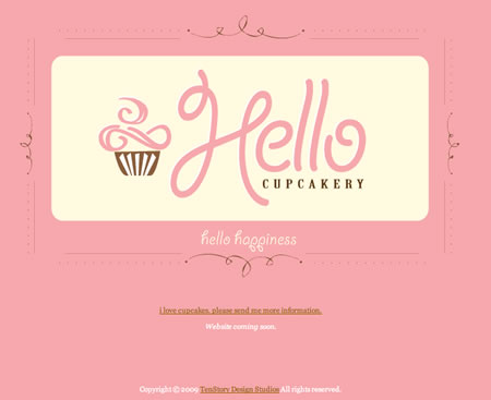
http://hellocupcakery.com/
This is really more of a holding page instead of a website. The pink and brown colours feature prominently, and I really like the logo and the simplicity.
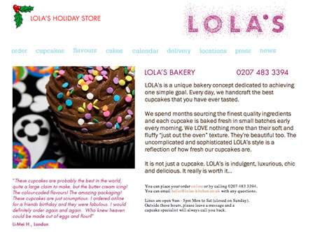
http://www.lolas-kitchen.co.uk/
You cannot go wrong with a simple design. Unfortunately, parts of the rest of the website is not as consistent. I like the 'sugar-like' rendering in the logo.
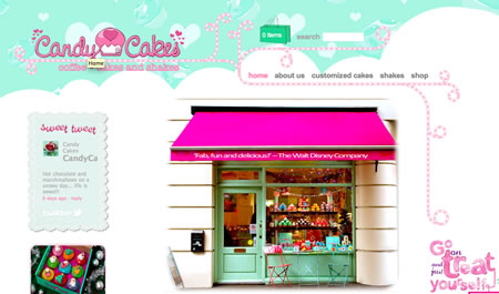
http://www.candycakes.com/
I love the colours; mint green and pink go well together. The photograph of their shop front on Goodge Street is showcases the shop as fun and vibrant, and the twisted peppermint stick illustrations break up the page nicely. I really like the header on this website.
http://www.cupcakesonline.com/
This Flash website has some nice touches, and I like the illustrations. The 'sparkle' in the logo is a nice touch.
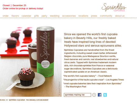
http://www.sprinkles.com/
This clean and simple website has a few nice touches. Good photographs, a nice logo (the pink and brown theme with an italicised font), and I like the simple dotted line to separate the navigation.
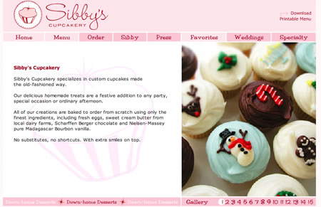
http://www.sibbyscupcakery.com/
Although a very simple website in terms of design, I like the logo and the catchy and cute photograph used on the home page.
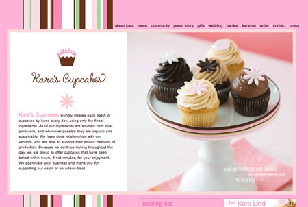
http://www.karascupcakes.com/
I enjoy the vibrant and modern colours in the stripe in the background, and the logo is also fun and modern. The home page displays the products nicely with a good photograph.
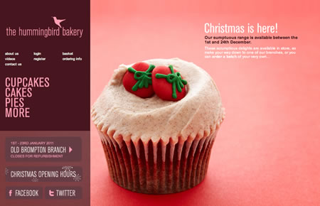
http://hummingbirdbakery.com/
I like the colours in the branding (pink and purple-burgundy) and photographs on this website, which compliment the branding; the photographs rotate when the page is refreshed. The two-tone column 'magazine' layout works well at showcasing the products.
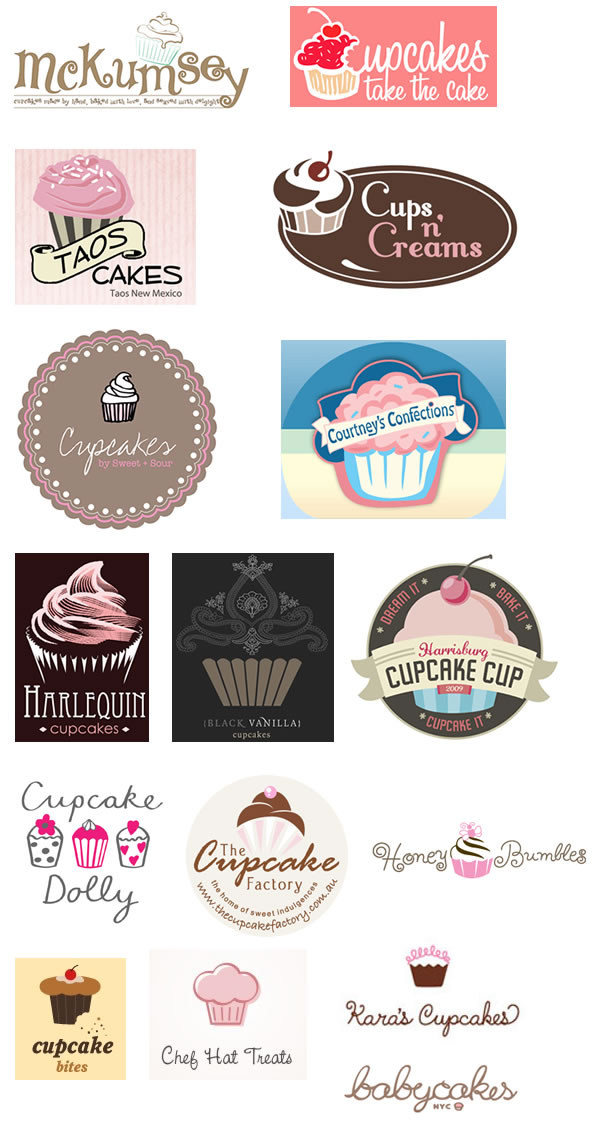
Logos:
McKumsey Cupcakes: Designed by Adam McGee, http://lemonheaddesign.com/
Cupcakes Take The Cake:
Tao's Cakes: http://www.taoscakes.com/
Cups 'n' Creams: Designed by Ula Kapala, http://ula.kapala.pl
Cupcakes by Sweet + Sour: L'Usine La Cafeteria, http://lusinespace.com/sweet-sour-cupcakes-1737.html
Courtney's Confections: http://www.courtneysconfections.net/
Harlequin Cupcakes: Designed by Steve Minor, http://www.steveminordesign.com
Jules Cupcakes: Designed by Vanessa Hansford, http://www.dukdesign.com/
Black Vanilla Cupcakes: Designed by Vanessa Hansford, http://www.dukdesign.com/
Harrisburg Cupcake Cup: http://CupcakeCup.org/
Cupcake Dolly: http://www.cupcakedolly.co.uk/
The Cupcake Factory: http://www.thecupcakefactory.com.au/
Honey Bumbles: Designed by Karen Var, http://karenvardesign.com
Cupcake Bites: Designed by DesignCity, http://brandstack.com/logo-design/details/2709
Chef Hat Treats: Designed by dbunk, http://logopond.com/gallery/detail/82329
Kara's Cupcakes: http://www.karascupcakes.com/
babycakes nyc: http://www.babycakesnyc.com/
Recent Comments