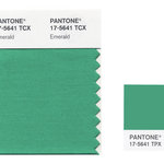
I am sure that most of you know Pantone®. For those who do not, Pantone® is the company that publishes a book with their defined colours, each set to specific standards of measurement of the pigments that make up the colours, for printing purposes. This is to ensure that when a company decides to print its brand, the colours always match. Pantone® devised this system of defining, and their booklet guide with its varying colour swatches is widely known and used in graphic design and printing. More on the company can be found here: http://en.wikipedia.org/wiki/Pantone.
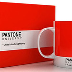
Recently, I have been noticing several trendy Pantone®-branded products in the shops. The products are solid colour with the Pantone® colour details, remiscent of their numbered colour swatches.
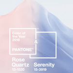
Pantone® has also been associating a colour for each year. The colour-of-the-year for 2011 is Honeysuckle (PANTONE 18-2120), an "uplifting" colour that encourages facing challenges and confidence, according to the company's press release: http://www.pantone.com/pages/pantone/Pantone.aspx?pg=20707&ca=10
The Pantone® colours for 2010 and the last five years are listed below:
- 2010: PANTONE 15-5519 Turquoise
- 2009: PANTONE 14-0848 Mimosa
- 2008: PANTONE 18-3943 Blue Iris
- 2007: PANTONE 19-1557 Chili Pepper
- 2006: PANTONE 13-1106 Sand Dollar
- 2005: PANTONE 15-5217 Blue Turquoise


Leave a comment