January 2011 Archives

Head.js and Page Loading

| No Comments | No TrackBacks
I have come across a new tool to enable faster web page loads by loading all of the Javascript files in parallel without blocking the page. This is achieved through using a Javascript class called 'Head.js' (http://headjs.com/), then loading the Javascript files through this. My first thought was that it may have other implications, and I searched for other user comments and found that the feedback is largely positive; there's a few issues users may have in certain instances, but these are documented. Largely, I think that Head.js is a simple and good idea; why didn't anyone think of this sooner?

The creator of Head.js has developed an example page where you can see this in action and compare it with loading the page with or without the use of Head.js. This can be found here: http://headjs.com/test/headjs.html.

I decided to put it to the test with a quick change to a website to see the difference in page loading. I have used YSlow, a Firefox Firebug add-on, to view the page load speed and size. Unfortunately, I did not see a difference in the performance rating, and the page size was slightly higher when adding the new Javascript file for Head.js. (I'm not sure what the reason is, but when completing the test based on page loading per miliseconds, my results were varied in favour of both ways.) So, my test was inconclusive.

I tried the same with the test comparison pages on the Head.js website, which is a simple test with no other distractions which may slow down the website. (Possibly the number of resources on my test page was slowly down loading at times, while other times loading was quicker.). Although the Head.js page is slightly larger and an extra Javascript file is loaded, the performance indicator is a lower number than loading the Javascript files in the <HEAD> tags. However, with several refresh attempts, I notice that the grade rating is higher for the page that uses Head.js; the Head.js is listed as a grade 'B' while the other page is a grade 'A'. This rating is possibly due to adding the extra Javascript file. Where the difference in this changes is when refreshing the page with cleared cache. This marks both pages to grade 'B', but the Head.js page has a better performance rating.

In conclusion, using Head.js can help to improve the page's loading speed if you are loading many Javascript files, but the most benefit seems to come from the page loading for the first time, before the page and files are cached. There will be an extra Javascript file to load, which makes the page only slightly larger. I suggest trying a variety of ways to refactor web pages, and if loading a lot of separate Javascripts, it would be worth trying and monitoring the Head.js solution to see if it suits your needs. 

Photos: St. Paul's Cathedral

| No Comments | No TrackBacks
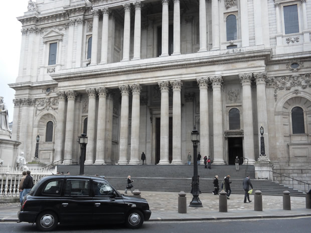
I am working not far from St. Paul's Cathedral, so I decided to have a walk to get some photographs of the cathedral during lunch. It was a cloudy day, and it was fairly quiet as people were settling back into their jobs from the holiday break in January, and it is a little too early for many tourists. Despite the grey day (the dome of St. Paul's is much more elegant in the sunshine and looks like a painting with the light and shadows playing on the architecture), I did manage to get some good photographs with clear white skies. 

stpauls01.jpg

stpauls02.jpg
 
stpauls03.jpg

stpauls04.jpg

stpauls05.jpg

stpauls06.jpg

stpauls07.jpg

Right before Christmas, I saw some pretty cool sculptures in Selfridges. They were inspired by pixels are were made up of many tiny ceramic cubes. I would have bought one, but I could not justify spending quite as much as they were asking for one, particularly as I'd be worried about it somehow getting shattered.

There has been a growing trend in pixelated artwork and design and a re-emergence of 1980's-style game and technology-inspired concepts. In movies, Scott Pilgrim vs The World had a 1980s 'geek' and old-style game console feel, and the 1980s Tron film inspired a remake and made a comeback to the cinema last year.

The artist who created those cool vases/sculptures in Selfridges is Julian Bond. (His work can be found on his website: http://www.julianfbond.co.uk.) Another artist inspired by pixels is Shawn Smith, and examples of his sculptures is located at http://www.shawnsmithart.com. Christian Zuzunaga creates pixels designs on furnishings (furniture, rugs, wallpaper, etc), and his work can be found here: http://www.cristianzuzunaga.com.

Another site showcases lamps (made out of recycled material) that light up with a pixel-ly glow when turned on; these were designed by various artists and can be seen here: http://www.techfemina.com/entry/banners-turned-into-stunning-pixelated-lamps/. And the following website displays pixel-inspired products - from jewellery to handbags to clothing to sunglasses: http://www.techfemina.com/entry/sexy-pixels-little-graphic-dots-making-maddening-fashion-buzz/. With all of these cool designs in the art and fashion world, it seems like a lot of people are pixel-mad at the moment. Embrace the pixel!

CSS Font Size Display Choices: px, em, %, pt

| 1 Comment | No TrackBacks
When specifying font size on a website using CSS, developers must choose between four different types of units: pixels (px), em, percentages, and points (pt). This article describes each solution and the solution that should be used. An example table displaying font size comparisons between the different units can be found can be found in the cited resource (1).

Pixels and points are both viewed as being a fixed font size in the browser. Although fonts set using pixels can resize in some browsers, they do not resize in all (such as Internet Explorer). A general rule: fonts sized using the measurement in points should be used for printed content and not screen content. (With this in mind, the web designer can set up a CSS style for print with font size specified in points.) That removes points from the equation.

Fonts set using pixels is not guaranteed to scale with the browser (Internet Explorer) if the user decides to increase (or decrease) the font size. Also, there is a difference in display size between Windows and Mac operating systems when using points due to different screen resolutions. This has not stopped developers using pixels to specify their font sizes, however. Sizing with pixels is easy, and it offers a little more control on the design of the page. In the past, I have used pixels to size my fonts because I liked the control over the position and display; it was also easy to learn when I adopted CSS several years ago.

Unlike pixels, the em and percentage units can scale with the browser. The measurement for em is based on the font. It is the width of the upper case 'M' letter (or 'em dash'), hence the name. Fonts sized using percentages are relative to the page.

To determine the correct font-sizing method (pixels, em, or percentages), we need to decide the goal of the website; the first goal should be to allow users to access the website and read content. The website should be accessible, meaning that it should allow everyone to read the website without problems. (For example, some users with poorer eyesight may need to make the font in their browser larger in order to read it easily.)

How can we make content accessible and readable? One way is to choose a scalable font size. (Other ways include choosing a legible font and an easy-on-the-eye colour, but these are beyond the scope of this article.) A good choice of font size will give the user the ability to resize the text displayed in the browser. With this in mind, the best way to go would be to use either em or percentages.

Now that we have determined that the font needs to be scalable, we are left with the choice of using percentages or em for sizing our fonts. Some suggest that percentages are the way to go; Blogger Kyle Shaeffer states that percentages should be used instead of em because they are the most consistent and resizing the text in the browser when using em is too abrupt (and too small or too large) in some browsers (2). However, other users believe that em is best used. The World Wide Web Consortium backs the use of em to be the best practice for declaring font sizes (3). Yet, others suggest using a blend of em and percentages. An article by Richard Rutter provides examples of different methods of setting font sizes and concludes that font sizes should be set using percentages on the body element and using em for defining font size and line-height to produce the most consistent visual design in all browsers (4). The W3Schools website also shares this idea for the most consistent browser font display (5).

In conclusion, I believe that web developers and designers should use font sizes in em units with a percentage on the body element. A separate CSS file for 'print' should also be developed to set the font sizes in points unit for pages that are likely to be printed.


(1) Briggs, Owen. Incremental Differences. http://www.thenoodleincident.com/tutorials/typography/incremental_differences.html [03 October, 2003].

(2) Schaeffer, Kyle. CSS Font Size: em vs. pt vs. px vs. percent. http://kyleschaeffer.com/best-practices/css-font-size-em-vs-px-vs-pt-vs/

(3) World Wide Web Consortium. Web Content Accessibility Guidelines, Chapter 4: The amazing em unit and other best practices. http://www.w3.org/WAI/GL/css2em.htm [26, October 2010].

(4) Rutter, Richard. How to Size Text in CSS. http://www.alistapart.com/articles/howtosizetextincss [20 November, 2007].

(5) W3Schools.com. CSS Font. http://www.w3schools.com/css/css_font.asp [10 January 2011].
I knew it was bound to happen sooner or later, and hopefully it does not get any worse that simply scaring a few (possibly niave) people. I am talking about stalking via geo-location applications, such as Foursquare.

Foursquare and other geo-location applications are used on a mobile device, such as an iPhone, and Foursquare can be played as a game by rewarding users by 'checking in' to places. Geo-location applications allow users to 'check in' to the location that they are physically at, such as a bar or a restaurant or their home. When the user 'checks in' to a place, this can be shared with other users over a social media website as well as on other mobile applications. Others then know exactly where that person is at.

Although these geo-location applications can be a useful tool and allow users to meet like-minded people (for dating, socialising, etc), I feel that this is also dangerous. I became interested in this concept when reading about it in a book several years ago where it has taken off in Japan as an application for single people looking for other single people in their physical location. (Imagine that you are at work and would like to meet up for after work drinks with someone. You could log onto the application and see others in your area and ask them if they would like to meet you after work. It's certainly great for networking and finding Mr. or Miss Right because you are meeting people you would not normally meet: strangers.)

It is generally an idea that many dislike the idea of others knowing their every movement and the 'invasion of privacy' argument. Mention Big Brother and CCTV cameras, and some people will get angry and say it is an invasion of privacy, but for whatever reason, some people do not see the problem with publicising their whereabouts. Possibly because it is their choice to do so, or they simply are not the people who care about being monitored on CCTV anyway.

Using these applications potentially opens you up to privacy invasion, being stalked, and burglars could know your whereabouts to determine if you are at home or not. Along these themes, there's a website called "Please Rob Me" (http://pleaserobme.com/) and a stalking website "Let's Stalk People!" (http://www.phonelosers.com/index.php?board=61.0), where members discuss prank calling others to warn them of the dangers of publicising their personal data and whereabouts (1).

I read a news story on Friday which claimed to be the first official reported case of stalking via these applications; a man was allegedly hassled with messages and phone calls from a 22-year-old woman (2). There is another case cited in various blogs; a woman out with her friends in a restaurant was tracked warned by a stalker (3). As stated in the blog, the stalker may have just been trying to warn her of the dangers. Journalist Leo Hickman has also decided to put the stalking theory in practice using Forsquare and found it easy to latch on to one user and learn a lot about her in a matter of minutes (4).

However, many do not see a problem with using geo-location applications. They were recognised by other users and have made friends this way (5). I think that it is possible to embrace this technology, but it needs to be done with caution. For example, users should update their privacy settings and only friend people that they actually know. Be intelligent, learn what data is private or how to make your personal data private, be careful about what you post (keep in mind that the whole world may see it), and be safe. 


(2) The Daily Telegraph. Police warn over location tracking site following case of alleged Foursquare stalker, http://www.telegraph.co.uk/technology/news/8244431/Police-warn-over-location-tracking-site-following-case-of-alleged-Foursquare-stalker.html [6 January 2011].

(5) Dolan, Michael. Is this the first confirmed case of Foursquare stalking? http://prbreakfastclub.com/2010/07/15/foursquare-stalking/ [15 July, 2010].

(3) sheasylvia, A Cautionary Tale, http://blog.sheasylvia.com/post/809428679 [13 July, 2010].

(1) Phone Losers of America, PLA Episode #27, http://www.phonelosers.org/pla-radio-episode-27-foursquare-stalking/

(4) Hickman, Leo. How I became a Forsquare cyber stalker. http://www.guardian.co.uk/technology/2010/jul/23/foursquare [27 July, 2010]

Notable Websites for Films Released in 2010

| 1 Comment | No TrackBacks
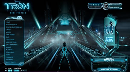
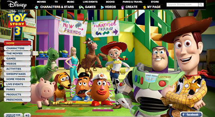
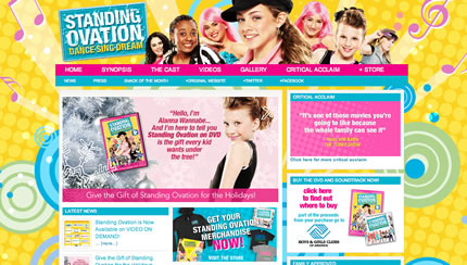
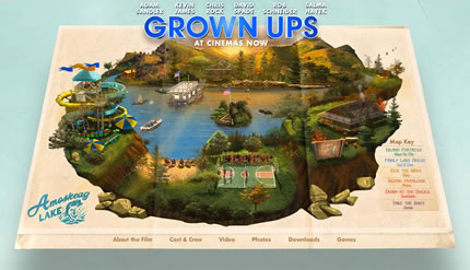
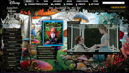
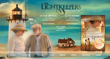
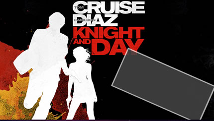
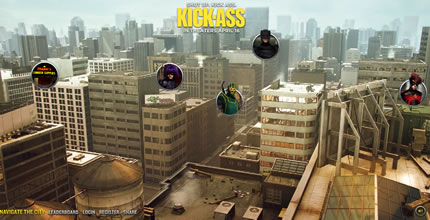
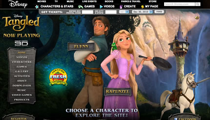
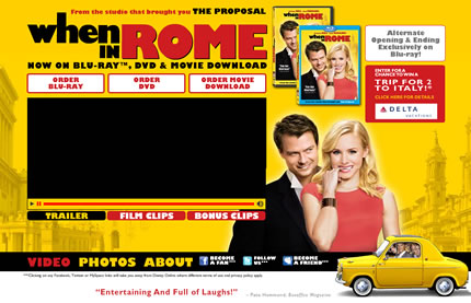
This post provides screenshots of websites to describe movies and films in the year 2010. This year brought us a variation of films, and many were still capitalising on 3D technology. Many children's films did well, such as Toy Story 3, How to Train Your Dragon, and Harry Potter. Twilight had another instalment, and Scott Pilgrim vs the World captured the reemerging 1980s-style-inspired geek culture. After trolling many film websites, I have selected some of the best websites in the film/movie industry in 2010. Enjoy the results below.

2010movie_01.jpg
Tron

2010movie_02.jpg
How to Train Your Dragon

2010movie_03.jpg
Toy Story 3

2010movie_04.jpg
Standing Ovation

2010movie_05.jpg
Grown Ups

2010movie_06.jpg
Edge of Darkness

2010movie_07.jpg
Harry Brown

2010movie_08.jpg
Inception

2010movie_09.jpg
Alice in Wonderland

2010movie_10.jpg
The Lightkeepers

2010movie_11.jpg
Leap Year

2010movie_13.jpg
From Paris with Love

2010movie_14.jpg
Little Fockers

2010movie_15.jpg
Knight and Day

2010movie_16.jpg
Eat Pray Love

2010movie_17.jpg
Megamind

2010movie_18.jpg
Scott Pilgrim vs the World

2010movie_19.jpg
Kick Ass

2010movie_20.jpg
Tangled

2010movie_21.jpg
Yogi Bear

2010movie_22.jpg
Burlesque

2010movie_23.jpg
When in Rome


Archives

Recent Comments

  • jenn: Thank you. read more
  • Murge: Amazing post. read more
  • Herbert: good post. site read more
  • Frank Quake: Hey, This is great when you said that I had read more
  • Chappy: You mention peptides here? I have had first hand experience read more
  • jenn: Thanks! I love the work. I have got more recent read more
  • Fanakapan: Thanks for the write up. This was some of my read more
  • jenn: Yes.... but that's only for the islands. Mostar and Montenegro read more
  • jenn: Hello, the code is not mine to hand out. I'll read more
  • pantich: More info about the best day trips from Dubrovnik can read more
OpenID accepted here Learn more about OpenID