February 2011 Archives

Creative Website Headers and Footers

| No Comments | No TrackBacks
I am forever looking for inspiring websites. Here are a few that have done well in developing their websites with creative headers and footers. (Footers can often be overlooked, so I thought that it would be a good idea to showcase a few websites that do not ignore this useful part of the web page).


SproutFund.org
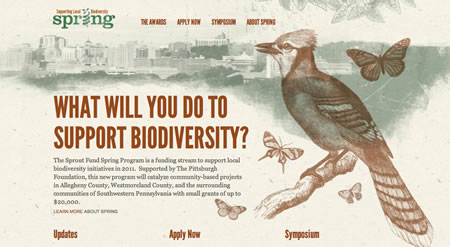
http://www.sproutfund.org/spring/

I enjoy the newsprint-inspired illustration featuring a bird and a city scape. The website uses age green and red-brown to give it an earthy feel. This website feels very much like a printed graphic with imagery and a large main font, one third of a way down the page. 
header01.jpg


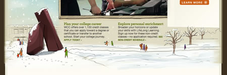
Washtenaw Community College
http://www.wccnet.edu/

The footer area of this website contains a winter illustration of the campus, which blends into the page's background. Lovely. 
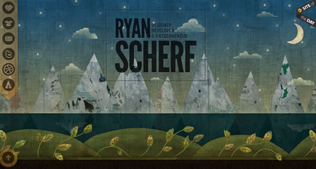
header02.jpg


Ryan Scherf
http://ryanscherf.net/

This personal website features a mountain and ocean theme.
header03.jpg


Carbonica
http://www.carbonica.org/

The footer of this website features a natural theme with bright green rolling hills. Peaceful.
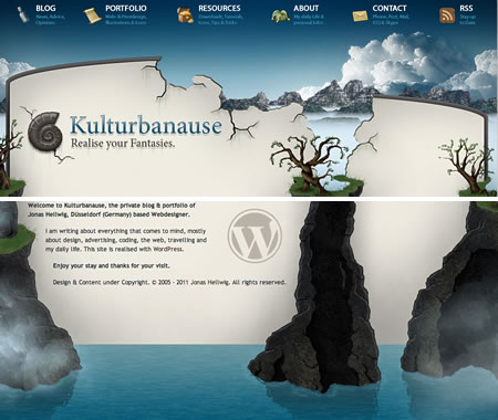
header04.jpg


Kulturbanause Blog
http://www.kulturbanause.de/

This website's design extends from the header to the footer with impressive rock formations and a sky filled with clouds. Very creative illustration.
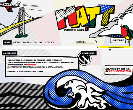
header05.jpg


Ma.tt
http://ma.tt/

A comic book feel and primary colours make this website stand out with a bold header and footer.
header06.jpg


Rubidine
http://rubidine.com/

This site is creatively designed, and not just in its headers and footers. The navigation scrolls with the website, and the website features many illustrations, so all parts of the website are unique but maintain a consistent theme. I also love the use of colour: lime, pink, tan, purple-red. The cityscape in the footer is animated to blink. I appreciate the attention to detail and the ideas.
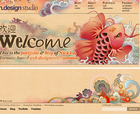
header07.jpg


N.Design Studio
http://www.ndesign-studio.com/

Pastel swirls create a watercolour of colour with fantasy and under-the-sea visual inspired for the header and footer.
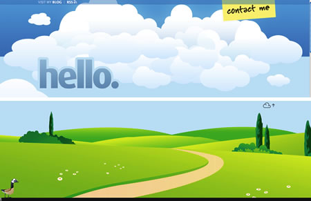
header08.jpg


Jan-Eike Koormann
http://koormann.de/

This website features an outdoor theme. The header of the page is a bright blue sky with clouds. The footer displays a scene of bright green rolling hills and a pathway with some trees and a duck. To add more interest, the pale blue body of the page contains clouds moving across the scene; I enjoy these little attentions to detail.
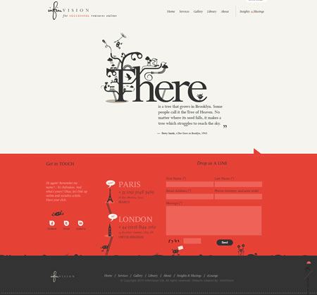
header09.jpg


InfinVision
http://www.infinvision.com

Quirky illustrations and clever font styling make this website. I love the footer and its great use of colour and illustrations with landmarks and the 'back to top' icon that scrolls with the page. 
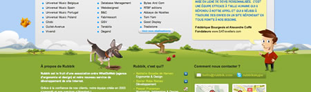
header10.jpg


Rubbik
http://www.rubbik.com/

Another outdoor footer theme adds character to the footer on this website. I only wish that they had spent as much time developing the top of the site.
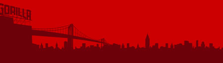
header11.jpg

Gorilla Coffee
http://www.gorillacoffee.com/

The footer uses a cityscape in Flash. 
header12.jpg

Spring is Coming: Snowdrops

| No Comments | No TrackBacks
After a long winter, spring is coming at last, and many snowdrops are in bloom. I took a photograph of these snowdrops in the middle of a roundabout while on the way to the cinema with some friends. 

snowdrop01.jpg

Going Retro With "Soap and Glory"

| No Comments | No TrackBacks
I really like the retro package designs on the skin-care and make-up product range from 'Soap and Glory'. (Their website is http://www.soapandglory.com.) The brand packaging is brown, pink, and cream; bold, sans-serif fonts are used. In addition, witty and tongue-in-cheek comments are used in the product packaging. The product packaging is consistent across the range and very noticeable on the shelves. 

soapandglory1.jpg

According to the website, Soap and Glory were inspired by bad British tabloid headlines, and the packages are designed to be cute (but not too cute) and clever (without being corny or too clever). 

The only disappointment is the design of the 'Soap and Glory' website. While they use some good graphics and the same sense of humour and retro-style, the website appears to be dated. They could have done better than putting the website in a pixelated 'page' (it is so 2000s); I can see that they are trying to go for the newspaper look, but this fails here (in my opinion). Also, I feel that they could have done better with the navigation, instead of putting a square, grey, half-border around the selected elements. This is such a fun product, and it is a pity that they do not have a nicer website, especially when you compare their awesome package design.

soapandglory2.jpg

London Street Photography Exhibit

| 1 Comment | No TrackBacks
Friday evening was the opening of the 'London Street Photography' exhibit, displayed in the Museum of London. As it is opening night of the exhibit, the museum was open until late. The exhibition displayed several photographs of daily life in London from the 1860s until modern day. The photographs (and a few videos from the turn of last century) document daily life and average people of London, including photographs of children playing in the streets, vendors in market places, the air raid destruction in World War II, and photographs of people from different cultural backgrounds. 

The exhibition also takes a look at modern day street photographers and modern day issues that have made it difficult for photographers, such as suspicion as a result of terrorism. 

The exhibition runs until the 4th of September, and I recommend it.

londonstreetphoto_paulmartin.jpg

Go to the Museum of London's website for more information: http://www.museumoflondon.org.uk

I've been doing some refactoring on a website this week, including replacing Javascript that uses the YUI library. The task was to replace YUI with JQuery, if it was needed, but all of the Javascript code was fairly simple, and no external Javascript libraries were necessary. Many of the tasks included adding listeners and adding classes to style the elements. This is easy to do in Javascript.

Obviously, there are a few tricks to get some Javascript to work on different browsers, and multiple-browser testing should not be forgotten. (If it was not for Internet Explorer, I am sure that quite a few developers and testers would be out of a job!)

Take the following code, which adds a class to an element in the HTML page by using the setAttribute function:
document.getElementById("wrapper").setAttribute("class""newClass");

However, this setAttribute function does not work in Internet Explorer, so developers should use the following method instead, which works in all browsers. This example targets the className in the DOM, directly:
document.getElementById("wrapper").className="newClass";

In addition, adding a listener to an element to see if the element has changed or is in focus, is different in versions of Internet Explorer 8 and previous versions of Internet Explorer. To add a listener to an element to work in all browsers, the following must be done:

var myelement= document.getElementById("element");
if (myelement.addEventListener){
    myelement.addEventListener("change",myFunction, false);
 } else if (langSelect.attachEvent){ // For IE8 and below
     myelement.attachEvent("onchange",myFunction, false); }

In short, the 'addEventListener' function will be recognised in all browsers (except most versions of IE), and the 'attachEvent' function will work in most versions of IE. On the event, which is the first parameter, the function (second parameter) will be called. Note that for the IE 'attachEvent' function, the event will normally have the word 'on' appended to the event: onchange, onmouseover, etc. The 'addEventListener' function will simply take the word 'change'.

On that note, I've got to get back to some work. Happy coding and making your websites work in all browsers!

An Afternoon with Cupcakes and Cocktails

| No Comments | No TrackBacks
This weekend, I went to the 'Cocktails and Cupcake' experience offered by 'The Cocoa Box' in north London. The lesson took place at a hotel, and we learned how to create sugar decorations for our cupcakes and how to decorate them. We learned how to create bows, ice cream cones, roses, and cupcake designs, all made from a sugar fondant. Then, we learned how to ice the cupcakes with different types of icing. Plenty of decorations awaited - little candies, sprinkles in different colours, and edible glitter. The delicious results are below.

For more information about cupcake decorating lessons (they also have chocolate-making lessons), visit 'The Cocoa Box' website: http://www.thecocoabox.co.uk

mycupcakes01.jpg

mycupcakes02.jpg

mycupcakes03.jpg

mycupcakes06.jpg

mycupcakes05.jpg

mycupcakes04.jpg

A Dozen Cookie-Roses

| No Comments | No TrackBacks
I was presented with a nice heart-shaped box filled with a dozen cookies with edible roses on top by a special someone. He knows my weakness for cookies, especially from this High Street chain. If that is not love, then I don't know what is. I thought that the dozen rose-cookies were very pretty, so I had to take a few snaps to share.

cookieroses02.jpg

cookieroses01.jpg

cookieroses03.jpg

After watching several commercials that aired during the Super Bowl XLV last month, I noticed a trend in companies displaying their Facebook URL. It was at that point that I realised just how much investment that companies are putting into social media. With the cost of air-time during the Super Bowl valued at millions, many different companies have made a conscious decision to advertise their Facebook pages. In some cases, they seem to have invested more into their Facebook presence over their official website. While they try to appeal to a generation of Facebook users, many others in America have never used the social networking website or are not regular users of it.

A quick search on the Internet revealed that others also recognised this trend. Ryan Carson blogged about nearly 100% of the big brands (Doritos, Coke, Ford) had listed their Facebook URL in their commercial played during the Super Bowl (1). 

Since the Internet is more readily available with laptops and mobile devices becoming more common, many combine television-watching with the Internet, and in 2009, the figure had increased 35% more Americans than last year combine watching television with browsing the Internet (2). With more people using the Internet while watching television, it is not surprising to view search trends during events, such as the Super Bowl. Fox (3), who also noticed the trend of companies using their Facebook URL on the Super Bowl commercials this year, has published trends showing that once a commercial is aired during the Super Bowl, viewers search for it online.

It seems that social networking (particularly Facebook) are the buzz and hype for this year, but companies also need to be sure that other Internet users are not alienated by keeping their official websites up to date and investing in good content and keeping an audience. (Facebook is easy to update and to keep in constant communication with 'fans', if they do log on to the website and follow your company website.)


(1) Carson, Ryan. Facebook.com is now the Internet. http://thinkvitamin.com/asides/facebook-com-is-now-the-internet/ [7 February, 2011].

(2) NielsenWire.com. Americans using TV and Internet together 35% more than a year ago. http://blog.nielsen.com/nielsenwire/online_mobile/three-screen-report-q409/ [2009].

(3) Fox, Vanessa. Scoring the 2011 SuperBowl commercials for search visibility and visitor engagement. http://searchengineland.com/scoring-the-2011-super-bowl-commercials-for-search-visibility-and-visitor-engagement-63672 [7 February, 2011].

Google Art Project

| No Comments | No TrackBacks
Like Google's Street View mapping application, which allows you to view streets in a series of pictures, Google have created the 'Google Art Project' (http://www.googleartproject.com). Now, users can enjoy browsing a museum from the comfort of their home, with some of the artworks featured and viewable close-up. Users can navigate the museum by selecting a room in the museum's layout. So far, the list of museums includes the National Museum, Van Gogh Museum, Rijksmuseum, Smithsonian, and the Palace of Versailles, the Metropolitan Museum of Art, and many more.

Review of SuperBowl 2011 Commercials

| No Comments | No TrackBacks

The SuperBowl: an excuse to get together with friends/family and watch football, party, and see the new commercials that companies have spent a few million making and broadcasting. According to statistics this year, a 30-second broadcasting slot during the SuperBowl cost $3 million dollars (1). 

So, what did the audience see this year, and what were the best of the best? The most popular tweeted brands prior to the SuperBowl included Volkswagen, Audi, Groupon, Best Buy, and Doritos - in that order (2). Groupon and the GoDaddy placement featuring Joan Rivers seem to be hot topics in the news today, from a critical point of view.

This year's commercials featured many celebrities (Justin Beiber, Ozzy Osbourne, Joan Rivers, Eminem, and Kim Kardasian - to name a few.)

The following advertisments were among the most memorable:

  • Doritos: Pug Attack (A man tempts a dog with chips with consequences.)
  • Volkswagen: The Force (Mini Darth Vader meets Volkswagen.)
  • Chrysler: Eminem (Eminem takes a proud look at Detroit.)
  • Bud Light: Dog Sitter (Dogs know how to host a good party.)
  • Best Buy: (Ozzy Osbourne and Justin Beiber star in this Tron-themed commercial.)
  • Coke: Border Guards (Border guards with the popular drink.)
  • Snickers: Logging (A celebrity gets hit with a log.)
  • Volkswagen: Black Beetle (A good play on the beetle theme.)
  • Bud Light: Hack Job (A family view their redesigned kitchen to discover it has beer.)

Some of these commercials can be viewed at: http://sportsillustrated.cnn.com/2011/football/nfl/super-bowl-2011/02/06/super.bowl.commericals/index.html?eref=sihp&hpt=C2


1. Wikipedia. http://en.wikipedia.org/wiki/Super_Bowl_advertising [7 February 2011].

2. Turner, Debbie. Online Social Media. http://www.onlinesocialmedia.net/20110206/super-bowl-2011-ads-top-brands-pre-buzz-on-twitter/ [6 February 2011].


Historical Internet Archives

| No Comments | No TrackBacks
I first came across this useful resource 10+ years ago and thought that I should share it. This tool has come in useful (for historical and content purposes) to view the layout and content of websites and to see how they have changed over the years. The 'Wayback Machine' achives the websites so that you can see how they looked over time. It's an interesting look at the web and its evolution.

To view the Wayback Machine, use one of the links below. The original 'Wayback Machine' can be found on the first URL, but they have not included a separate website for an updated website with a timeline interface. (The original one seems to have stopped archiving, so the recent archives can be found on the second URL.)

Wayback Machine: http://web.archive.org
Wayback Machine (Beta 2): http://waybackmachine.org/

Simply visit a website, such as Yahoo!, and see how it has evolved over time, from its early days (the 'Wayback Machine' starts to archive data from 1996) to today.

Archives

Recent Comments

  • jenn: Thank you. read more
  • Murge: Amazing post. read more
  • Herbert: good post. site read more
  • Frank Quake: Hey, This is great when you said that I had read more
  • Chappy: You mention peptides here? I have had first hand experience read more
  • jenn: Thanks! I love the work. I have got more recent read more
  • Fanakapan: Thanks for the write up. This was some of my read more
  • jenn: Yes.... but that's only for the islands. Mostar and Montenegro read more
  • jenn: Hello, the code is not mine to hand out. I'll read more
  • pantich: More info about the best day trips from Dubrovnik can read more
OpenID accepted here Learn more about OpenID