I really like the retro package designs on the skin-care and make-up product range from 'Soap and Glory'. (Their website is http://www.soapandglory.com.) The brand packaging is brown, pink, and cream; bold, sans-serif fonts are used. In addition, witty and tongue-in-cheek comments are used in the product packaging. The product packaging is consistent across the range and very noticeable on the shelves.
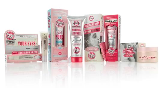
According to the website, Soap and Glory were inspired by bad British tabloid headlines, and the packages are designed to be cute (but not too cute) and clever (without being corny or too clever).
According to the website, Soap and Glory were inspired by bad British tabloid headlines, and the packages are designed to be cute (but not too cute) and clever (without being corny or too clever).
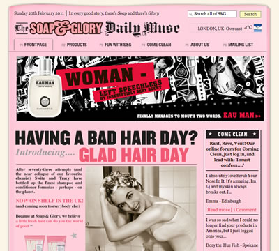
The only disappointment is the design of the 'Soap and Glory' website. While they use some good graphics and the same sense of humour and retro-style, the website appears to be dated. They could have done better than putting the website in a pixelated 'page' (it is so 2000s); I can see that they are trying to go for the newspaper look, but this fails here (in my opinion). Also, I feel that they could have done better with the navigation, instead of putting a square, grey, half-border around the selected elements. This is such a fun product, and it is a pity that they do not have a nicer website, especially when you compare their awesome package design.
Leave a comment