June 2011 Archives

Leadenhall Market, London

| No Comments | No TrackBacks
The following photographs are taken in Leadenhall Market earlier in the year and just before the Royal Wedding, when the market was covered with red, white, and blue bunting. The market is an indoor market with some familiar High Street shops, restaurants, pubs, and a few market stalls selling crafts and foods.

leadenhall01.jpg

leadenhall03.jpg

leadenhall02.jpg

Enhanced by Zemanta
I love these colourful prints from Marisa Seguin (http://www.marisaseguin.com); each print shows a different illustrated map in different colours. There are about five cities to choose from (Venice, Paris, San Francisco,Vancouver, and Milwaukee.) I do wish that she had a London one. The artwork can be purchased on her ETSY page by following the link below. 

marisa_seguin_prints.jpg

http://www.etsy.com/shop/marisamidori

Enhanced by Zemanta

Evolution of Popular Websites: BBC News

| 1 Comment | No TrackBacks
Using the Wayback Machine (http://wayback.archive.org), an archive of past websites and designs, I have put together an evolution of BBC News. 

Evolution of the BBC News website

In 1998, the BBC News website was three columns, built for 800x600 monitors. The middle column contained the main news features, with a narrow left-hand navigation column. 

By the year 2000, the website was redesigned with a wider left-hand navigation menu, interactive content in the right-hand column, and a better use of space. In 2001, the right-hand column was developed to incorporate online broadcasts. 

In 2003, a major website redesign took place, including expanding the width of the page for larger monitor sizes. The middle and right columns were more integrated, and the main news story featured prominently in the middle of the screen with a larger image. This website design continued with minor adjustments (mainly to the area underneath the feature news story) for the next few years. Most notably, in 2006, the BBC News website started to advertise its mobile website in the header. 
Video features too a prominent place underneath the feature news story in 2009. 

In 2011, a major website redesign took place; improvements included a new header, centring of the page layout, the removal of the left-hand links column, and a prominent right-hand column (with media features). Popular news items are featured on the website, with tailored results to the user, and more than one prominent news item featured near the top of the page with many other items listed below.

webevolution_bbc.jpg


Enhanced by Zemanta

Cream Tea in Broadway

| No Comments | No TrackBacks
For my birthday weekend, I stopped off for cream tea in Broadway at "Market Pantry", a bright little tea room on the High Street. The scone came with a heap of clotted cream and a little glass jar of strawberry jam. I loved the bay windows in this little tea shop, which made it very bright. The vintage feeling was very much in use, and I loved the forest green/sage green and white colours in use and little wooden boxes and green and white checkered napkins. 

Here's a photograph of the scone and its trimmings.

creamtea2011.jpg

Evolution of Popular Websites: Yahoo!

| No Comments | No TrackBacks
Using the Wayback Machine (http://wayback.archive.org), an archive of past websites and designs, I have put together an evolution of popular websites: Yahoo!, Google, and BBC News. I will be introducing the first instalment of the topic with the evolution of the Yahoo! website.


Evolution of Yahoo!

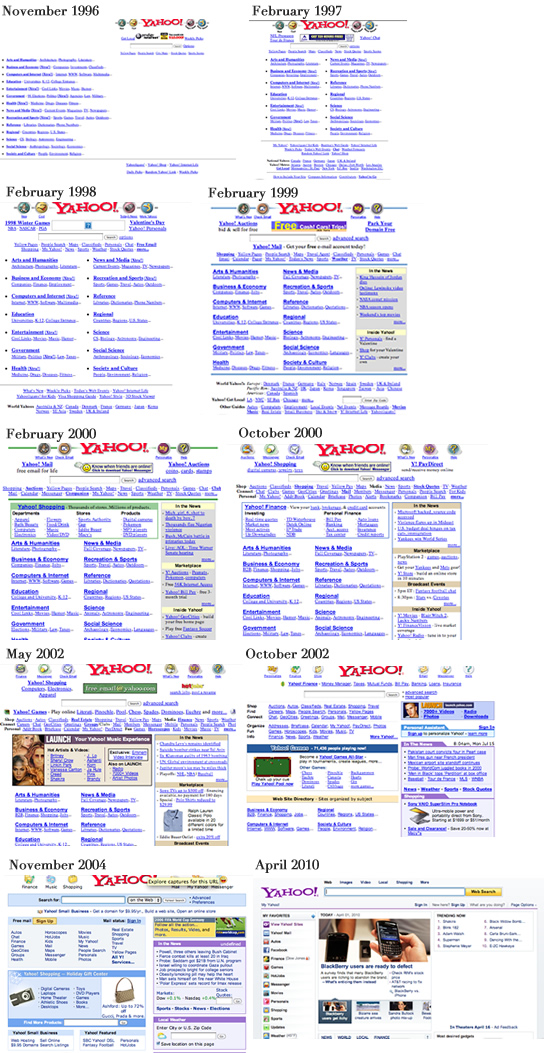
In late 1996, Yahoo!'s website consisted of a search field with links to categories and sub-categories where users could narrow down their search, similar to searching at a library. By 1997, the website's design became centred, and the categories became more defined and designed aesthetically (in tables). Over the next months, no major changes were made to the design; the focus seemed to be on enhancing the categories and sub-categories and terminology. 

In 1999, a major redesign of the website took place. While the top of the website with the search field remained fairly consistent (though with more links and slight image changes around the logo), the width of the website was increased, and a new column was added. The first two columns displayed the categories, now in larger font sizes and Arial type (as opposed to Times New Roman in the earlier designs), with only a few sub-categories described below in smaller Times New Roman font. The third column advertised news and Yahoo!'s features. 

By 2000, Yahoo! had introduced an advertisement box underneath its textfield for users to find items and to shop online, defined in a green table; the green colour was enhanced in its horizontal rulers. Throughout this year and the following year, Yahoo! makes minor design changes by using simple borders and removing the shading in the third column and adding two new icons on either side of the logo to advertise new services (the horizontal ruler through the middle of the logo has also disappeared). In 2002, Yahoo! made some minor changes to the design. This mainly consisted of using graphical elements on the website (for the first time, apart from the header), particularly advertisements within the advertisement box that was introduced in 2000. 

By the middle of 2002, a major redesign took place; the list of links underneath the search field disappeared and were replaced with styled categories. The logo (and icons around it) was anti-aliased (and not pixelated as it had been before) as Internet speeds became quicker to cope with slightly larger image files. The two-column layout started directly underneath the search field with a banner placement and colourful slanted-corner tabs (using images). The categories became less prominent and moved further down the page. 

By late 2004, a major redesign took place. The search field was placed in front of a light blue background, and popular websites and Yahoo! pages were placed in a similar box underneath. The two-column design remained with the news on the right-hand side, but the slanted tabs were removed in favour of simple HTML table mark-up. The advertisement box remained similar with other news features underneath and the removal of the categories. The icons near the logo were redesigned with the removal of the circles around them. No major design changes took place until the end of 2006. 

Unfortunately, the archives are missing as only a holding page remains between then and early 2010, informing the user to upgrade their browser to see the latest designs. However, in 2010, the Yahoo! website was redesigned with three columns; the first showcasing the partner links, and the second and third dedicated to news and advertising. The heading became simplified with a prominent search field with different categories of search (probably inspired by Google), and the branding changed; the logo became purple instead of red. 

The website has not changed much since the latest redesign (2010), but it is possible that a new design will be released later this year. (It seems that Yahoo! tend to redesign their website toward the end of the year.)

webevolution_yahoo.jpg
Enhanced by Zemanta

Evolution of Popular Websites: Google

| No Comments | No TrackBacks
Using the Wayback Machine (http://wayback.archive.org), an archive of past websites and designs, I have put together an evolution of Google's website. 


Evolution of Google

In November of 1998, Google was a prototype; the simple website contained a URL to the prototype search engine (on Stanford University's website). By 1999, Google had updated its website with company information and search options in a turquoise table. The branding had been established, depicting the primary blue, red, yellow (and lime green) colours with a serif font and an exclamation mark (probably a tribute to Yahoo!, the most popular search engine at the time). By the middle of 1999, the turquoise table was removed in favour of a simplistic website with its search option. 

In 2001, the simplistic design remained, but links to 'Advanced Search' appeared, and the branding was changed; the font became sans-serif and the exclamation mark disappeared. 

In 2002, a tabbed search feature was placed above the main search box so that users could search for content other than websites, but this was replaced in 2004 with text links and the introduction of new Google brands, such as Froogle. The simplistic design and logo remained for the next few years, until 2010, with a change in placement of the search option links to appear above the logo in 2007. 

In 2010, the branding was redesigned and modernised to tone down the shadow and to soften the colours. The simple layout exists in 2011, although the links above the logo have been removed.

webevolution_google.jpg

Enhanced by Zemanta

Pantone Sugar Cookies

| No Comments | No TrackBacks
A while ago, I came across Kim's Pantone Chip Cookies (http://www.kimcreativestar.com/Portfolio/Cures_for_Boredom/Entries/2011/1/1_PANTONE_CHIP_COOKIES!.html), and I have been dying to try this recipe and create my own Pantone-inspired sugar cookies. (Decorating cookies seems to be the next food decoration fad, after cupcakes). 

It is my birthday coming up, and as I am on a diet and do not want to eat too many sugary snacks, I thought that it would be perfect to bring in some of these cookies to my web designer colleagues. (Geek treats, anyone?)

My cookies did not turn out to be as nice looking as Kim's, but I do not think they are that bad, considering the time that went into them. However, they are a bit messy to make; the icing is sticky and takes a while to dry and I've not got a lot of space in the apartment in order to create baking tasks on this scale. All in all, I am pretty pleased and they went down well at work!

Here are some photographs of the cookies.

pantonecookies_01.jpg

pantonecookies_02.jpg

pantonecookies_03.jpg


Enhanced by Zemanta

Google Logo Doodle - Les Paul Guitar

| No Comments | No TrackBacks
Google's doodle (logo) for the day is unique. Not only is it an image, but it incorporates sound. Users can 'strum' different strings in the doodle, which are then highlighted in one of Google's colours, and the strings produce a different sound. Users can also record their attempts to make a tune and share with friends through a URL provided. 

google_doodle1.jpg

Enhanced by Zemanta

Borough Market, Part 1

| No Comments | No TrackBacks
Borough Market in London dates back to the early middle ages. It is located just south of the Thames, next to Southwark cathedral and London Bridge. The market is held underneath a railway viaduct. Fruits and vegetables, meats, cheeses, and fine foods are sold here, and today it is a popular place for City workers to go to get lunch. The atmosphere is great here, and it attracts many tourists.

borough01.jpg

borough02.jpg

borough03.jpg

borough04.jpg

borough05.jpg

borough06.jpg

borough07.jpg

Enhanced by Zemanta
One of my favourite bands is the Kaiser Chiefs, and I've recently come across their new website. I love it. The website allows an album to be created by listening to clips of various songs and selecting the songs you like and want to purchase (up to nine) to include on the album. Each song clip is represented by a small icon, and "plugged" into a "machine". This is a quirky, fun, and interactive way (highly addictive) to admire the music.

kaisercheifs.jpg

http://createmyalbum.kaiserchiefs.com/

London to Brighton: Mini

| No Comments | No TrackBacks
Every May, hundreds of Minis (old and new) make the journey from London to Brighton and park along the seafront. Each Mini is different and has its own personality and design, ranging from cartoon characters to flags to artwork and racing themes. A couple of years ago, I was a part of the World Record for the largest convoy of cars; this happened in London's Crystal Palace. This year, I went straight to Brighton to catch the excitement. Here are a few photos taken at this year's London to Brighton Mini show.

mini_l2b01.jpg

mini_l2b02.jpg

mini_l2b03.jpg

Enhanced by Zemanta

Twitter Introduced 'Follow' Button

| No Comments | No TrackBacks
Twitter have released a 'follow' button, which third parties can put on their websites for users to follow news on their Twitter websites. (In the past, users would need to go to Twitter to locate the Twitter page to 'follow' it.) The code for the 'follow' button is located here: http://twitter.com/followbutton

Many websites are already using the new feature, which was launched today.

Read Twitter's blog on the 'follow' button. http://blog.twitter.com/2011/05/introducing-follow-button.html
Enhanced by Zemanta

Archives

Recent Comments

  • jenn: Thank you. read more
  • Murge: Amazing post. read more
  • Herbert: good post. site read more
  • Frank Quake: Hey, This is great when you said that I had read more
  • Chappy: You mention peptides here? I have had first hand experience read more
  • jenn: Thanks! I love the work. I have got more recent read more
  • Fanakapan: Thanks for the write up. This was some of my read more
  • jenn: Yes.... but that's only for the islands. Mostar and Montenegro read more
  • jenn: Hello, the code is not mine to hand out. I'll read more
  • pantich: More info about the best day trips from Dubrovnik can read more
OpenID accepted here Learn more about OpenID