October 2011 Archives

I just wanted to wish a Happy Halloween to all of my visitors. (This is my favourite holiday, as it falls just after my favourite time of the year; autumn colours and the last of the warm summery days, known as Indian Summer.) I love the colours; russet and yellow and orange and brown. I like pumpkins, cinnamon, and 'Indian corn' and gourds.

I thought that I would include a special creative post about pumpkins. Besides making jack 'o lanterns and carving intricate designs, pumpkins can be used to create other decorations, and I have added a few ideas below.
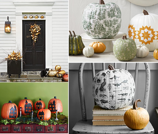
Painted Pumpkins

paintedpumpkins1.jpg
Country Living Magazine: http://www.countryliving.com/
1) Carol Kemry created a gilding kit to use to decoratively paint pumpkins and gourds.
2) Miki Duisterhof - These pumpkins were inspired by different fabric patterns.
3) John Kernick - these stencil silhouette-style houses are dawn and painted onto pumpkins
4) Dana Gallagher - pumpkins painted with textbook-inspired illustrations.


Pumpkins in Crafts

paintedpumpkins2.jpg
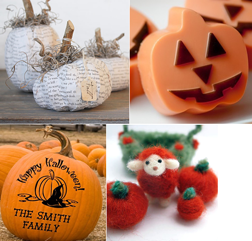
1) Cloth and Patina: http://www.etsy.com/people/ClothandPatina
I like these paper pumpkins.
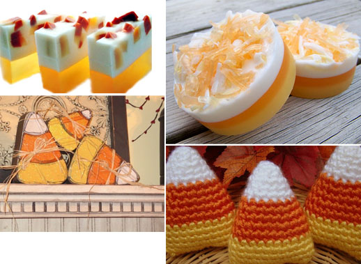
2) Paradise Body Soap: http://www.etsy.com/people/ParadiseBodyShop
These jack o' lantern pumpkin spice-scented soaps look cute.
3) wallblooms: http://www.etsy.com/people/wallblooms
A pumpkin can be personalised.
4) kippyssomature: http://www.etsy.com/people/kippyssomature
I could not resist adding this cute lamb with felt pumpkins.


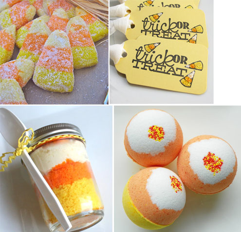
Pumpkin-flavoured Treats

paintedpumpkins3.jpg
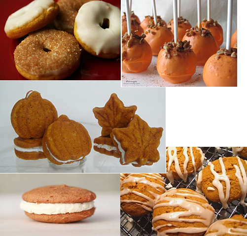
1) donutsandmore: http://www.etsy.com/shop/donutsandmore
Pumpkin doughnuts sound delicious; look at the sugar and cinnamon. Mmm.
2) cploch: http://www.etsy.com/people/cploch
These pumpkin cake pops look delish.
3) Old Time Favorites: http://www.etsy.com/people/OldTimeFavorites
These pumpkin-spiced whoopie pies are shaped like maples leaves and mini pumpkins.
5) Splendora Cakes and Tea: http://www.etsy.com/people/SplendoraCakeandTea
A pumpkin whoopie pie looking yummy.
6) Broken Road Farm: http://www.etsy.com/people/BrokenRoadFarm
Pumpkin cookies are my favourite, and these look like the kind I make.


Pumpkin in Recipes

paintedpumpkins4.jpg

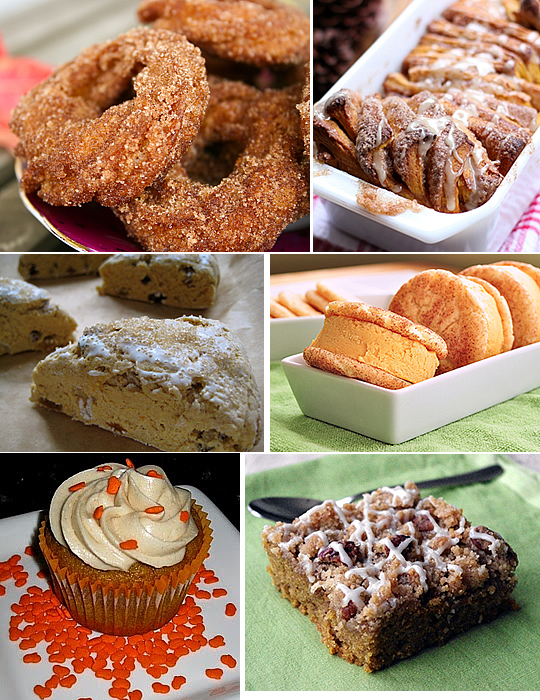
1) Pumpkin churros: http://buddingbaketress.blogspot.com/2011/09/pumpkin-spice-churros.html
2) Pumpkin-Spice Pull-Apart Bread: http://willowbirdbaking.wordpress.com/2011/09/18/pumpkin-spice-pull-apart-bread-with-butter-rum-glaze/
3) Pumpkin Spice Scones: http://eggsonsunday.wordpress.com/2008/12/10/pumpkin-spice-scones-my-best-scone-so-far/
4) Snickerdoodle with Pumpkin Ice Cream: http://penniesonaplatter.com/2010/10/15/snickerdoodle-pumpkin-ice-cream-sandwiches/
5) Pumpkin Spice Cupcakes: http://cupcakestakethecake.blogspot.com/2010/09/pumpkin-spice-cupcake-recipe.html
6)  Pumpkin Coffee Cake: http://www.americancupcakeabroad.com/cake/pumpkin-streusel-coffee-cake

(Note: All photographs and images were taken from the respective website or Etsy seller's page.)
Fudge company "Burnt Sugar" are running a competition for package designs. The best package design will be used for packaging their 'lumpy bumpy' fudge range in Borough Market in London. Designers are urged to visit the company's Facebook website to upload their design; they can also e-mail or snail-mail their design to the company. Users can vote on the best design on the Facebook website.

Users can enter the competition through the company website here: http://www.burntsugar.co.uk/. However, you should be quick to get your designs entered as the competition ends at the end of November.

The company hosted a drawing event in Borough Market at the beginning of October, but I did not know about it in time, sadly, as I work only a few minutes away. Their fudge is delicious, too, and I like the design of their website.

burntsugar1.jpg

Their current packaging and website design can be classified as whimsical, and several crude (almost child-like) drawings, fonts, and design elements are representative of their current range. The hand-drawn feeling, similar to what I have seen the companies "Lush" and "Innocent" do, provides a personal feeling. It also portrays the product as being a little quirky as well as friendly. (I have captured a screenshot of their website, and this depicts some of their package designs, which feature hand-drawn fonts, cats, sailboats, and other elements.) 

burntsugar2.jpg

To get you inspired, I have posted a few of my favourite design submissions below. (Note that these designs belong to the individual designers and "Burnt Sugar". Unfortunately, I cannot credit the individual designers as that information is not given, but these designs can be found on the "Burnt Sugar" competition Facebook page.) Do not hesitate to vote on your favourite design, even if you do not have the time or the ability to contribute your own. I hope that reading about the fudge does not make you too hungry, as it has me.

burntsugar3.jpg


One of my recent tasks was integrating a Twitter feed onto a website. Upon researching the various methods to achieve this, I decided to use the Javascript written by seaofclouds, which uses the Twitter Search API, which you can read more about here: https://dev.twitter.com/docs/using-search.

Adding the code to print out the tweets is effortless. To do this, simply add your jQuery and the seaofclouds Javascript classes; download these scripts and include them in your page. (If you add these classes at the bottom of your web page, make sure that you load the following method to call your Twitter function after the page has loaded, of course.) 

Next, add your function to make the call to the Twitter class, which is printed below. The function will reference a <DIV>, and the ID of this should be set in your function. In the example below, the ID is called "tweet". You will then need to add a <DIV> tag with this ID to your web page, and the content will be added here.

function callTwitters() {
      jQuery(function($){
        $("#tweet").tweet({
           // ..... add your customisation here .....
       }).bind("loaded",
            function(){
               $(this).find("a").attr("target","_blank");
            }
       )
        .bind("empty",
                function(){
                    $(this).find("ul").append("<p>No tweets.</p>");
                }
           );
      });
 }


In the above example, I have included two 'bind' tags. I feel that this will always need to be used, but if you do not wish to use them for whatever reason, you can remove them. The first will add the property 'target=_blank' to all <A> tags. (This will ensure that all links will open in a new window so that users will not be navigated away from your website.) The second will display a message if no tweets were returned.

I have included some of the customisation options below. These will be added to the code above, in place of the comment in the code above. (Simply add each configuration item with a comma following it, but do not include a comma after the last item.)

avatar_size: 20, // Set the size of the avatar, in pixels.
count: 5, // Set the number of tweets you wish to be displayed
usernames: ["jenikya", "twitter"], // If you want tweets from more than one user, list all users.
username: "jenikya", // List the user you want to see tweets from
loading_text: "searching twitter...", // Set the text to display before tweets are loaded
refresh_interval: 60, // Set the refresh, which will look for new tweets every 60 seconds, in this case
template: "<div class=twitmain> {text} {avatar} </div> {time} {user}", //Set a template, which can include styling as well as the items received from Twitter      
filter: function(t){  // Set up a filter to filter any results. In this example, we filter out replies, designated by the '@' symbol.
                   return ! /^@\w+/.test(t["tweet_raw_text"]);
},   
join_text: "auto", // Automatically join the text
fetch: 100, // Fetch a sampling of results if you use a filter or a query. It will ignore all results that are filtered out.

Instead of specifying usernames individually, you can automatically view all tweets from users in a list. That way, you don't need to make a code change to add a new user. To do this, simply add a 'username' and a 'list' attribute. (Make sure that you set up the list on twitter first, and the list will need to be a public one.)

username: "jenikya",
list: "myPublicList"

The 'query' attribute can also be used to gather results. For example, if you wanted to return all results with a hashtag, you would use the 'query'. However, if you use the 'query' attribute, it will ignore the 'username', 'usernames', and 'list' settings. The query is set to null by default. The query below will return a list of tweets with the #London hashtag. Tweets will be from any user on Twitter that has used this hashtag.
query: "#London",

If you want to only specify tweets from your user when the #London hashtag has been used, simply complete the following:
query: "from:jenikya #London",

Fortunately, Twitter allows web developers access to their feeds without the glitches that Facebook had. (Last year at about this time, I added Facebook comments to a series of websites. The weekend that I worked on this, there was a glitch in Facebook which meant that none of the changes were making their way though; even the Facebook developers on the forums admitted the issues and it seemed that one developer was solely in charge of the task of fixing it. It took three days before Facebook's feed started to work again; meanwhile I'd wasted my weekend thinking that I got something wrong and spent countless hours going over my work and trying alternative methods.)

Twitter also allows web developers the ability to format the tweets in the manor that they see fit, whereas Facebook packages up the whole lot and send it in an iFrame, so customisation is limited.

For more information and for the code from seaofclouds and other examples, visit the website: http://tweet.seaofclouds.com/

My Designs: Wedding Invitations Stationery

| No Comments | 1 TrackBack
My wedding invitations were designed with the modern-but-vintage flair which is popular at the moment. The invitations and the other wedding stationery use floral imagery and a combination of fantastic fonts. I was originally inspired by the vintage letterpress designs that are popular at the moment, and this fit the mood and the setting of the wedding perfectly. The wedding was held at a small country church on the edge of my parents' farm, and this church was the first in the county, dating from the late 1800s. The reception was held at a winery.

Cornflowers feature prominently in the design. These are my favourite flower, and they were used in the wedding. The image of the cornflower also highlights the vintage mood as cornflowers can be found growing in the countryside and meadowlands. (I drew the cornflowers and cornflower buds using Adobe Illustrator.)

Choosing a combination of acceptable and aesthetic fonts for the theme was an important task, so I selected three primary fonts to use in these wedding invites. The fonts convey a modern vintage feel while keeping some elegance with the Feel Script font.

The cards were printed on a brown/slate-coloured recycled card stock, which contained imperfections to give it a vintage and old-fashioned feel. Matching RSVP cards, envelopes, a directions card, and a program card for the day's events were also designed.

A sampling of the work is below, and I hope that these will also inspire you.

wedding2011invite_1.jpg

wedding2011invite_2.jpg

wedding2011invite_4.jpg

wedding2011invite_6.jpg

wedding2011invite_5.jpg

wedding2011invite_3.jpg

wedding2011invite_7.jpg

Walking by the Seaside in Deal, Kent

| 2 Comments | No TrackBacks
The village of Deal in Kent is located on the south-eastern coast on England. The village boasts a pier, bandstand, waterfront pubs, a circular castle on the seafront, and a small group of fishing boats. I took a walk down the seafront in Deal in September, and the weather was perfect. A late afternoon drink and lunch was taken at one of the seaside pubs, and sitting in the pub garden and looking out to sea on this warm and summery September afternoon was enjoyable.

On the walk along the seafront, I admired these fishing boats, moored upon the shore with their fishing cages and other boating equipment next to them. 

deal3.jpg

deal7.jpg

deal2.jpg

deal1.jpg

deal4.jpg

deal5.jpg

deal6.jpg

New BBC Website Launched

| 3 Comments | No TrackBacks
When a high-profile website, such at the BBC, gets a re-design, it gets noticed. Recently, the BBC have launched a new design for their website. (I recently wrote an article about the different phases and the evolution of the BBC website, which can be read here: Evolution of the BBC website.) In the past, users were not so happy of the BBC's re-designs.

In 2010, the BBC launched a new design, which was considered 'chaotic' by many users, and the new design resulted in the BBC receiving mainly critical comments on its blog about the layout looking 'too crowded' and users' inability to find their way around the new layout (1). 

Earlier this spring, the BBC made changes to its international website, which were deemed 'less innovative' with the removal of features that allowed the user to customise their pages (2). 

bbcoct2011.png

The re-design of BBC's homepage made a couple of weeks ago puts emphasis on the media player (iPlayer) and enhancing the design for mobile devices, which are becoming increasingly popular. Many users on Twitter and on the Internet compared the new website to Windows 8 (3). A conscience decision was made by the BBC to appeal to a wider audience by displaying all of the content, with different colours for each category, in a carousel, which can then be customised (4).

A more in-depth description of the design changes and reasoning behind these changes can be read on the BBC's Design Blog here: http://www.bbc.co.uk/blogs/bbcinternet/2011/09/bbc_online_homepage_beta_producer.html

I like the new design; it looks modern, clean, and it's simple, though I think that the design probably looks the best on a mobile device. (The text and images may look a little large on my computer monitor, but they look spot on in an iPad.) The interactivity works very much like a mobile device, such as the swiping of the content in the carousel. I notice that the clock, which I think is unique because it is not a digital display, is developed using the <canvas> tag, and rolling the mouse over the weather gives options to see extended forecasts. I like the simplicity of this layout, and I think that it would achieve their goal of attracting a wider audience to the BBC homepage and to use it as a quick stop to see the latest or most popular news stories.


1) Shaw, Vicky. The Independent on Sunday. http://www.independent.co.uk/news/media/online/bbc-website-sticking-with-chaotic-new-look-2032973.html [22 July, 2010].

2) TNW Media. BBC pushes out brand new (less innovative) website to international readers. http://thenextweb.com/media/2011/04/13/bbc-pushes-out-brand-new-less-innovative-website-to-international-readers/ [April 13, 2011].

3) The Guardian. BBC unveils new homepage in beta. http://www.guardian.co.uk/media/pda/2011/sep/21/bbc-unveils-new-homepage-beta [21 September, 2011].

4) Sinclair, Mark. BBC unviels new beta homepage. http://www.creativereview.co.uk/cr-blog/2011/september/bbc-beta-homepage [21 September, 2011].
The popular search engine, Google, is known for creating specialised logos for popular holidays or events to showcase them on the special day. The simple and clean website features its logo as one of the primary elements, along with the search field, so when the logo changes, it is noticed and appreciated. Over time, the logo has evolved and gained in popularity and dubbed "Google Doodle", and the logos themselves have become more complex and, at times, interactive. Google is the most popular search engine in most countries of the world, so word is quickly spread when a new "Google Doodle" is displayed. Some of the doodles are displayed globally, and others are displayed within the particular country.

Years ago, before Google (can anyone else remember the pre-Google days?) was launched, other search engines had developed varying (mainly seasonal) themes for their websites. I remember that Yahoo! created a Halloween version of its website with animated ghosts, and they made changes to their logo and the colours of their website during the Christmas season. It is no doubt that Google's founders were probably first inspired by these.

Google's first "Google Doodle" was launched in August of 1998 with its "Burning Man Festival" logo, which was created to let users know that the founders were going to the festival. The next logo was made to celebrate Thanksgiving (United States) in November of that year, before introducing its BETA logo. Since then, it has produced hundreds of other variations of its logo for events and holidays worldwide. The first several years of the "Google Doodle" were minimal illustrations, and these evolved with some reuse in illustrations. The doodles for the first few years were focused around public holidays, apart from the BETA verison of the logo.

The year 2000 was a major year for the "Google Doodle". Dennis Hwang was asked to create one for Bastille Day, which was popular; as a result, he was asked to head up the "Google Doodle" department, which now includes four doodlers (1). By looking at the evolution of these doodles, one can see that the quality improved in the year 2000, and illustrations were used to enhance the logo; the primary colours of Google (primary yellow, blue, red, and green) were kept consistent in most doodles. (In 1999, several of the doodles used colours popularly associated with the holiday.) Christmas of 2000 was also the first year in which several variations of the logo were created to celebrate the holiday, and these logos showed illustrations of a family of polar bears. (Since then, there have been a Dilbert comic series, Olympics series, and seasonal series, to name a few.)

In the past three years, Google has been experimenting more with highly interactive logos, such as the PacMan game, the Jules Verne submarine, the Les Paul Guitar, and, more recently, one with muppets that animate and follow the mouse. The drawings have also become less crude, and in the past year or two, the logo is worked into the illustration. (Sometimes it takes imagination to see it.)

The below images illustrate this evolution, though many more and a complete history can be viewed on Google's website (linked at the bottom of this article).

googledoodle.jpg

1) November 1998: Thanksgiving (US)
2) March, 1999: St. Patrick's Day
3) October 2001: Halloween (US)
4) October 2002: Picasso's birthday (Global)
5) September 2003: Google's 5th Birthday (Global)
6) April 2005: Leonardo Da Vinci's Birthday (Global)
7) January 2006: Braille's Birthday (Global)
8) January 2008: Lego Brick anniversary (Global)
9) May 2009: Big Ben's 150 years (UK)
10) February 2010: Winter Olympics
11) May 2010: PacMan 30th anniversary
12) April 2011: Earth Day
13) September 2011: Jim Henson Muppets


Although many companies ensure that their logo and branding adheres to strict guidelines (changing the consistency of the branding could disassociate the product or service with the company and cause the consumer confusion), Google gets away changing its logo and claims that this is a part of its corporate culture. According to Google, changing the logo is a part of the company's culture and branding, and it "illustrates the creative and innovative personality of the company itself" (2). Google have even patented the idea of these slight changes to branding (3). However, I am not sure that this patent would certainly hold up in any argument because other brands have been doing this for years, before the search engine existed. For example, Absolut Vodka have various implementations of their logo. Yahoo! and Excite.com (pre-Google search engines) used varying themes and slight changes to their logo during the holidays.

Google has kept a history of all of its doodles on its website, and these can be viewed here: http://www.google.co.uk/logos/


(1) Banks, Tom. Doodle for Google, Design Week. http://www.designweek.co.uk/home/blog/doodle-for-google/3027360.article [June 13, 2011].

(2) Google. http://www.google.com/doodle4google/history.html [26 September, 2011].

(3) Lloyd, John. Crit: Why Google has oodles of doodles, Creative Review. http://creativereview.co.uk/current-issue/crit-why-google-has-oodles-of-doodles [26 September, 2011].

Living Life via Facebook

| No Comments | No TrackBacks
Hello Facebook and social media fans. If you have ever wanted to physically keep your Facebook data and memories, this is now possible to make and purchase a physical book of these memories. In addition, it is also possible to view an online/virtual "museum of me" (museum of your life) before you decide to spend money to build your own museum to showcase your life.

The Facebook Book: http://vimeo.com/16889815
Facebook users can now purchase a book with their Facebook comments, photographs, and status updates over a specified time period. The books were printed with Facebook-style branding. 

PostEgram: http://www.postegram.com/
A similar tool is postEgram, which prints out Yearbook-style or magazine-style photographs and updates from up to fifteen friends.

The Museum of Me: http://www.intel.com/museumofme/r/index.htm
This website connects via your Facebook account (if you allow it) and presents information to you to represent your social Facebook life visually and showcased in a museum form. It displays photographs, images of friends, status updates, and other meaningful information about you.

Samsung Galaxy S II - New Gadget

| 4 Comments | No TrackBacks
A couple of weeks ago, I could not wait any longer to own my very own smart phone, although this means being tied into a contract for two years. I am a late adopter of owning my own smart phone, though I often use them while testing websites.

I simply prefer to get complete use out of my gadgets and use them until the end of their days. Technology is always changing, and keeping up with the changes is costly and, in my opinion, bad for the environment. It costs energy to make technology, and bits of unwanted phones simply go into landfills a couple of years after they are considered out-of-date. I also know of many who get into debt through adopting the new technologies as soon as they come out, such as anything from a new car every three years to a new phone or new camera every couple of years. Society tends to make people judge their self-worth through material items. My last two mobiles were on their last days before I decided that it was best to replace them; it's normally always the battery that tends to go first, apart from scratches and paint/plastic rubbing off and touchy keypads.

However, this post is not meant to be about keeping green, personal finances, or materialism. It's about my new phone. I decided to get the Samsung Galaxy SII, and I opted for the white version of the model. My first impressions are quite good, though I have heard that the battery does not last very long, but a new battery (that lasts longer) can be purchased. The phone is thin and light, and it's easy to use. Usability-wise, it is similar to the iPhone.

I'm in the process of installing applications on the new phone and playing with the new features. So far, the battery has not drained too much, but I probably will invest in a new battery that lasts longer, and I can always keep this battery charged in case I need a back-up. (This is what I do when I use my digital SLR camera. I have a battery in the camera, and I have a charged back-up batery on hand for replacement.)

The Samsung Galaxy SII also looks like it was a perfect choice of phone as it was just announced to be the winner of the T3 Gadgets "Phone of the Year" award, beating the iPhone, which I am glad I did not wait for in the end (I originally had my heart set on the 'iPhone 5', before the announcements were made last week for the release of the new iPhone).

Inspired by Candy Corn

| 4 Comments | No TrackBacks

Love the taste or loathe the taste (sickeningly-sweet chewy corn syrup?), there is no denying that these little American sweets, shaped like a kernel of corn (and tri-colored white, orange, and yellow), are an autumn icon. These little candies bring back memories of being a child, Halloweens, and crisp autumn mornings of a relatively new school year. What is even nicer is that autumn is my favourite time of the year, so these little candies hold a special place. It appears that they hold a special place in the hearts of others as well, with the below finds and ideas:

candycorn1.jpg

From top left:
1) crumblescookies: http://www.etsy.com/people/crumblescookies
These candy-corn sugar cookies, sprinkled with sugar, look absolutely delicious. I want them in my tummy! (I am weak at the knees for cookies.)

2) FreshLemonBlossoms: http://www.etsy.com/people/FreshLemonBlossoms
Hand-stamped gift tags with glittery candy corn illustrations on them will brighten up any Halloween-inspired gift for any stylish Halloween party.

3) Instead of buying something, why not make your own vanilla cake (orange and yellow layers) and icing. Put these in a clear jar, and the result looks like candy corn.

4) bathbombconfections: http://www.etsy.com/people/bathbombconfections
These candy-corn-inspired bath bombs look good enough to eat; this is perfect "candy for the bath", and I'd love to have some of these.


candycorn2.jpg


From top left:
1) CassiasGarden: http://www.etsy.com/people/CassiasGarden
2) Twin Dream Creations: http://www.etsy.com/people/TwinDreamCreations
There's more "candy for the bath" with these bath treats (from different sellers), scented and coloured like candy corn candies. It is a difficult decision on which one to purchase for my bath; why not buy both?

3) alleys attic crafts: http://www.etsy.com/people/allysatticcrafts
These three wooden candy corn decorations are very cute, and they are sprinkled with glitter to add some sparkle. I think that these would brighten up a room and certainly look autumn-y.

4) magnolia surprise: http://www.etsy.com/people/magnoliasurprise
These candy corn candies are not made for eating; they are fabric decorations.

London Design Festival 2011

| 2 Comments | No TrackBacks
The London Design Festival was hosted throughout September. Art and design was showcased throughout the city with larger installations on display in front of various public venues, such as South Bank, V&A, St. Paul's Cathedral, and Covent Garden. The London Design Festival exhibited graphic design, furniture, crafts, fashion, architecture, and art across London as well as held discussions and seminars from individuals in the field.

londondesignfest2011.jpg

Landmark projects, larger installations, that were on display included a tall timber-framed sculpture Timber Wave (in front of the V&A), Perspectives (showcases the beauty of St. Paul's Cathedral), Textile Field (inside the V&A), Two Lines (tall metal and glass panels located in South Bank), and Lego Greenhouse (a Greenhouse and soil made of Lego bricks in Covent Garden).

Here were a selection of the exhibitions and events that took place:

Fantasy Skylines: Architectural Postcards
A workshop designed to show how to create three-dimensional fantasy postcards using the London skyline.

The Power of Making
A display of over 100 different objects crafted by individuals.

A Pylon for the Future
Voters can vote on their favourite new electric pylon design and see the competition entries.

British-ish
Exhibition for design university students that are studying at University of Arts London.

Design Department Store
View various designs of furnishings and artwork in this shop, and all items on display can be purchased.

More information about the London Design Festival can be read here:
http://www.londondesignfestival.com/

Jewellery Inspired by Architecture

| 5 Comments | No TrackBacks
I love a unique statement piece; jewellery compliments an outfit, and in some cases, it can enhance an outfit. The following pieces of jewellery are works of art in their own right, and the one common theme that they share is that they have been inspired by architecture in some form. I love the contemporary designs, which is an unusual take on most jewellery on offer. These are works of art and tell a lot about the wearer.

etsyjewel_03.jpg.png
Archetype Z Studio
http://www.etsy.com/people/ArchetypeZ
Archetype Z Studio creates jewellery inspired by architecture, according to her Etsy profile page. This collection of futuristic and geometric-inspired rings is unique and cleverly-constructed. The first item is a square-shaped block ring made of bamboo wood. The stainless steel honeycomb ring, the second item, comes in other primary colours (red and blue). The faceted ring has a futuristic style as well, and the heart stainless steel ring is a little more contemporary-traditional. I love these rings as they are different to any I have seen and would look great with contemporary or block-colour outfits.

jdavisstudio.jpg
J Davis Studio
http://www.etsy.com/shop/JDavisStudio

Jill Davis creates miniature houses out of sterling silver, gold-plated brass, and other metals and turns them into fashionable jewellery - necklaces, rings, and ear-rings. According to her profile on Etsy (link above), she started making jewellery from an early age and out of any material that she could find - food, plants, clay. She went on to get a degree in metalsmithing at Syracuse University, and she lives and creates her artwork in New York City. When asked what inspires her (1), she states: "I'm constantly inspired, especially living in such a diverse, animated city as New York. I'm mostly inspired these days by structure and interior/exterior spaces, which can be seen in my House jewelry."


AnastasiaYoung.jpg
Anastasia Young
http://www.etsy.com/people/AnastasiaYoung
Anastasia Young describes the inspiration for her jewellery creations to come from "Victorian machinery", and "gothic concepts" on her Etsy profile page (above). According to her product page, the ring is inspired by "gothic windows". The artwork looks alien and contemporary; the rings look as though they could be alive. Discussing her inspiration further (2), Anastasia states: "I am intrigued by the narratives which are conveyed by function, and the ways in which an object describes this function by its form, but my pieces are often subversive because they do not function in the expected manner and very often are no more than aesthetic pseudo-machines, reduced to decorative curiosities." The idea of creating jewellery from recycled materials to give it an architectural and mechanic feel is beautiful.


QuercusSilver.jpg
Quercus Silver
http://www.etsy.com/people/QuercusSilver
Su Trindle is the artist behind this stunning metal jewellery, which, according to her Etsy profile, is inspired by art and sculpture; some of the products are inspired by "architectural angles", such as the first ring. Many of her pieces use angles and a bright colour along with the silver of the metal used. The second item, a ring, is a series in a collection of modern sculpted pieces that are made to look like a letter in the alphabet, and these were inspired by her "Ring a Day" exhibit in Seattle. 

alibalijewellery.png
1) TDN Creations
http://www.etsy.com/shop/TDNCreations
This cute silver pin, handmade by TDN Creations, is shaped like a house.
2) Ali Bali Jewellery
http://www.etsy.com/people/AliBaliJewellery
Ali Bali Jewellery creates jewellery that seems primarily inspired by nature, but this cute 'house' and heart piece completes the architectural theme.


(1) Miller, Bound Staff Press. Feature Artist - Jill Davis. http://boundstaffpress.blogspot.com/2007/11/featiure-artist-jill-davis.html [28 November, 2007].

(2) Klimt02, Anastasia Young. http://www.klimt02.net/jewellers/index.php?item_id=18814 [20 September 2011].

A Hot Chilli Experience

| No Comments | No TrackBacks
A few weeks ago, I visited a chilli farm (Edible Ornamentals) based near Cambridge and tasted a range of chilli peppers. The chilli farm grows several different types of pepper and also provides colourful chilli pepper plants for decorative and practical use. (The first time I saw chilli pepper plants used as decorations was in Copenhagen when I visited Tivoli theme park in late October, when they were opened for a short time for Halloween festivities. The theme park was decorated with pumpkins, scarecrows, dried corn, and other autumn-related items. The red/orange/yellow chilli pepper fit right in with its autumn-like colours.) 

The farm also has a kitchen where the sauces are produced, and I bought some chilli sauces in the on-site shop. I enjoyed visiting the farm, picking chilli peppers, and snapping photographs. I brought home a few samples of chillis; these will be lasting me for a little while, which is a good thing because I love spice and I love hot chillis. (And what isn't to love with the hot food in autumn and winter time?)

I also came home with a chilli plant (Numex Twilight variety) with purple chilli peppers, that I am hoping will continue to produce a lot of chillis. It's currently brightening up the apartment.

A link to the chilli farm is below, along with photographs.

chillifarm.jpg

http://www.edibleornamentals.co.uk/

Archives

Recent Comments

  • jenn: Thank you. read more
  • Murge: Amazing post. read more
  • Herbert: good post. site read more
  • Frank Quake: Hey, This is great when you said that I had read more
  • Chappy: You mention peptides here? I have had first hand experience read more
  • jenn: Thanks! I love the work. I have got more recent read more
  • Fanakapan: Thanks for the write up. This was some of my read more
  • jenn: Yes.... but that's only for the islands. Mostar and Montenegro read more
  • jenn: Hello, the code is not mine to hand out. I'll read more
  • pantich: More info about the best day trips from Dubrovnik can read more
OpenID accepted here Learn more about OpenID