When a high-profile website, such at the BBC, gets a re-design, it gets noticed. Recently, the BBC have launched a new design for their website. (I recently wrote an article about the different phases and the evolution of the BBC website, which can be read here: Evolution of the BBC website.) In the past, users were not so happy of the BBC's re-designs.
In 2010, the BBC launched a new design, which was considered 'chaotic' by many users, and the new design resulted in the BBC receiving mainly critical comments on its blog about the layout looking 'too crowded' and users' inability to find their way around the new layout (1).
Earlier this spring, the BBC made changes to its international website, which were deemed 'less innovative' with the removal of features that allowed the user to customise their pages (2).
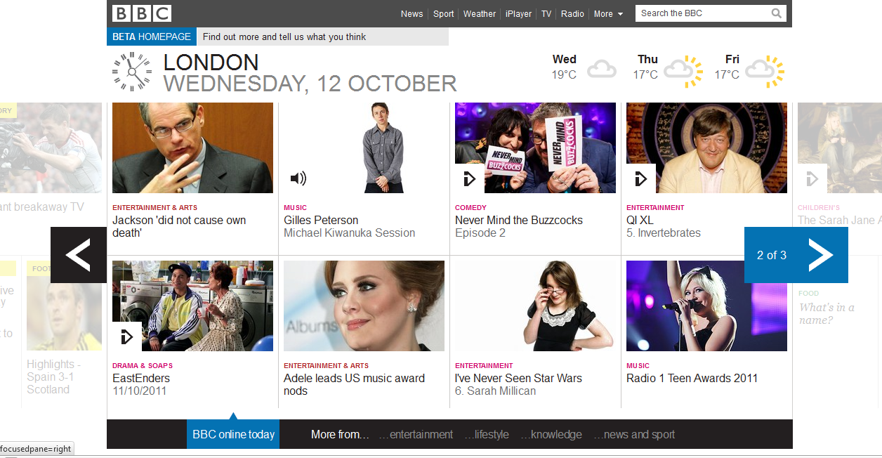
The re-design of BBC's homepage made a couple of weeks ago puts emphasis on the media player (iPlayer) and enhancing the design for mobile devices, which are becoming increasingly popular. Many users on Twitter and on the Internet compared the new website to Windows 8 (3). A conscience decision was made by the BBC to appeal to a wider audience by displaying all of the content, with different colours for each category, in a carousel, which can then be customised (4).
A more in-depth description of the design changes and reasoning behind these changes can be read on the BBC's Design Blog here: http://www.bbc.co.uk/blogs/bbcinternet/2011/09/bbc_online_homepage_beta_producer.html
A more in-depth description of the design changes and reasoning behind these changes can be read on the BBC's Design Blog here: http://www.bbc.co.uk/blogs/bbcinternet/2011/09/bbc_online_homepage_beta_producer.html
I like the new design; it looks modern, clean, and it's simple, though I think that the design probably looks the best on a mobile device. (The text and images may look a little large on my computer monitor, but they look spot on in an iPad.) The interactivity works very much like a mobile device, such as the swiping of the content in the carousel. I notice that the clock, which I think is unique because it is not a digital display, is developed using the <canvas> tag, and rolling the mouse over the weather gives options to see extended forecasts. I like the simplicity of this layout, and I think that it would achieve their goal of attracting a wider audience to the BBC homepage and to use it as a quick stop to see the latest or most popular news stories.
1) Shaw, Vicky. The Independent on Sunday. http://www.independent.co.uk/news/media/online/bbc-website-sticking-with-chaotic-new-look-2032973.html [22 July, 2010].
2) TNW Media. BBC pushes out brand new (less innovative) website to international readers. http://thenextweb.com/media/2011/04/13/bbc-pushes-out-brand-new-less-innovative-website-to-international-readers/ [April 13, 2011].
3) The Guardian. BBC unveils new homepage in beta. http://www.guardian.co.uk/media/pda/2011/sep/21/bbc-unveils-new-homepage-beta [21 September, 2011].
4) Sinclair, Mark. BBC unviels new beta homepage. http://www.creativereview.co.uk/cr-blog/2011/september/bbc-beta-homepage [21 September, 2011].
Great post admin. As well, constructing innovated web designs needs creativeness plus patience to provide the very best work probable.
Great post!
Hello.This post was really interesting, particularly because I was investigating for thoughts on this topic last Saturday.