Lately, I have been using CSS to draw various shapes for some designs that I have been working on instead of relying on images to create the relevant design elements, if possible.
Obviously, this technique will not work in older browsers, so I suggest using an alternative for specific browsers in the case that your website audience may have a variety of browsers and is accessible without Javascript. Normally, I would simply not use these techniques as I feel usability is important, but the audience for the websites I am working on requires newer browsers and enabled Javascript.
A common design element is the use of 'triangles' to create speech bubbles or arrows. Borders are rendered at angles, so assigning border colours and widths will create triangles. (More on this subject can be read on Jon Rohan's website (1).)
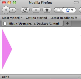
A quick example of this is demonstrated in the class below with setting the border colour as follows, from left to right in order - top: transparent, right: transparent, bottom: transparent, and right: violet. Changing the widths of the border sides controls the size and angle of the borders. For this example, I wanted a triangle to point to the right. The top and bottom angle needs to be the same to keep the angle 'straight', and I set it at 80px. Since we are only setting the right-hand size border, we need to give this a width, and this will influence the width of the triangle, which has been set to 40px. The code and screenshot is pictured below.
.css-arrow-multicolor {
border-color: transparent transparent transparent violet;
border-style:solid;
border-width:80px 0px 80px 40px;
width:0;
height:0;
}
(Please note that the 'transparent' colour setting does not work in some older browsers.)
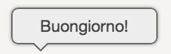
Using these basics, a simple comment bubble (like the image below) can be made without the use of images. To create and adapt the following comment bubble to your own style, simply visit Jon Rohan's website (1) to get the code.
In addition to creating triangular shapes, circles and rounded corners can also be created. To create rounded corners, simply add a border radius. (Unfortunately, not all browsers work the same, so you will need to use these three different tags for this to work in all browsers.)
The following three tags will create rounded corners, and the shape achieved is dependent on the width and height of the <DIV>. (For a circle, the border radius needs to be half the height and width of the <DIV> element, otherwise you will simply achieve a rectangle with rounded corners.)
-moz-border-radius: 50px;
-webkit-border-radius: 50px;
border-radius: 50px;
An oval shape can be achieved by slightly rounding the height and width. The width of the radius should be half of the height and half of the width. (The one in the screenshot below is 200px wide and 100px tall.)
-moz-border-radius: 100px / 50px;
-webkit-border-radius: 100px / 50px;
border-radius: 100px / 50px;
Three shapes created using the border radius are pictured below, along with the code.
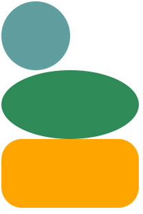
#circle {
width: 100px;
height: 100px;
background: cadetblue;
-moz-border-radius: 50px;
-webkit-border-radius: 50px;
border-radius: 50px;
}
#oval {
width: 200px;
height: 100px;
background: seagreen;
-moz-border-radius: 100px / 50px;
-webkit-border-radius: 100px / 50px;
border-radius: 100px / 50px;
}
#rounded {
width: 200px;
height: 100px;
background: orange;
-moz-border-radius: 30px;
-webkit-border-radius: 30px;
border-radius: 30px;
}
It may take a few tweaks to get exactly the shape and style you want, but that is part of the fun. Happy programming.
1) Rohan, Jon. Creating Triangles in CSS. http://jonrohan.me/guide/css/creating-triangles-in-css/ [22 October, 2011].
2) CSS Yard. Making Shapes in CSS3. http://www.cssyard.com/css-tutorials/making-shapes-in-css/ [18 February, 2011].

I have made a big list of creating shapes in CSS.
http://www.paulund.co.uk/how-to-create-different-shapes-in-css
It is a shame you dont have a donate button! I would most definitely donate to this fantastic site! I guess for now I’ll settle for bookmarking and adding your RSS feed to my Google account. I look forward to brand new changes and will certainly chat on the subject of this web site with my Myspace group. Connect soon!