Hello visitors! I have been keeping this quiet, mainly because I have been putting my focus on work tasks over my personal projects recently. I had started a new design earlier in the year and had made some good progress on it early this spring. (I know, that is quite a while ago and it does seem to be the norm that a developer's/designer's or company's website takes a back seat while other work has been completed. I have seen this and experienced it numerous times.)
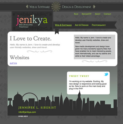
However, a few more hours spent last weekend, and my new design is now fully responsive. It looks good in IE8, IE9, Chrome, and Firefox. (IE7 does have a few issues that I need to sort out.) I still have to work on the body content and some integration with the blog, but a good chunk of my work will be some code reuse PHP database calls for my portfolio content. The sneak peak screenshot is below. (Obviously, there's the bits I need to fit in to the main content area and a few minor design tweaks.)
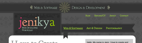
I've decided to give my new design a 'vintage' treatment, and I am in love with some of the vintage fonts that are available. In fact, I've used a few of them for this website, combining Google Fonts and CSS Fonts and FitText.js for responsive font displays. I've also used other vintage design elements.
Like my previous portfolio web designs, I have tried to create a neutral design, but I have also tried to give it some colour. I'm conscious that I do not want the design to overpower my portfolio pieces, so the primary colours must be neutral.
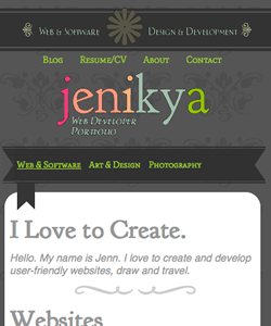
The other element that I have focused on is making my design responsive. The current design is ancient; I designed it in early 2006 while I was living in Bath. Unfortunately, the idea was half-baked, and I was never happy with it as I rushed to launch it in early 2007. I actually prefer the previous design, and I still do. In early 2006, the world was not too concerned with mobile devices, and iPads were not even invented then. Now, these other devices are important to design for. Below is the design for the website that fits on a mobile device, such as an iPhone.
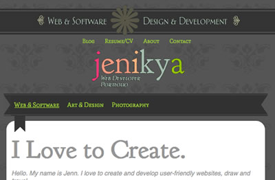
The image below is what my visitors will see if they visit using an iPad. (In both this image and the one above, visitors will be able to see more body text. I just don't really have that area designed yet enough to give it justice, so I cropped it from the images.)
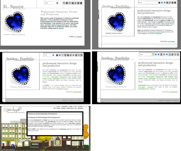
I've included some screenshots of my previous portfolio designs below so that you can see the evolution. I started off with the neutral folder-like appearance, then I added colour and new fonts to each section. (Sorry that some of the images are broken; these images are from Waybackmachine.org.) I then decided to create a pixel-art-inspired design with buildings that visitors could click on the images of to go 'inside' to see more about the projects. The design was featured in the four seasons.
I am happy with my new design. What does everyone think? Leave me a message and let me know.

Leave a comment