Website navigation is one of the most important areas of a website as it determines how the user can browse the website and the various areas on the website. Careful thought must be given into the navigation and the website's structure, the terminology, the location, and whether or not the navigation is fixed. Most importantly, the website must be easy to browse and the user must be able to determine where the information that they need is located. This brings us to the first topic: structure.
Structure
The website's architecture or structure should be planned out so that the information flows and similar content is grouped together or in a hierarchy. In a past project that I worked on (for a university), we had a top level structure based on our user personas or user types. These areas included 'current students', 'prospective students', 'alumni', and 'staff/faculty'.
Getting the website's structure correct takes research and an understanding of the user personas. These areas are often linked and it also reflects the journey that each user will take to meet their goals. Following on, the navigation's terminology must be understandable to the user.
Terminology
Terminology is one of those tricky areas that can bring up much discussion (and conflict) between individuals in companies. I've spent more time discussing the terminology for some projects that is needed. It's just one of those areas that some management types seem to focus on and want to change.
Overall, the user must be able to relate to the terminology of the website. Often, the more simple the term, the better for the user to understand. The terminology should not make the user think. According to Silfer on Smashing Magazine (1), there are two important points when determining the terminology:
1. The labels must relate to the navigation and help to explore it.
2. Are the meanings of the labels separated enough not to be confused with each other?
In addition to the above, all terms that do not help the navigation need to be removed. In a past project that I worked on, we had the top level navigation items, which included: "News", "Your Companies", and "Your Watchlists". The word "Your" was removed because it was not necessary and over-complicated the website.
Keep in mind that the website must be as usable as possible, and because of this, labels should be used and the user should not rely on icons. However, using icons with a label is fine and helps the association of the area with an icon. I have seen websites that rely on an icon or on the user rolling the mouse over an icon in order to see the description of the area, and this simply is not good practice.
Moving on, the location of the navigation is important, particularly today as more and more users are browsing using tablets.
Navigation Location
Navigation has been traditionally at the top or left-hand side of the website. Either of these options was popular in the 1990s. Developers often used the left-hand side of the website to contain the navigation. (Remember frames?) However, the trend for the past several years has been to favour horizontal navigation at the top of the website.
With mobile devices and tablets becoming more popular, left-hand vertical navigation is becoming popular again. Developers can also use media queries to make their websites respond differently in different devices based on the size of the screen that the website is being viewed on.
Another factor to consider when developing the navigation is the option to make the website fixed on one area of the website.
Fixed vs Non-Fixed Navigation
The recent trend seems to favour fixed navigation (on the side or top of the page). Many websites have started to adopt this technique. Fixing navigation is popular because it prevents the user from scrolling back up to the top in order to use the navigation to browse to another area.
A study was done by Denney (2) in 2012 in which he developed two identical websites with the navigation fixed in one and not fixed in the other. He found that the fixed menus were 22% quicker to navigate because the user was not forced to scroll back to the top of the page. He also noted that 100% of the users preferred the fixed-navigation website, but none of them knew why.
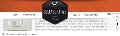
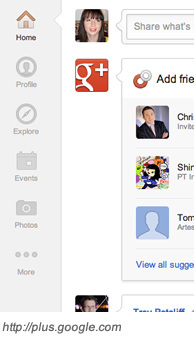
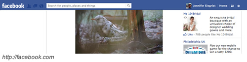
Some of the most popular websites are using fixed navigation. These include Facebook, Google+, Google, and Twitter.
Now that we've looked at the pros of fixed navigation, I'll explain the negatives. Firstly, fixing or not fixing the navigation must be considered for each website. In some cases, it simply may not be viable to include. Perhaps the navigation area is quite large and fixing the navigation means consistently losing the top 200 or more pixels of a page to the navigation. This makes the navigation an annoyance and distracting. Changing the navigation when the user scrolls is another option, but this again could create distraction and inconsistency. Only consider using fixed navigation if you believe that it can help the usability and experience of the website.
Secondly, do not forget tablet and mobile devices. These may require a different use case anyway as users tend to use mobile website versions for only core tasks. Identify these tasks. A different treatment of the website is required for mobile devices because the screens are much smaller. Consider the device that the user is using and determine the case for fixed or non-fixed navigation.
How to Fix the Navigation
Fixing the navigation is simple and done using CSS. To do this, you will want to use the 'position' attribute, and this should be set to the 'fixed' value. Developers may also need to set the 'z-index' attribute to prevent content from over-lapping the navigation.
#navigation {
position:fixed;
}
Examples of Fixed Navigation
To wet your appetites, I've added a few examples of fixed navigation. Come back later to see more examples.

1) Silfer, Peter. Smashing Magazine. The Elements of Navigation. http://uxdesign.smashingmagazine.com/2012/03/20/the-elements-of-navigation/ [20 March, 2012].
2) Denney, Hyrum. Smashing Magazine. Sticky Menus Are Quicker to Navigate. http://uxdesign.smashingmagazine.com/2012/09/11/sticky-menus-are-quicker-to-navigate/ [11 September, 2012].

Leave a comment