Many designers (and web developers) are familiar with the term 'grid layout'. For those who do not know, a 'grid layout' is a visual organisation and structure of content into horizontal and vertical lines. Essentially, a 'grid layout' defines sets of columns and rows for a visual design. Grids have been used since the early days of printing to define visual structure.
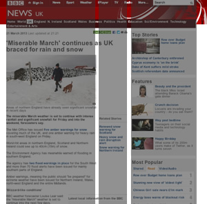
An example of the BBC Layout, which is broken into three main columns.
Developers and designers may ask why a grid layout it important. In short, it is important because it provides consistency of a layout and groups similar elements together. It also promotes readability.
In web design, developers normally create templates, which promotes usability and consistency of an overall layout. All pages inheriting the template will contain this consistent layout. The grid layout is traditionally set up in these templates.
Defining website grid layouts is extremely important for web design and development. In particular, websites should be readable on mobile and tablet devices since more and more people are browsing the web on non-desktop devices. Using a successful grid layout means that the website can adapt to the size of the device and be readable on every device by making the layout responsive.
There are many grid solutions available to developers that others have developed to be quickly reused and adapted to your website. Completing a quick Google search will bring up many grids that other developers have created, and I'd recommend using one of these and adapting it. When choosing a grid solution, bear in mind that your solution should be a responsive one. I've noted a brief review of some of the grid layout solutions below.
GridPak
http://gridpak.com/
This seems like a powerful tool. The developer can change the number of columns, gutter, and the column padding to suit their needs. The CSS can then be downloaded. However, the drawbacks are that this is in Beta, and it uses some mark-up that isn't compatible with older browsers. I'd probably stray from using this for those reasons, but I like the ability to automatically configure the grid in the browser.
Responsive Grid System
http://www.responsivegridsystem.com/
This is easy to add to your websites because the math is already configured for the column widths, and the developer can choose how many columns they wish to display (up to twelve). It's also nicely-responsive, and it's being used by a few websites. However, the margins are fixed currently and the developer would need to adapt this; they would need to update the width percentages in order to use this. I'd really like to try this solution.
CSS Grid
http://www.cssgrid.net
This twelve column layout is responsive and caters to monitor sizes up to 1140 (for 1280). I cannot see anything wrong with this tool, and it's one of the solutions that has been around for a while. I'd really like to try this solution to see how I get on with it.
Skeleton
http://www.getskeleton.com/
Skeleton is a boilerplate that includes several CSS files so that developers can plug in to quickly set up a responsive grid layout for their websites. I feel that this solution is a little too heavy, and it offers a lot more than a grid layout. This solution is essentially a boilerplate, but it may be a good solution for developers who are not focused on CSS and front end development and want to set up something quickly for a web project. I personally would not use it because I like to have a little more control over the solution and only add what I need.
Less Framework
http://www.lessframework.com
This solution does not look as flexible as the others, and from what I have read on the website, the solution uses pixels and not percentages. (Though, it does say that it can work on mobile and tablet.) This solution seems to need much customisation to get it up and running to adapt to developer needs. Nothing has convinced me to use this solution over the others.
Fluid 960 Grid System
http://www.designinfluences.com/fluid960gs/
This is the grid system that I have adapted in the past for web projects, and it worked quite well, but it does need to be set up and configured for your needs, and there's some work to be done to adapt to your website design. While it works well enough, it's not really good enough for creating responsive forms for tablet devices, if you require responsive form layouts. While this solution did work, I was not happy with some of the extra work required to set up websites quickly, especially when responsive forms were required for a project. I would try my luck with one of the other solutions first, before deciding on whether or not I'd continue using this.
Fluid Baseline Grid
http://www.fluidbaselinegrid.com
Using HTML5 and CSS3, this grid solution seems to tick all the boxes, and it is mobile first, meaning that it will use mobile rendering before desktop rendering and this is more efficient for downloading speed on mobile. It would be interested to see how this adapts on older browsers. There's no preview or examples, so I'd probably give this one a try to see how useful it is.
In conclusion, there are many responsive grid solutions in existence. The only way to find a good one is to use a few and pick the best ones with the fewest drawbacks - bearing in mind the website's objectives.

Leave a comment