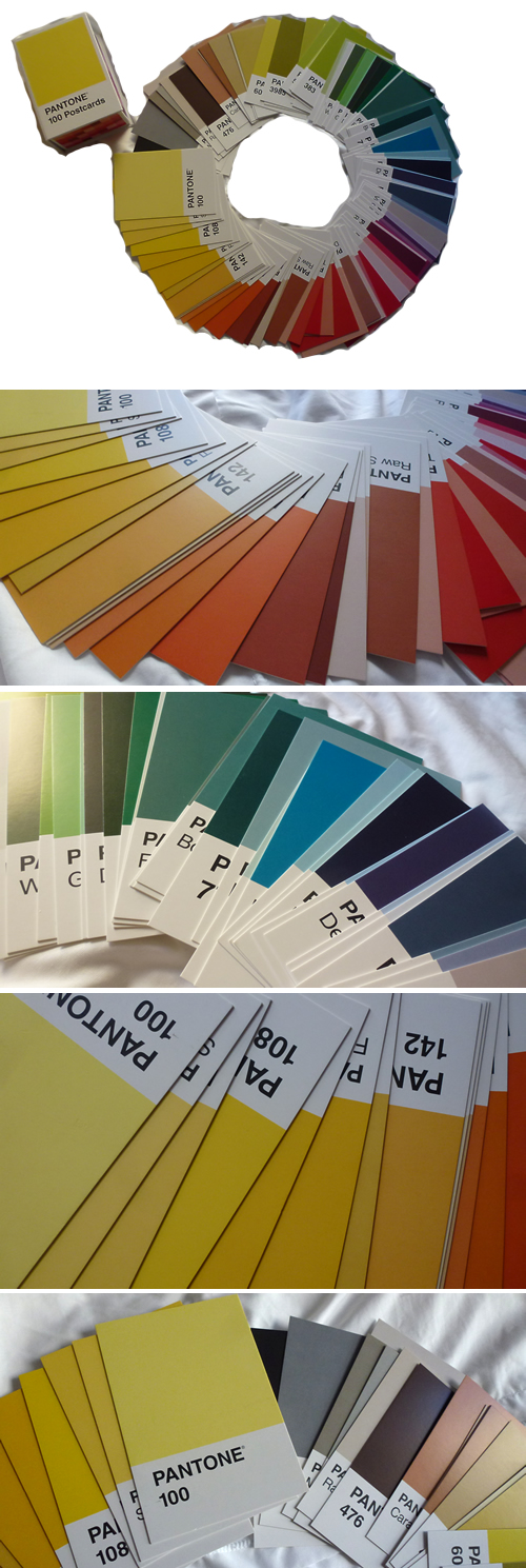
A couple of months ago, I placed an order for Pantone® postcards. One of my hobbies is Postcrossing - sending postcards to random people in the world and receiving one back in return. I love Pantone®, and I've requested some (particularly my favourite colour of green) in return. A colour can hold so much emotion and feeling. For friends in America, I have sent yellow postcards so my friends do not feel cabin-fever after being stuck in blizzard-like conditions over the past couple of months.
I was glad to receive the postcards, and they are printed on thick card-stock. Overall, there is a nice range in colours available. These are nice cards. I've taken a few photographs below. Apologies for the poor Photoshop job in the first image below. The cards were laid out on the bedspread, and the natural lighting was quite harsh, and I didn't really dedicate much time to attempt to erase the background or reshoot. Besides, I've sent a few more of these since the photograph was taken anyway. But, you can get the idea...
If you are on Postcrossing and wish to exchange postcards (such as these Pantone® postcards), do let me know.
And, for those of you who do not know what Pantone® is... Pantone® is the company that publishes a book with their defined colours, each set to specific standards of measurement of the pigments that make up colour, for printing purposes. This is to ensure that when a company decides to print its brand, the colours always match so that the consumer can identify the brand. More on the company can be found here: http://en.wikipedia.org/wiki/Pantone.
Leave a comment