On Saturday, I found myself transported to dystopian future Los Angeles from the script of the science fiction cult classic "Blade Runner". I became Detective Schultz for the evening and dressed up for the new identity provided. Some of my readers may remember the posts where I went to Secret Cinema "Back to the Future" in 2014 and Secret Cinema "The Empire Strikes Back" in 2015. I'd actually never seen the full film "Blade Runner" until a couple of weeks ago; I'd watched clips of it in my film university classes, but this was one film that we did not fully watch. I know that "Blade Runner" was also one of Secret Cinema's earlier immersive cinema experiences. For those who do not know what Secret Cinema is, it's basically the chance to become a part of the film through a set creation and interactions with other visitors and actors/actresses to participate in a storyline.
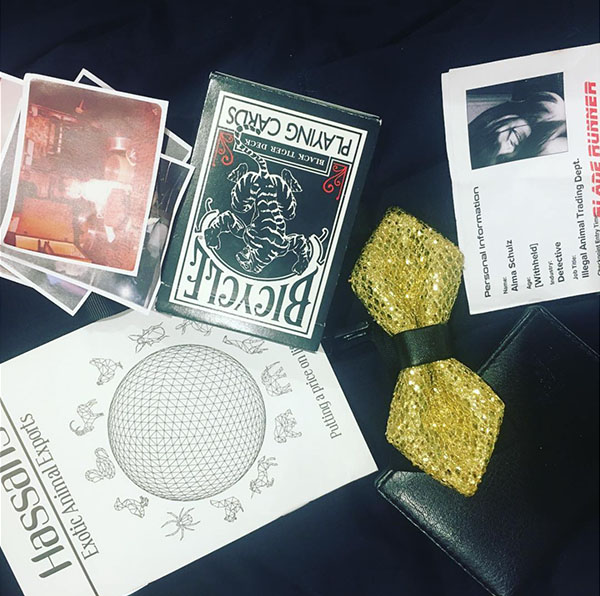
On ticket purchase, the visitors fill out an online survey to receive their character's information. The bloke and I had got the VIP tickets, which made us become L.A.P.D. detective and undercover detective. (There were other ticket categories too and some people were replicants/robots, sympathisers and other categories loosely based on the film.) Each type of character had a storyline with an end goal, and the end goal of the detective groups was to become a "blade runner", which we received a little stamp for if we helped do great things. I cannot spoil it, but everyone will have a different path/experience/story.
VIP access also gave us better seats, two cocktails, and a meal. Cocktail bars were a part of the event with one in the detective's lounge and another as a bar with dancers known as "The Snake Pit", which is a tribute to the film. The seats were worth the cost because they were comfortable, and I remember being very uncomfortable for the "Back to the Future" showing as the seats were too narrow and close together; I have long legs and did not have enough room.
While the film was shown, the actors and actresses acted out certain parts of the film or the lighting was changed to add atmosphere to what was being shown. The film itself is a fairly easy one for that as there's not too much action but a lot of the same type of atmosphere in future Los Angeles' Chinatown. So, most of the scene cuts and changes focused on street people going about their daily commutes in Chinatown.
Like all Secret Cinema events, mobile phones are not allowed; you're asked to put them into a bag when you arrive, and there are lockers to store items as well. So, photography is also not allowed. (There is an area just outside the event that is set up for selfies and other photographs.)
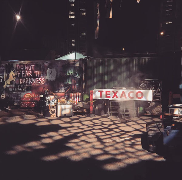
Overall, it is a great and unique experience, but I think I preferred "Back to the Future" and "The Empire Strikes Back". The world created for "The Empire Strikes Back" was larger and more interactive and amazing, and I am a big "Star Wars" fan, so of course that made it even more special for me. The set for "Blade Runner" was impressive but on a smaller scale. Visitors could interact in "Chinatown" with food stalls set up with the smells, and they also had rain falling from the ceiling indoors in the Chinatown set. The police department looked like an old-fashioned 1950s-style office, and "The Snake Pit" had exotic dancers on stage.
The only downside is that there's not really any time to explore; it's two hours, and it goes super-quick. I think they should have shown the film later and maybe started half an hour earlier. There is an after-party as well, but they do close off some of the main areas. I also felt lacking in time with the other events as there's simply just not enough time.
This event goes on until June 10, so if you do want the chance to experience, book now. There are still tickets available. Let me know if you have been and what you thought of it in the comments.


Recent Comments