Recently in technical Category

Recently, I noticed a quirk in obtaining the file title in CQ5. To be clear, I am only obtaining file metadata here if the file type (dc:format property is a PDF, or 'application/pdf'). The file title (dc:title property in the jcr:content node), is stored as a String. However, when actual metadata is stored with the actual document, it is stored as a String array (String[]). 

Basically, what I have done is to obtain the dc:title metadata property, but if this is empty, then I simply display the file name in place of the title on the front end. What was happening is that, even though a file title was transfered from the document when it was uploaded to the DAM, it could not obtain the dc:title property so it simply displayed my fallback, which is the name of the file. 

The fix is to simply obtain the Asset and determine if it is an Object[] instead of a simple String, and if it is an instance of an Object array, simply get the first item in the array and store that as the title. An example of how you may do this is below:

First, get the Resource from the path, and adapt this to an Asset.

Resource resource = resourceResolver.getResource("/a/path/to/a/file/in/the/dam");
Asset asset = resource.adaptTo(Asset.class);

Next, get the metadata property that contains the title.

String fileName = asset.getMetadataValue("dc:title");

Finally, assess that the fileName is empty or null. (You can use the StringUtils class in the package org.apache.commons.lang3 or your own method.) If it is empty or null, determine if it is an instance of an Object array, and if it is, get the first item in the array as below.

if (fileName instanceof Object[]) {
  Object[] titleArray = (Object[]) asset.getMetadata("dc:title");
  fileName = (titleArray.length > 0) ? titleArray[0].toString() : "";
} else {
  fileName = asset.getName();
}

File size and thumbnails can also be obtained. To get the size of a file, simply adapt it to a Property. The path to the jcr:data node will need to be obtained, similar to the below. Note that one can use the JcrConstants class from the package com.day.cq.commons.jcr in order to get various property names in the Java content repository. The dam creates the following structure to store the uploaded PDF: PDF>jcr:content>renditions>original>jcr:data

Property property = asset.adaptTo(Node.class).getNode(JcrConstants.JCR_CONTENT + "/renditions/original/" + JcrConstants.JCR_CONTENT).getProperty(JcrConstants.JCR_DATA);

To get the size of the file from the property, simply:

fileSize = property.getBinary().getSize();

This file size can then be adapted to display user-friendly units and text, such as "100 MB". 

Thumbnails can be obtained in a similar way, except we do not need to adapt these to Property objects; the path is what we need in order to display the image. Different renditions of the PDF thumbnail are created from the first page in the document when it has been uploaded, and a thumbnail can also be uploaded and overwrite the renditions created at upload time. Decide which rendition will work for you, and simply obtain the path. The dam creates the following structure to store the uploaded PDF's thumbnails: PDF>jcr:content>renditions>.

String thumbnailPath = asset.adaptTo(Node.class).getNode(JcrConstants.JCR_CONTENT + "/renditions/" + "you/rendition/to/use").getPath();

The CSS1k Project

| No Comments | No TrackBacks
Although we have come a long way from the days of modem dial-up Internet connections and optimising images to load quicker, it is still essential to ensure that our web sites are built efficiently.
CSS1k is a project aimed to see how much can be achieved in using only one kilobyte of CSS. (A similar project was achieved for Javascript: http://js1k.com/.) Users submit their CSS, and a design takes shape, similar to the Zen Garden CSS project, in which users complete their own designs using CSS.)
This project is worth a look to see what can be achieved by only using up to 1K of CSS. To view, go to: http://css1k.com/

FF Chartwell, a font for creating graphs

| No Comments | No TrackBacks

FF Chartwell is a font family that can be used to create different types of visual graphs and diagrams for designers to use. The font family contains the following, each for a different type of graph, such as a bar graph or a pie chart:

  • Chartwell Bars 
  • Chartwell Bars Vertical 
  • Chartwell Lines
  • Chartwell Pies
  • Chartwell Radar
  • Chartwell Rings
  • Chartwell Rose

The designer can create the graphs by using one of the programs in the Adobe Creative Suite, such as Fireworks. Essentially, the designer creates a textbox with the font family and adds a string of values with their colours attached to each value in order to create the graph. A tutorial is included on the following page fron FontFont: https://www.fontfont.com/how-to-use-ff-chartwell 

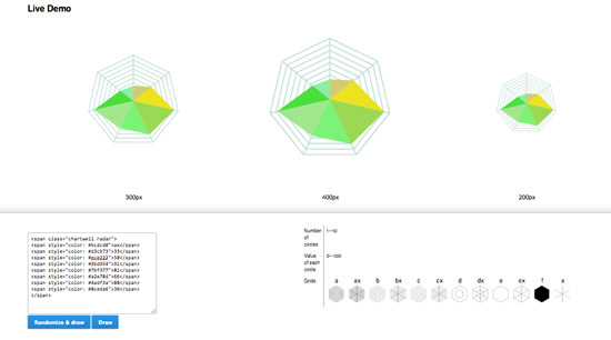
Since the end of last year, this font has been made for use on websites. However, it is not used as a font. Instead, it has been transferred into Javascript libraries, and a tutorial on the website above allows the developer to use the Chartwell Radar family in order to test how it works. (Note that it does not work on IE8.)

ffchartwell.jpg

I am not sure that I would use it for the web, but FF Chartwell looks like it could save time spent in design. If you have used this font for the web, let me know how you found it.

As a web developer, I am always interested in technology and its uses and how users interact with it. "Hello Lamp Post" is an experimental Bristol-wide platform to encourage users to interact to discover the city and others' experiences. The platform encourages people to take time out and to interact with the environment and with others who have previously left their responses. 

hellobristol2.jpg
Hello, Cityhall

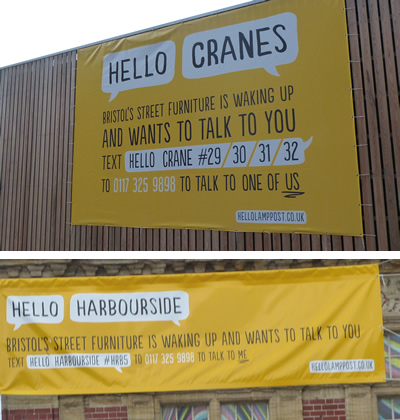
"Hello Lamp Post" can be prompted by sending a text message to 'talk to' various items of street furniture, the harbour, signage, cranes, and buildings and receiving text messages back to interact. The signs read: "Bristol's street furniture is waking up and wants to talk to you." They encourage visitors to send a text message with a unique hash code.

According to the website hellolamppost.co.uk, the inspiration for this experiment comes from two ideas: a city diary that allows us to conjure memories of the city that we have had with applying codes to everyday objects.

hellobristol3.jpg
Hellolamppost.co.uk website

Although there were several of these around Bristol that I discovered, I only photographed and interacted with a couple of them.

Here is my discussion with Crane #31. I think I confused it. 

Me: Hello crane #31
Crane 31: Hello, human. All over Bristol objects like me are waking up and asking people about the city. I have a few questions for you. I can't see you. Where are you standing?
Me: I am near the water.
Crane 31: Ah, now I see you. Give me a wave. Someone else told me: 'Stalker!! By the arnolfini' I have another question. Can you see the Balmoral? She's a beautiful ship.
Me: I am not sure which ship she is.
Crane 31: Interesting. Someone else told me: 'She is. I am moored near the Irene. She is an old grain boat.' Here's something else I'm wondering about you. If you were as tall as me, what would you do?
Me: I would admire the great views over Bristol and gaze at stars.
Crane 31: Thanks, short stuff. I'll let you go but check other objects for existing codes - almost anything can talk.
Me: Coolio
Crane 31: It was great to chat, but I need to think about your answers. Come back soon!

hellobristol.jpg
Cranes and harbourside

Here is my discussion with the harbourside. Unfortunately, the harbourside did not have the concept of time. 

Me: Hello harbourside #hrb5
Harbour: Hello, human. All over Bristol objects like me are waking up and asking people about the city. I have a few questions for you. What's your favourite thing around here?
Me: I like to admire the views along the waterfront.
Harbour: Cool! Someone else told me: 'around bristol?? i love the old vic theatre! my boyfriend performed there last night and it was truly amazing!!!xxxxxxx' Let me ask another question. What brings you to this part of town?
Me: I am visiting Gromits.
Harbour: I see. Someone else told me: 'Going to the Watershed to catch up with a friend.' I have another question. What have you got lined up for the rest of the day?
Me: It is night now, so I will go to bed soon. Staying out later would be awesome, but I will be too tired.
Harbour: Right. Someone else told me: 'Seeing the cathedral and taking a boat tour' I'll let you go but check out other objects for existing codes - almost anything can talk!

Dynamic Dialog Data with JSON in CQ5

| No Comments | No TrackBacks
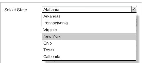
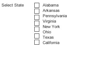
A little over a year ago, I posted about creating dynamic dialogs in CQ5 (Using JSON to Populate CQ5 CMS Dialogs); this was a method I used in CQ5 4.0. In CQ5 5.0, it is much easier to do this. Here's an up-to-date tutorial that makes adding dynamic dialogs in CQ5 with JSON much easier. In this tutorial, I will explain how to make a dyamic selection (drop-down menu) and a dynamic checkbox group. 
cq5states.jpg
 

Creating the Component and its Dialog

The first step is to create the component with the dialog.xml file for the component. Create the component in the 'apps/' directory in the usual way, and create the dialog.xml file. In this file, make sure that you specify a 'selection' xtype. You will also need to include the following:
  • options: This should point to the output of the JSON file. (In this tutorial, we will be creating our JSON using Java Server Pages, but you could simply create a static JSON file instead.
  • optionsRoot: This defines the JSON data root.
  • optionsTextField: This defines the text label for an option in the select box.
  • optionsValueField: This defines the value for a selected option in the drop-down.
I've included an example of this selection xtype below. This drop-down will display a list of US States.
<items jcr:primaryType="cq:WidgetCollection">
                <states
                        jcr:primaryType="cq:Widget"
                        fieldLabel="Select US State:"
                        name="./state"
                        type="select"
                        options="$PATH.states.json"
                        optionsRoot = 'states'
                        optionsTextField = 'label'
                        optionsValueField = 'id'
                        xtype="selection"/>
</items>
In the example above, we point our 'options' variable at the current path to the node in the JCR. The variable $PATH will give us this value dynamically. The JSON node should be accessible via the following:
http://localhost:4502/cf#/content/PATH-TO-PAGE/NAME-OF-COMPONENT.states.json
You can get the above path from looking at CRXDE; simply click onto the component in the 'apps' directory and view the path to the file.
We then create our dynamic file (which will output the JSON) in the same directory. (This file is referenced in the dialog above, and it will dynamically add the results of the JSON.) Our file structure will look like the following:
- states
  - .content.xml
  - dialog.xml
  - states.json.jsp
  - states.jsp
 

Creating the dynamic JSON

The dynamic JSON file should be saved as states.json.jsp as it uss Java Server Pages to render. At the top of the page, be sure to add the contentType 'application/json' so that it knows to render the output as JSON. Then, include your link to the Java tag. Print out the items by looping through using the JSTL core library, as demonstrated below:
<%@ page contentType="application/json" %>
<%@ page import="java.util.*" %>
<%@ include file="/libs/foundation/global.jsp" %>
<%@ taglib prefix="mylocation" uri="http://myapp.mysite.com/locations" %>
<%@ taglib prefix="c" uri="http://java.sun.com/jsp/jstl/core" %>
<mylocation:states currentPage="${currentPage}" />
{"states":[
<c:forEach var="item" items="${states}" varStatus="loop">
  { "id": "${item.name}", "label": "${item.name}"} ${not loop.last ? ',' : ''}
</c:forEach>
]}
 

Add your Java Tag Descriptor

In the above example for the JSON file, we referenced our own tag library, known as "mylocation". This will need to be added to the tag library descriptor (TLD) file. Simply locate this in your Java package and add the descriptor. In the above example, we are passing the current page (currentPage). Remember that the prefix described in the JSON file needs to be the same as the 'name' in the TLD file.
<?xml version="1.0" encoding="UTF-8"?>
<taglib xmlns="http://java.sun.com/xml/ns/j2ee" xmlns:xsi="http://www.w3.org/2001/XMLSchema-instance"

xsi:schemaLocation="http://java.sun.com/xml/ns/j2ee http://java.sun.com/xml/ns/j2ee/web-jsptaglibrary_2_0.xsd" version="2.0">

<tag>
<name>myloction</name>
<tag-class>com.path.to.file.LOCATIONS</tag-class>
<body-content>empty</body-content>
<attribute>
<name>currentPage</name>
<required>true</required>
<rtexprvalue>true</rtexprvalue>
<type>com.day.cq.wcm.api.Page</type>
</attribute>
</tag>

</taglib>


Add your Java Tag

After the tag descriptor has been created, add the Java file in the same location as defined in the tag descriptor. You will add your logic to this class, and you will pass back (to the JSP page) the value to render the states. It is likely that you will need to also create a Java model to describe this data (for states). For example, you should probably create a model for the states and use getters and setters to set up your data for each state. (You possibly want to associate the state name, abbreviation, and other data about a state for this.)
In the tag, you should add your getters and setters for the data passed into the tag. As we are passing in the currentPage, we need to add a getter and setter for this. To do this, we want to add the following to our Java Tag file:
At the top of the file, we will add the variable: 
private Page currentPage;

In the Java Tag file, we simply add our getter and setter methods, as below:

public Page getCurrentPage() {

return currentPage;
}

public void setCurrentPage(Page currentPage) {
this.currentPage = currentPage;
}

When we have completed the logic to retrieve our data, we need to pass the data back to the JSP page. In the following method, we use pageContext to pass the name of the variable (which we use to get the object in the JSP), and the name of the object. For example, the states object is the second parameter, and it would be a type StateModel, as discussed.

pageContext.setAttribute("states", states);

Completed


Once you have followed the steps above, your dialog should print out dynamic data. You may need to debug this by viewing the JSON output as provided by accessing the JSON link detailed above. And, you should use JSONLint to ensure that your JSON is valid JSON mark-up.

Dynamic Checboxes and Radio Buttons

Once you have completed the above, making a dynamic radio button or checkbox button group is a piece of cake. You can use the same code as above, but there is only one change that needs to be made here. This change needs to be made in the dialog.xml file. In the 'type' field, add 'checkbox' (instead of 'select'). You're all set to go!

cq5states-check.jpg

Problems and Issues

This method was slightly different to my older implementation, but this is much easier. I spent over a day trying to locate an issue, however, as I could not get my JSON to load. I assumed that it was not being rendered correctly, and I was not expecting the results. It turned out that it seemed to be cacheing the JSON. I know that JSON can cache, and Google Chrome is notorious for cache issues, even when you have cleared the cache and forced refresh.

Another problem was environment-related. For some reason, two instances of CQ5 were running, and the environment (localhost) was confused! The old JSON was being rendered, despite making obvious changes, and it wasn't clear why CQ5 was hanging on to the old file. I spent ages going over (and then back over) my JSON and the method I was using only to discover that it was an environment issue with two CQ5 instances running in the background.
Of course, check the obvious issues first. Make sure that your paths are correct. And, perhaps start with dummy JSON data just to ensure that the JSON is being dynamically loaded into your dialog. That way, you can isolate any issues that may be related to Java errors. Also, don't forget to use JSONLint to validate your JSON mark-up.

Enjoy!

I had fun making this, despite annoyances with the environment. I hope you do too! 

Grid Layout and Responsive Tools

| No Comments | No TrackBacks
Many designers (and web developers) are familiar with the term 'grid layout'. For those who do not know, a 'grid layout' is a visual organisation and structure of content into horizontal and vertical lines. Essentially, a 'grid layout' defines sets of columns and rows for a visual design. Grids have been used since the early days of printing to define visual structure. 

gridlayout1.jpg
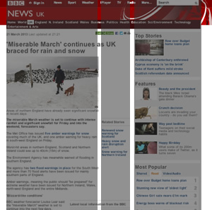
An example of the BBC Layout, which is broken into three main columns.

Developers and designers may ask why a grid layout it important. In short, it is important because it provides consistency of a layout and groups similar elements together. It also promotes readability.

In web design, developers normally create templates, which promotes usability and consistency of an overall layout. All pages inheriting the template will contain this consistent layout. The grid layout is traditionally set up in these templates.

Defining website grid layouts is extremely important for web design and development. In particular, websites should be readable on mobile and tablet devices since more and more people are browsing the web on non-desktop devices. Using a successful grid layout means that the website can adapt to the size of the device and be readable on every device by making the layout responsive.

There are many grid solutions available to developers that others have developed to be quickly reused and adapted to your website. Completing a quick Google search will bring up many grids that other developers have created, and I'd recommend using one of these and adapting it. When choosing a grid solution, bear in mind that your solution should be a responsive one. I've noted a brief review of some of the grid layout solutions below.

GridPak
http://gridpak.com/
This seems like a powerful tool. The developer can change the number of columns, gutter, and the column padding to suit their needs. The CSS can then be downloaded. However, the drawbacks are that this is in Beta, and it uses some mark-up that isn't compatible with older browsers. I'd probably stray from using this for those reasons, but I like the ability to automatically configure the grid in the browser.

Responsive Grid System
http://www.responsivegridsystem.com/
This is easy to add to your websites because the math is already configured for the column widths, and the developer can choose how many columns they wish to display (up to twelve). It's also nicely-responsive, and it's being used by a few websites. However, the margins are fixed currently and the developer would need to adapt this; they would need to update the width percentages in order to use this. I'd really like to try this solution.

CSS Grid
http://www.cssgrid.net
This twelve column layout is responsive and caters to monitor sizes up to 1140 (for 1280). I cannot see anything wrong with this tool, and it's one of the solutions that has been around for a while. I'd really like to try this solution to see how I get on with it.

Skeleton
http://www.getskeleton.com/
Skeleton is a boilerplate that includes several CSS files so that developers can plug in to quickly set up a responsive grid layout for their websites. I feel that this solution is a little too heavy, and it offers a lot more than a grid layout. This solution is essentially a boilerplate, but it may be a good solution for developers who are not focused on CSS and front end development and want to set up something quickly for a web project. I personally would not use it because I like to have a little more control over the solution and only add what I need.

Less Framework
http://www.lessframework.com
This solution does not look as flexible as the others, and from what I have read on the website, the solution uses pixels and not percentages. (Though, it does say that it can work on mobile and tablet.) This solution seems to need much customisation to get it up and running to adapt to developer needs. Nothing has convinced me to use this solution over the others.

Fluid 960 Grid System
http://www.designinfluences.com/fluid960gs/
This is the grid system that I have adapted in the past for web projects, and it worked quite well, but it does need to be set up and configured for your needs, and there's some work to be done to adapt to your website design. While it works well enough, it's not really good enough for creating responsive forms for tablet devices, if you require responsive form layouts. While this solution did work, I was not happy with some of the extra work required to set up websites quickly, especially when responsive forms were required for a project. I would try my luck with one of the other solutions first, before deciding on whether or not I'd continue using this.

Fluid Baseline Grid
http://www.fluidbaselinegrid.com
Using HTML5 and CSS3, this grid solution seems to tick all the boxes, and it is mobile first, meaning that it will use mobile rendering before desktop rendering and this is more efficient for downloading speed on mobile. It would be interested to see how this adapts on older browsers. There's no preview or examples, so I'd probably give this one a try to see how useful it is.

In conclusion, there are many responsive grid solutions in existence. The only way to find a good one is to use a few and pick the best ones with the fewest drawbacks - bearing in mind the website's objectives.

Editing Column Widths in CQ5

| No Comments | No TrackBacks
Hopefully, you would have read the entry "Creating Web Templates in CQ5" before reading this article. In that article, I mentioned the importance of getting the site structure and visual designs correct beforehand, otherwise extensive rework may be needed.

  • This article explains how to set and edit column widths in Adobe CQ5 CMS for your websites. This article assumes that you can edit the CSS and decide which grid or column framework to use for your website, dependent on the designs.


Set up the CSS for the columns

Once the templates have been identified, the developer can identify column widths and set up a grid framework for the column widths, keeping in mind if the website will be a fluid one or a fixed-width one. The developer will need to identify the acceptable widths available for each template and create the CSS classes for the columns. The CSS will be included in the file, and I suggest splitting the CSS into multiple manageable files as this is good practice. For example, layout-specific CSS should be put in a layout.css. The CSS files will be concatenated and minified in the build process.


Set up columns for the templates

The page information and column information for a page can be found in the file:
[PATH]/etc/designs/[PROJECT-NAME]/content.xml

This file's contents are split by the template, and below is an excerpt of this file showing one template. In the example below, the name of the template is "level1". This file is updated when the columns are edited in the CMS.

Notes: 
  • The columns for this website (Mysite) are put into a group named Mysite.
  • Each section in the template is separated in this file. The following different sections, marking the parsys in the template, are described below:
    • main
    • secondary
  • For each parsys section, the "colctrl" is the column control area, and it defines the available layouts and the CSS style. For example, 3 Columns (25%, 25%, 50%)&#xa;3;grid-363 is the name of the column layout and the CSS class. (The column class is "grid-363", and the rest of the string above is the text that the content editor will see when they use the CMS to select a column.) The content editor will see the description for each column option to understand what column type to use in the parsys. 

<level1 jcr:primaryType="nt:unstructured">

            <main

                jcr:lastModified="{Date}2013-01-06T10:45:25.586Z"

                jcr:lastModifiedBy="admin"

                jcr:primaryType="nt:unstructured"

                sling:resourceType="foundation/components/parsys"

                components="[group:Columns,group:Mysite]">

                <section jcr:primaryType="nt:unstructured"/>

                <colctrl

                    jcr:lastModified="{Date}2013-01-06T10:39:03.337Z"

                    jcr:lastModifiedBy="admin"

                    jcr:primaryType="nt:unstructured"

                    sling:resourceType="foundation/components/parsys/colctrl"

                    layouts="3;grid-333&#x9;3 Columns&#xa;4;grid-44&#x9;2 Columns&#xa;4;grid-2222&#x9;4 Columns"/>

                <col_end13242935548710

                    jcr:primaryType="nt:unstructured"

                    sling:resourceType="foundation/components/parsys/colctrl"

                    controlType="end"/>

            </main>

            <secondary

                jcr:lastModified="{Date}2013-01-06T10:46:16.990Z"

                jcr:lastModifiedBy="admin"

                jcr:primaryType="nt:unstructured"

                sling:resourceType="foundation/components/parsys"

                components="[/libs/foundation/components/flash,group:Columns,group:Mysite]">

                <section jcr:primaryType="nt:unstructured"/>

                <colctrl

                    jcr:lastModified="{Date}2013-01-06T10:38:52.144Z"

                    jcr:lastModifiedBy="admin"

                    jcr:primaryType="nt:unstructured"

                     sling:resourceType="foundation/components/parsys/colctrl"

                    layouts="2;grid-66&#x9;2 Columns (50%,50%)&#xa;2;grid-93&#x9;2 Columns (75%, 15%)&#xa;2;grid-39&#x9;2 Columns (15%, 75%)&#xa;2;grid-48&#x9;2 Columns (40%, 60%)&#xa;2;grid-84&#x9;2 Columns (60%, 40%)&#xa;3;grid-633&#x9;3 Columns (50%, 25%, 25%)&#xa;3;grid-336&#x9;3 Columns (25%, 25%, 50%)&#xa;3;grid-363&#x9;3 Columns (25%, 50%, 25%)&#xa;3;grid-444&#x9;3 Columns (33%, 33%, 33%)&#xa;4;grid-3333&#x9;4 Columns (25%, 25%, 25%, 25%)"/>

                <col_end13243732957980

                    jcr:primaryType="nt:unstructured"

                     sling:resourceType="foundation/components/parsys/colctrl"

                    controlType="end"/>

            </secondary>

        </level1>


Have fun

Make sure that the file above is saved each time so that the content editor can select the column that they wish to use for the area. Enjoy!

Creating Web Templates in CQ5

| 1 Comment | No TrackBacks
In the Adobe CQ5 CMS projects that I worked on, the front-end developers worked closely with the user experience (UX) and visual design (UI) resources. Establishing the site structure and the available templates is extremely important for CQ5 projects. Changes to the site structure can lead to extensive re-work, particularly in cases where specific breadcrumbs are implemented or areas where the developer needs to extract information about parent or child pages to display on the current page. Moving pages around is not easy. Also, there is no way to change a page's template once the page has been set up. (I can understand why they do this as otherwise, things can get very messy in the JCR.) 

For the reasons mentioned above, details of templates and site structure is necessary at an early stage. For the purpose of this discussion, let's assume that we are building a website (unimaginatively dubbed MySite) with a home page, a page that lists data organised by category, and the lowest-level page, which would display content about the list item (an article). we will have the following three types of template used throughout the website:

  • Home Page
  • List Page
  • Article Page

Now that we know that we have the templates to build, we need to complete the following tasks:

  • create the main JSP page for the project, which will inherit the accompanying Java classes to use in our later templates.
  • create a base template that extends the foundation page and separates the HTML into multiple files and that will be extended by other templates
  • create additional templates that extend the base template and create JSP files to overwrite any of the base template files.

Creating the Main Page JSP, Extending global.jsp

Since we will need to develop our own Java methods to complete specific actions used on the pages, we should extend the /libs/foundation/global.jsp file and include specific Java pageHelper classes that we have created. 

If we have multiple websites managed through our CQ5 installation, it is important to break the various Java files down into a core file to be used by all websites and then site-specific Java files. This path to the project.jsp file is: [PATH]/apps/[PROJECT-NAME]/project.jsp

Each project will have its own project.jsp file, and this file's imports will reflect the project. The project.jsp file will contain the below mark-up to import the particular files, a core PageHelper and a MysitePageHelper. We will also be including the global.jsp file so we can use the other elements specified in the foundation global.jsp.

The Java classes (PageHelper) listed below would be placed in the directory: [JAVA-PATH]/src/main/java/com/[COMPANY-NAME]/

project.jsp

<%@page session="false" import="
        static com.mycompany.cq.core.util.PageHelper.*,
        static com.mycompany.mysite.util.MysitePageHelper.*
        "%><%
%><%
%><%@page session="false"%><%@include file="/libs/foundation/global.jsp"%>

Now that we've set up this project.jsp file, we can move on to the next step, which is creating our base page template. 


Creating the Base Page Template

Now, the page templates need to be set up. The path to the templates is located at: [PATH]/apps/[PROJECT-NAME]/templates

To create a new template, we simply create a new directory under the 'templates' directory mentioned above. The name of the directory will coincide with the name of the template, without spaces and illegal characters. Inside this directory we will place the file .content.xml. This file stores information about the template. We should also include a screenshot of the template, saved as thumbnail.png, so that the content editor can easily see the template that they wish to use when they create a new page.

The first template that we will create is a "base template". This template will allow us to set up the base structure, which will be inherited by other templates. I've named the directory "base-page". The .content.xml file contents is shown below:

<?xml version="1.0" encoding="UTF-8"?>

<jcr:root xmlns:sling="http://sling.apache.org/jcr/sling/1.0" xmlns:cq="http://www.day.com/jcr/cq/1.0" xmlns:jcr="http://www.jcp.org/jcr/1.0"

    jcr:primaryType="cq:Template"

    jcr:title="MySite Base Page"

    allowedPaths="/content(/.*)?">

    <jcr:content

        cq:designPath="/etc/designs/mysite"

        jcr:primaryType="cq:PageContent"

        sling:resourceType="mysite/components/template-components/base-page"/>

</jcr:root>


Note that the jcr:resourceType in the file above points to the location where the JSP file is stored. The template files are displayed in the path: [PROJECT-NAME]/components/template-components.

Underneath this path, create a directory for each template to match  the template name in the templates directory, as detailed above. This directory will also include the .content.xml and the relevant JSP files. The details of the .content.xml are below.

<?xml version="1.0" encoding="UTF-8"?>

<jcr:root xmlns:sling="http://sling.apache.org/jcr/sling/1.0" xmlns:cq="http://www.day.com/jcr/cq/1.0" xmlns:jcr="http://www.jcp.org/jcr/1.0"

    jcr:description="Mysite Base Page Component"

    jcr:primaryType="cq:Component"

    jcr:title="Mysite base page component"

    sling:resourceSuperType="foundation/components/page"

    componentGroup=".hidden"/>


Note that the sling:resourceSuperType in the base template should point to the foundation's component 'page'.

After creating the directories with the relevant details, we now create the JSP pages, which need to be placed in the directory mentioned above:  [PROJECT-NAME]/components/template-components/base-page

Separating the different parts of the HTML page is recommended here, and I recommend using the HTML5 Boilerplate as an example of your HTML file and break the HTML page down. You should break your main HTML template down into smaller files, such as header.jsp, headlibs.jsp (contains scripts loaded in the header), footer.jsp, body-tag.jsp, seo-footer.jsp (contains SEO-specific scripts), libs.jsp, and so on. I've created an example of what one file (footer.jsp) could look like below:

footer.jsp (example)

<%@include file="/apps/mysite/project.jsp"%><%
%><div id="footer">
     <cq:include script="seo-footer.jsp" />
     <p>Put static content here.</p>
     <cq:include path="copyright" resourceType="foundation/components/parsys"/>
</div>

In addition to your specific JSP files, you will also need to include a file called init.jsp which is copied from one of the core files for CQ5, /lib/wcm/core/init/init.jsp. However, the only difference here is setting previewReload = true so that the page refreshes when the user switches from 'edit' mode to 'preview' mode. Naming this file the same as the original file overwrites it, so our file below will be used instead.

init.jsp

<%@include file="/libs/foundation/global.jsp" %><%
%><%@page import="com.day.cq.wcm.api.WCMMode" %><%
if (WCMMode.fromRequest(request) != WCMMode.DISABLED) {
    String dlgPath = null;
    if (editContext != null && editContext.getComponent() != null) {
        dlgPath = editContext.getComponent().getDialogPath();
    }
    %><cq:includeClientLib categories="cq.wcm.edit" />
    <script type="text/javascript">
        CQ.WCM.launchSidekick("<%= currentPage.getPath() %>", {
            propsDialog: "<%= dlgPath == null ? "" : dlgPath %>",
            locked: <%= currentPage.isLocked() %>,
            previewReload: "true"
        });
    </script>
<% } %>

The following file is the content.jsp file, which will be overwritten for each template. The template imports various CQ5 classes and sets the "cq" taglib variable to be used to access other elements, such as the components.

content.jsp

<%@include file="/apps/mysite/project.jsp"%>
<%@page import="com.day.cq.wcm.api.WCMMode, com.day.cq.wcm.foundation.ELEvaluator, com.day.cq.commons.Doctype"%>
<%@page session="false"%>
<%@taglib prefix="cq" uri="http://www.day.com/taglibs/cq/1.0" %>
<div id="content">
    <cq:include path="main" resourceType="foundation/components/parsys"/>
</div>

Now that we have set up our base template, we need to set up our individual templates, all of which will extend this base template.


Set up the Home Page Template

Now that we've created the "base template", we will create the other templates in the same format. We will use the 'Home' template as an example. 

 .content.xml in [PATH]/apps/[PROJECT-NAME]/templates/home

<?xml version="1.0" encoding="UTF-8"?>

<jcr:root xmlns:sling="http://sling.apache.org/jcr/sling/1.0" xmlns:cq="http://www.day.com/jcr/cq/1.0" xmlns:jcr="http://www.jcp.org/jcr/1.0"

    jcr:primaryType="cq:Template"

    jcr:title="MySite Homepage"

    allowedPaths="[/content/mysite(/.*)?]">

    <jcr:content

        cq:designPath="/etc/designs/mysite"

        jcr:primaryType="cq:PageContent"

        sling:resourceType="mysite/components/template-components/home"/>

</jcr:root>


Notes: Note that we set the allowedPath to this project (mysite) only if we are inheriting from a core project and have multiple projects set up under the environment. If you have multiple projects, you would set this to the site that you want to access this template. 

.content.xml in [PROJECT-NAME]/components/template-components/home

<?xml version="1.0" encoding="UTF-8"?>

<jcr:root xmlns:sling="http://sling.apache.org/jcr/sling/1.0" xmlns:cq="http://www.day.com/jcr/cq/1.0" xmlns:jcr="http://www.jcp.org/jcr/1.0"

    jcr:description="Mysite Homepage Component"

    jcr:primaryType="cq:Component"

    jcr:title="Mysite homepage component"

    sling:resourceSuperType="mysite/components/template-components/base-page"

    componentGroup=".hidden"/>


Notes: Note that we set the sling:resourceSuperType to the base-page that we created. All sub-templates should inherit the base template.

In the above folder (under template-components/home), we have two JSP files. You can have as many as you like, and if you wish to overwrite one of the JSP files from the base template, you can do so by creating a file with the same name in the directory. I have overwritten the body-tag.jsp for the home page. The reason that I have done this is because I want to add a different class on the 'body' tag for the home page so that we display some elements slightly differently on this page.

The contents of body-tag.jsp

<%@page session="false"%><%
%><%@include file="/apps/mysite/project.jsp"%><%
%><!--[if IE 7]>    <body class="no-js ie7 home"> <![endif]-->
<!--[if IE 8]>    <body class="no-js ie8 home"> <![endif]-->
<!--[if IE 9]>    <body class="no-js ie9 home"> <![endif]-->
<!--[if gt IE 9]><!--> <body class="no-js gtie9 home"> <!--<![endif]-->

<script type="text/javascript">
//remove the no-js class from the body tag
var bodyTag = document.getElementsByTagName('body')[0];
bodyTag.className = bodyTag.className.replace('no-js ','');
</script>

Notes: The standard browser checks are in place and set against the body tags here. We use Javascript to remove the 'no-js' class if Javascript is enabled. The only difference with this template is that we append the extra class dubbed 'home' to pages that use this template so that we can style the home page template slightly differently. You may not need this for your site, but it's good practice to see this in action and to see how you can change your pages for slight design differences. For more information about detecting browsers, you may wish to have a look at HTML5 Boilerplate. You can adapt this to fit your own needs.

The contents of content.jsp

<%@include file="/apps/mysite/project.jsp"%><%
%>
<div id="content">
    <cq:include path="main" resourceType="foundation/components/parsys"/>
    <cq:include path="secondary" resourceType="foundation/components/parsys"/>
</div>

Notes: We set up two parsys components here for content editors to drag and drop their components into.


Set up the Additional Templates

Now that we have the Home template example, we can continue to set up our other templates using this as an example. The main difference is that we will probably not need to replace the body-tag.jsp. Instead, we will replace the content.jsp file with the basic page elements and components that we will place on the page automatically and other areas (parsys) where the content editor will insert custom components.

The contents of content.jsp

<%@include file="/apps/mysite/project.jsp"%><%
%>
<div class="left-col" id="content">
<cq:include path="header" resourceType="mysite/components/header"/>
<cq:include path="main" resourceType="foundation/components/parsys"/>
<div class="secondary">
           <cq:include path="left-nav" resourceType="mysite/components/component1"/>
    </div>
</div>


Have Fun

That's all you need to know in order to get started creating your CQ5 templates. The above framework should allow you to create extensive components for multiple projects from a core framework. Have fun creating these and let me know if you have any observations.
Rounded Corners (Border Radius) in CSS

| No Comments | No TrackBacks
Any web developer who has been in the industry for a number of years can tell you the pains of creating rounded corners on websites. In the past and before the days of CSS, we designed our page layouts in tables and nested tables. Each corner was saved as a graphic and placed inside a table data field. For rounded corners in tabs, this was painful and required a lot of extra mark-up and empty table data fields to create the tabbed effect. I, and probably many others, became an expert at creating image corners with the minimal number of pixels and colours at this time.

After browsers started to use CSS, developers still needed to save the corners as images. Instead of tables, we used DIVs to hold our corner images. We still needed to include extra mark-up for this, but it was better than using tables for design.

These days, many developers are using CSS3 to create borders without the need to save their rounded corners as images. Rounded corners can be achieved using CSS without the need for images in all browsers except for any version of Internet Explorer below IE9. Although you do find some websites supporting IE6, this is far less common now, and there are other websites that simply do not support IE7 (or provide the user with the chance to upgrade). Although this solution does not work in the IE8 browser (and older versions), many tend to feel a graceful degradation is acceptable.

The border radius is easily set in CSS. Developers will need to include three variations of this property so that the rounded corners are properly set in generic browsers, Mozilla, or Webkit. The user can use the following three lines to set the border. 

border-radius
-moz border-radius
-webkit border-radius

The above three lines can have one value, which will set the borders on all four sides, or it can take two values or four values. (This is similar to other CSS properties, such as padding and margin, where each side can have its own value.) If placing in two values, the values pertain to the top left and bottom right. If placing in four values, the values are in the following order: top-left, top-right, bottom-right, and bottom-left.

To target specific corners only, developers can use another property to target the specific corner. For example, if the developer wants to only change the top right corner, they can use the following:

border-top-right-radius
-moz-border-radius-topright
-webkit-border-top-right-radius

The same can be done for the other three corners. Yes, I agree that the consistency of the terminology between the different properties (Mozilla, Webkit, and CSS3) is a little confusing.

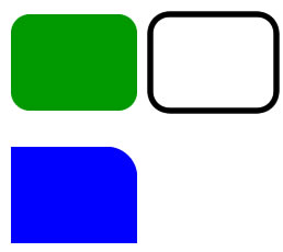
To achieve the borders below, I've provided a demonstration of how the properties should be used:
borders.jpg

Green box:

#green {
border-radius:10px;
-moz border-radius:10px;
-webkit border-radius:10px;
background-color:green;
}

Black and White box:

#black-white {
border-radius:10px;
-moz border-radius:10px;
-webkit border-radius:10px;
border:5px solid black;
}

Blue box:

#blue {
border-top-right-radius:10px;
-moz-border-radius-topright:10px;
-webkit-border-top-right-radius:10px;
background-color:blue;
}


Developers can experiment with the border radius property by visiting: http://border-radius.com/
On this website, developers can enter the radius of each corner and see the output produced. (Note that the CSS provided by this website is not efficient in certain instances as it sets each corner separately, but it's a good guide.)

In addition to changing the borders, the developer can also specify the border radius so that the 'box' appears elliptical. To do this, the developer will also use a slash (/) between the values. The first value is the horizontal radius, and the second value is the vertical radius.

borderradius.jpg

Green:

#green {
border-radius:40px 5px 40px;
background-color:green;
}

Yellow:

#yellow {
border-radius:50%;
background-yellow;
}

After reading this, you can get started creating rounded elements. Just remember that CSS3 will only work in certain browsers, and some older browsers do not support them.

Using CSS @Font-Face for Custom Fonts

| 2 Comments | No TrackBacks
For my new website design, I wanted to use a custom font for headings and navigation. Gone are the days when developers had to use web-safe fonts for their websites. With various different Javascript libraries readily available, specialised services that serve fonts through the web (such as Typekit), and the addition of the @font-face attribute in CSS3, designers and developers are encouraged to play with new fonts in their websites. And, having a complimentary font does make a world of difference.

My views on using non-safe web fonts are to encourage designers to use them in their applications because it does make the website look nicer visually, and this impacts the users positively (subconsciously). However, developers should never use a non-safe web font to replace a web-safe font for the body text. Headers and navigation areas are fine in moderation, and the developer should have a fallback method for older browsers.

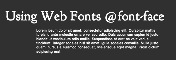
webfonts.gif

Unique web fonts are increasingly popular, and I think most designers and front-end developers agree that this is a great way to make your website stand out. After all, typography is a highly important element in visual design.

For my vintage-inspired new website design, I decided to use the font "Goudy Bookletter 1911", which is in the public domain. In order to use the CSS @font-face attribute, you need to have different files available for different browsers. Luckily, we have a website that converts a font to the different styles, and you can convert your font files here: http://www.fontsquirrel.com/fontface/generator

Many fonts have use and copyright restrictions, so it is important that you make sure that you have permission to use the font in this way. Also, please note that you should always test your website in different browsers with the loaded font (and fall-back font in case there was an issue loading the font) to ensure that the fonts look nice and have generated properly into the respective file types. You can use the quick guide below to see which font file types are loaded in different browsers.

  • EOT - Internet Explorer
  • OTF - Mozilla, Safari, and Opera
  • TTF - Mozilla, Safari, Opera, and Chrome
  • SVG - Safari, Opera, and Chrome

I will now demonstrate how to use the CSS @font-face method. The first step is to convert your font to the various font types (as mentioned above). Obviously, make sure that you follow the copyright restrictions. Once the font file has been converted, simply create your CSS with the @font-face method as below, and make sure that this is near the top of the CSS file. Be sure to name the font-family attribute accordingly, because this will be used in the CSS file to reference the font.

@font-face {
  font-family: "Goudy Bookletter 1911";
  src: url("type/goudybookletter1911.eot");
  src: local("☺"),
    url("type/goudybookletter1911.woff") format("woff"),
    url("type/goudybookletter1911.otf") format("opentype"),
    url("type/goudybookletter1911.svg#filename") format("svg");
  }

The next step is to identify which HTML tags you wish to use the new font on, use it and set a fallback web-safe font. In the below example, I decided to use the font-family (defined above) for the H1, H2, and H3 tags. Make sure that this CSS is defined after the @font-face (in the CSS file) so that the fonts are loaded first.

h1, h2, h3{
font-family:"Goudy Bookletter 1911", Times New Roman, serif;
color:#969696;
}

Using @font-face is not the only way that a developer can add new fonts to their websites. Font services, such as Typekit and Google Web Fonts allow the developer to obtain their font via Javascript and load it on their websites without the need to convert and place the font on their web server. In my new website design, I am using Google Web Font to obtain fonts to use on my website. This is simple to do. 

First, the developer should browse to look for acceptable fonts to use at http://www.google.com/webfonts. (Google Web Fonts does not have every font available, but they have quite a selection. Additional web font services may have a specific font that you are looking for, and Adobe Typekit, which owns the license to many fonts, may be a good place to start if you are looking for a particular font.)  

Once the font has been found, the developer simply should add a line of code to link to the font(s) in Google Web Fonts. In the example below, I have added three fonts: Goudy Bookletter 1911, Quicksand, and Mate SC.
 
<link href='http://fonts.googleapis.com/css?family=Goudy+Bookletter+1911|Quicksand|Mate+SC' rel='stylesheet' type='text/css'>

After referencing the above near the top of your HTML file, simply load your CSS like the example above with the H1, H2, and H3 HTML tags.

This is all you need to know in order to begin using the @font-face CSS3 method or to start using different fonts on your websites. Keep in mind to use different fonts sparingly and don't forget to add a fallback option.

Archives

Recent Comments

  • jenn: Thank you. read more
  • Murge: Amazing post. read more
  • Herbert: good post. site read more
  • Frank Quake: Hey, This is great when you said that I had read more
  • Chappy: You mention peptides here? I have had first hand experience read more
  • jenn: Thanks! I love the work. I have got more recent read more
  • Fanakapan: Thanks for the write up. This was some of my read more
  • jenn: Yes.... but that's only for the islands. Mostar and Montenegro read more
  • jenn: Hello, the code is not mine to hand out. I'll read more
  • pantich: More info about the best day trips from Dubrovnik can read more
OpenID accepted here Learn more about OpenID