Results tagged “branding”

15 Companies Using Pinterest Successfully

I've been using Pinterest for nearly a year now. Pinterest makes bookmarking inspiration easy. For those of you who do not know about this social media website, let me explain.

In short, Pinterest is a social media website that allows web users to 'pin' a web page featuring a recipe you'd like to try, a craft idea, a pretty dress or shoes that would complement your wardrobe, a hairstyle you like, or anything else that you find on any website while you browse the web. The 'pin' is stored as an image with a reference to that web page. These pins can be organised into various boards and revisited at a later time. Instead of a text-only bookmark description of the page, the items 'pinned' are stored with an image, and these are displayed in a grid layout on the page. That way, they can see all of their pins and remember that nice dress or the delicious-looking chocolate tart recipe that they wanted to try.

While I have been using Pinterest for my own inspirational benefit, I have also been researching how companies are using this relatively new social media tool to promote their businesses. Generally, I think companies using and embracing social media websites need to follow some rules, and I am not convinced that Pinterest will work for every company. (Why jump on the bandwagon for the sake of it and without a clear direction?) I also find that some of these companies to have missed opportunities and missed what their followers want to see. I've drawn up a few rules below.

One of the biggest mistakes that companies make with their social media websites (Pinterest) is to post irrelevant information and imagery. The simple rule to follow is that if the image does not relate to the brand or product, then why post it? Companies must also ensure that images posted also represent the brand and connect with the brand's followers. For example, image you are following a shop that specialises in furniture and the furniture brand posts imagery with cute animals in amusing posts with cute quotations. This generally does not relate to the brand.

Another common mistake is uncertainty of using Pinterest and how to use it for the audience - including what type of content to post and how frequently to post it.

Another fact about Pinterest to help: Most of the users are middle-aged females. In an article written by Jainchill (1), she describes Pinterest as a 'scrapbooking' website, which has a large following of women interested in creative endeavours to organise memories. 

Naturally, specific products and industries are adopting Pinterest more than others. Fashion, food, interior design, style, and travel are all areas that have made a success out of Pinterest. 

In the travel industry, companies are adopting Pinterest to show exotic places to visit. According to Lisa Cohen of Voyages Group, "over 50% of Facebook users make buying/brand decisions based on photos of their friend's pages." (1). The travel industry are excited by the demographics of Pinterest, (females between the ages of 25-44 with a household income exceeding $100,000). (1). As travel photographs (and photographs of exotic locations) features heavily on Pinterest, I know many re-pin photographs of places that they would like to visit someday. (I have, and I used to collect this data in a document with a link to an URL, but this simple text entry does not do the same justice at remembering what I liked about the place as a photograph does.)

I've taken a look at companies who are using Pinterest across different industries and have rated each one.


Sephora (Rating: 5/5)
Sephora sells beauty products, and their Pinterest site showcases their products and current fashion and beauty trends. Their Pinterest website lists fashion tips, images from Instagram, products, make-up colours, and examples of make-up from other users (such as fingernail art). This site is all about beauty and trends.
pinterst01.jpg
http://pinterest.com/sephora/


Gap (Rating: 4/5)
Gap's Pinterest site showcases its clothing ranges and different styles, including providing gift ideas around the holiday season. They also provide several Pinterest boards featuring the T-shirt design company, Threadless, and boards that feature several different craft ideas using old clothing. While I feel that the boards do promote the brand, I was confused about the connection that the company have with other brands, such as Threadless. Also, while the craft products encourage fans to be creative, I am not sure that this is a good place. If anything, I would combine these boards into one.
pinterest02.jpg
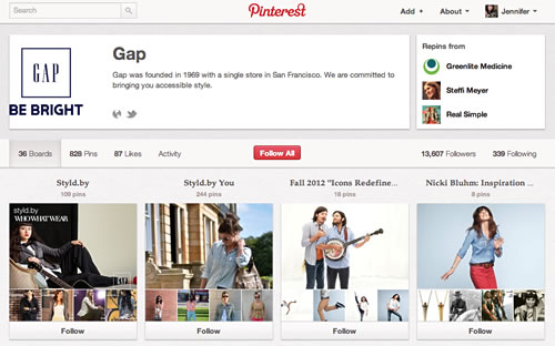
http://pinterest.com/gap/


Benefit (1/5)
The cosmetics company list many of their products on their Pinterest site along with make-up tips. However, the company seem to be confused as to what to do with their Pinterest page and have listed several boards that have nothing to do with the brand, such as a random selection of travel-related photographs, food, and summer photographs (organised into separate boards). I feel that these do not belong and that they should focus more on their products and not on creating boards filled with imagery from other pages on the web. While "creamy coconut pops" and "multi-coloured snow cones" look and sound great, this and photographs of random travel resorts, cosmetics, and other food or fashion items doesn't relate to their products. It may fit the demographic, but I don't want to visit the company's Pinterest page to view unrelated imagery. I want to see where I can buy the sparkly glitter lip gloss, but as it is linked to someone's random website, I believe that it is not even their own cosmetic product.
pinterest03.jpg
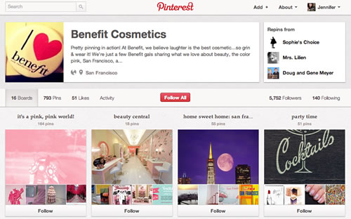
http://pinterest.com/benefitgals/


Links of London (Rating: 5/5)
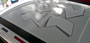
Links of London is a designer jewellery shop. Their boards showcase press releases, celebrities, and their collections of fine jewellery, organised into different product categories. The company created boards for various Olympic events and marketing campaigns during the Olympics. They also have created boards for their fans to submit images for different competitions. Overall, I feel that the boards do focus on their products and brands and also allow others to contribute. (I am over-looking the fact that one of their boards does contain imagery that do not focus solely on their product or brands.)
pinterest04.jpg
http://pinterest.com/linksoflondon/


IKEA UK (Rating: 5/5)
The Swedish furniture and home store's Pinterest page displays several of their products organised into different boards (by room) for quick inspiration. The boards and photographs of the items contain good descriptions (and, in some cases, a cost associated with the product). They have also created special albums for special days (Father's Day) to help customers decide what to buy.
pinterest06.jpg
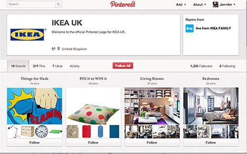
http://pinterest.com/IKEAUK/


Innocent Drinks (Rating: 2/5)
Innocent Drinks make healthy snacks and drinks and support charitable causes. The company like to be thought of as 'fun' with some of the pins and imagery that they produce. They also get their fans involved by posting images in a board of items that their fans have sent them. The drinks company have not done a lot with their Pinterest page, and I could argue that some of their boards or pins do not represent the products or the brand. Also, some of the boards look bare.
pinterest05.jpg
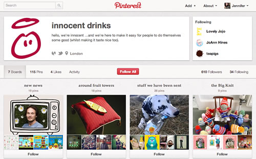
http://pinterest.com/innocentdrinks


Taco Bell (Rating: 4/5)
Taco Bell, the American fast food chain, use Pinterest to promote their brand and products. Some of the pins feature imagery created by fans, such as tattoos and tacos being eaten in various places in the world. I'm not really convinced that tattoos of the brand (that don't completely follow the brand) really should be on these boards. I personally feel that they could do better and also have better descriptions on the page and images/boards.   
pinterest07.jpg
http://pinterest.com/tacobell/


Auntie Anne's (Rating: 1/5)
Auntie Anne's is an American company specialising in pretzels. The shops are usually to be found in the cafe court areas in large shopping malls. (They have recently made their way to the UK as well.) The Pinterest page for this company contains several boards. Some of the boards show the company's history and headquarters city. Others show their followers' photographs relating to the company's products. Other than that, the remainder of the boards (all nine of them at the point of writing) have little or nothing to do with the company. I do not understand what drawings from children, random quotations, fashion and wedding boards have to do with pretzels. Other boards feature random pretzel recipe ideas and pretzel-inspired items (jewellery and handbags). I am fairly confident that many followers would find most of these boards too much of a diversion and question why Auntie Anne's pretzel company is posting a photograph of yellow women's shoes with the caption "Still on my mission to find the perfect yellow shoes."
pinterest08.jpg
http://pinterest.com/auntieannes/


Krispy Kreme (Rating: 4/5)
The doughnut company, Krispy Kreme, have used professional photographs and Instagram photographs on their Pinterest page. The page features a few boards that relate to the company, and these boards remain true to the brand. Of course, doughnuts and branding feature prominently. The photographs are professional and seasonal. (At the moment of writing this, they have a county fair board as it's the time of year for county fairs and a "Talk Like a Pirate Day" giveaway.) Other boards feature coupons that dedicated followers can print out. The boards are spot on, but many of them seem to be fairly empty. I'd like to see more photographs of doughnuts. 
pinterest09.jpg
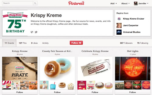
http://pinterest.com/krispykreme/


Cosmopolitan Magazine (Rating: 5/5)
The women's magazine Pinterest page contains boards that relate to their magazine's features: health, beauty, fashion, food, cute men, and magazine covers. The boards contain links to the features from Cosmopolitan's website mentioned in the pins. The content is relevant and ties in with the magazine.
pinterest10.jpg
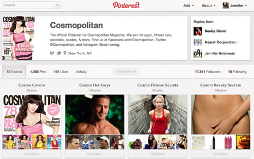
http://pinterest.com/Cosmopolitan


Fossil (Rating: 3/5)
The fashion company Fossil have created several boards with various items that inspire them. While the boards are organised well, I felt that some of them did not fully showcase the brand but are simple re-pins based on the style or theme of the board. I feel that this is a little too much noise and that their Pinterest page should focus more on their products. Their selection of pins seems to have some relevancy to their products and the brand, but I feel that there may be a little too much noise.
pinterest11.jpg
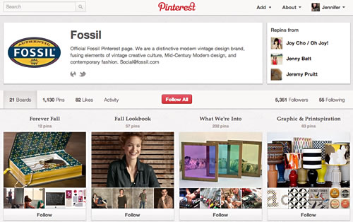
http://pinterest.com/fossil


Southwest Airlines (Rating: 3/5)
Many of the boards on this page feature holiday destinations that the airlines flies to, its fleet, vintage photographs, employee photos, and travel-related products and items. There are a few random boards and images that seemed to miss the mark, in my opinion.
pinterest14.jpg
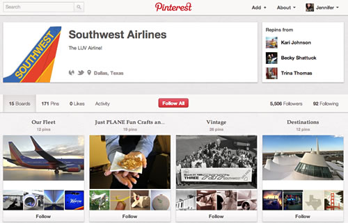
http://pinterest.com/southwestair/
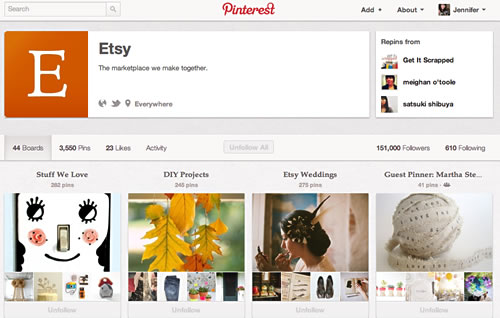
Etsy (Rating: 5/5)
It would be difficult for an art/craft-seller's marketplace Pinterest website to turn out wrong, particularly when many of its users are women (and women who do appreciate art) and fit the Pinterest demographic. This page features many boards with sellers' items, all organised. I cannot fault it. In fact, Etsy had already been doing something similar to Pinterest even before Pinterest, with its user-created Treasury lists. (Sure, it is executed a bit differently, but it is essentially the same idea.)
pinterest13.jpg


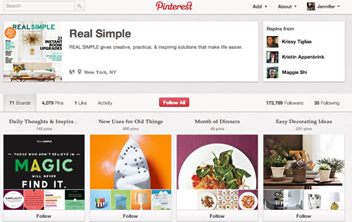
Real Simple Magazine (Rating: 5/5)
Similar to the same demographics as Etsy and Pinterest, this page lives up to the brand.
pinterest12.jpg
http://pinterest.com/realsimple/

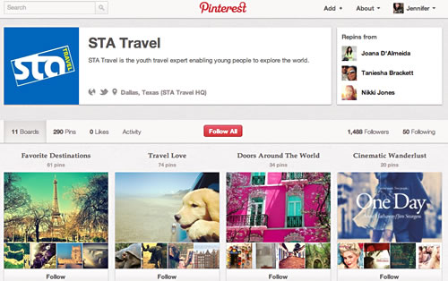
STA Travel (Rating: 4/5)
This Pinterest page features many travel boards and travel products, but I don't see what the 'cupcakes' board has to do with travel.
pinterest15.jpg
http://pinterest.com/statravelus/


Susan Gunelius has also posted a few companies that seem to be using Pinterest really well. These include the beauty company Birchbox (http://pinterest.com/birchbox/), WholeFoods (http://pinterest.com/wholefoods/), Scholastic (http://pinterest.com/scholastic/), Better Homes and Gardens (http://pinterest.com/bhg/), and Michael's Stores (http://pinterest.com/michaelsstores/). Obviously, all of the above companies are more popular with women shoppers.


1) Jainchill, Johanna. Travel companies see potential in scrapbooking site Pinterest. http://www.travelweekly.com/Travel-News/Online-Travel/Travel-companies-see-potential-in-scrapbooking-site-Pinterest/ [10 April 2012].

2) Gunelius, Susan. 5 Brands Using Pinterest Brilliantly. http://sproutsocial.com/insights/2012/02/best-pinterest-brands/ [13 February 2012].

Olympic Products and MINI Olympic Special Edition

Now that the Olympics have finally arrived, the focus of the world (or at least the UK) seems to be on the games and everything surrounding them. The official sponsors have spent a lot to market their brands. Many companies, including official sponsors, are deciding to cash out on the London 2012 Olympics with Olympic special edition merchandise. Coca Cola, Cadbury, and MINI are a few of the companies who have launched Olympic-themed merchandise.

Cadbury have launched Union Jack chocolate bars; these were launched before the Diamond Jubilee. In addition, they have also launched chocolate Olympic mascots and chocolate gold medals. Cadbury have also set up an exhibition in Hyde Park and in other areas of the UK to sell their product.

In addition, Coca Cola have been doing a lot of marketing around the Olympics and have hosted several concerts and events, including the torch relay events. Coca Cola have launched special edition torch relay bottles for those who attended the torch relay, and these were handed out for free around the country. In addition to the torch relay bottles, Selfridges are currently selling special edition gold bottles of Coca Cola to celebrate the Olympics. (These gold bottles can only be found at Selfridges.)

olympic_merch.jpg

Another brand spending money on marketing for the Olympics is MINI. Last year, MINI launched a special edition Olympics MINI. The car comes in red, blue, and silver, and the seats have a red/white/blue trim on them. The car also has graphics in the form of small Union-Jack stripes and the Olympic logo on the roof. In addition, MINI have a float in the Thames near the Olympic park.

2012mini.jpg

Also, MINI have been participating in the Olympics. Miniature radio-controlled MINI cars are participating in the games by delivering Olympic equipment (such as javelins) to the athletes during the game. Several MINIs are also being used for fire emergencies and are painted accordingly in yellow. A MINI was also used in the opening ceremony.

As mentioned for the Queen's Diamond Jubilee in a previous post, many other products have used flags in their branding, such as Marks and Spencer (pictured below). 

britproducts1.jpg

Rimmel Product Design - Union Jack Eyes

I absolutely love the Union Jack icon and have it on t-shirts, my purse, and even on the roof of my Mini Cooper car. That's why I was so excited when I discovered these Union Jack eye shadows from make-up company Rimmel in the shop at the beginning of the year. I read about these in one of my magazines at the end of 2011, so I am glad to see them in the shops. These Union Jack eye shadows were inspired by Kate Moss.

My favourite palette is the one the red/pink cross, but this really is not practical. I do own some red eye shadow, but I rarely use it. Instead, I have purchased the silver/black/grey palette (great for achieving the 'smokey eye' effect) and the blue palette (to match my eyes).

revlon_ujeyes.jpg
(Image is from: http://thingsllove.blogspot.com/2011/12/swatches-rimmel-glameyes-hd-green-park.html)

When To Avoid Displaying Your Brand

Recently, I have been giving a lot of thought about branding and its importance, particularly in today's world with the use of social media to build direct relationships with customers. The trend in the past few years is for companies is to establish a social media presence, and social media has come a long way in a short time to meet these needs. As a result of this need or desire to establish these relationships with customers and promote "word of mouth" marketing, companies are establishing instantaneous and closer relationships with consumers or brand champions (those who actively engage with the brand). 

Today, many companies have a presence on Facebook, Twitter, Pinterest, Instagram, YouTube, and other social networking websites. Since consumers can view this information instantaneously, these interactions and representations of the company's brand must be carefully thought through. After all, we would not want to compromise the brand and its integrity. In her article about the use of Instagram, Jessica McLaughlin (1) states that companies must decide which social media websites best align to their business needs and ensure that they devote enough time to this social media website. In this example, companies that use the photographic social media website Instagram must keep imagery fresh and find creative ways to showcase their brand imagery and values without recycling images.

In short, companies should not jump on the social media bandwagon without giving thought into how the particular social media website will help them. In my opinion, there is nothing worse than an 'empty' or 'ghost town' social media page or community that is rarely updated or that is updated with irrelevant content. This is harmful to the brand.

Now that I have discussed the social media impact on a brand, I will discuss the basics of branding and learning to identify mistakes. After all, the company you are working for has probably spent money on a new brand or branding materials, wether this is on business cards, brochures, logo, or a website. I don't need to state how important brand is; that is a lengthy topic of discussion that is beyond the scope of this article.

What is brand? In short, a brand should correctly convey the company and its message to customers in a positive light. The treatment should be consistent and revisited regularly, in line with the goals of the business. There are many examples where companies fail to grasp this concept or ignore the brand guidelines once their brand has been developed and the initial work has been completed; this can be immediately or a few months after the initial release. However, once the style guide and logos have been delivered and the money paid up, there is much more work to be completed. In my opinion, once this work has been done, the fun work in the brand execution is just beginning.

Let's face it. Creating a brand is a time-consuming and expensive task, and following through with the branding correctly and continuing to roll it out consistently, while keeping the brand fresh, is a challenge. It's also a task that should not be taken lightly. The branding exercise does not stop once the new brand has been created. A new brand is not going to miraculously work its way into the subconscious of potential customers and increase sales overnight. Correctly utilising the brand will, and there's much more to the brand than a "pretty logo". The brand should encompass an ideal and uniqueness of the company or product/service.

I've been locating articles and resources to back up my beliefs, and there's a lot of research out there to support this. I have taken the time to list some of these common branding mistakes and have identified some areas where designers and employees should be cautious to avoid common branding mistakes, which reflect poorly on the company.

  1. Inconsistent Branding. The branding guidelines are interpreted differently across different mediums. For example, the treatment of the brand on the website may be different to the treatment on business cards, signage, or invoices. The way that employees interact with customers may be inconsistent. The branding treatment should always be consistent.
  2. Failing to Update the Brand. Branding can get stale, and marketing materials should be refreshed and revisited often to ensure that it does not get "tired". This is an ongoing process. Precision Intermedia (1) mentions that some companies print a large order of brochures and use these brochures for several years; by that time, the company or message would have changed. Stale branding does not reflect well. The same can be said about keeping company websites up-to-date.
  3. Poor Visuals or Signage. Similar to brand inconsistently, companies must ensure that their visuals are pixel-perfect and also translate well in the physical forms. (Keep in mind that logos may be resized or photo-copied.)  Due to background colours or sizing issues, a good web designer will always ask a company for the original artwork instead of using a small, grainy and pixelated GIF or JPEG logos at the beginning of any web redevelopment project. Outdoor signage must be given the same attention. (It does not look professional when a company does not fix its broken signage. It's the same feeling as when your neighbours leave their Christmas lights up all year.) When FedEx employees were asked how small companies sabotage their own brands, the following comments were made (6):
    •  "poor banners at trade shows"
    • "bad signage"
    • "poor quality of printed items"
  4. Lack of Brand Training or Guidance to Employees. Employees should act as brand ambassadors and may need to be briefed on the importance and uses of the brand as well as professionalism in public when wearing branded materials. Employees should be trained to execute branding materials correctly to avoid inconsistency and to be briefed on how to follow brand guidelines. Where possible, this should be done by professional designers. In the least, a professional designer or marketing individual should monitor the use of the brand and any materials sent to customers.
  5. Not Using Professional Existing Customers to Promote. Every company probably has a brand champion. These customers could help generate new customers. "Word of mouth" marketing is particularly important in today's world. Offering incentives and competitions may help the brand, and identify customers who are good for enhancing your brand. This also means avoiding controversial people, such as celebrities. Remember that mess with Tiger Woods a few years ago and how he was ditched by top brands? Follow the same rules.
  6. Poor Communication. Gutscher (4) mentions poor signage harming a brand, such as having signs in washrooms/parking spaces/indoors telling people how to behave. She also mentions communication in forms being poor and/or negative and that companies should take care and construct letters that present the brand in a positive light. This leads us on to the next point.
  7. Avoid Brand Contamination - Errors. Anderson (5) mentions association of negative feelings with a brand, such as displaying an electronic company Vizio's logo on a television whenever it crashes. This creates a negative feeling about the brand. Showing your brand on error pages sends the wrong message; for this reason, social media company Twitter use their "Fail Whale" image. This brings us to the idea of "Fail Pets", typically cartoon animals displayed in a website error page instead of the company's branding (3).
  8. Incorrectly Using Social Media websites. Companies must dedicate time to invest in social media websites and avoid being tempted to jump on the latest craze. Companies must ensure that the social media website works for them. For example, a fashion company may be able to successfully adopt use on Pinterest.com (pinning fashion photographs), but this may not work for a company that sells interactive online games. Once a company has invested in a social media website, content must be unique and tie in with the brand.
  9. Failure to Track Branding. Feedback should be noted, and customers thoughts on the brand should be obtained from time to time. Website tracking could also be recorded. This assesses if your branding is working.
  10. Adopt Employee Branding. Successful branding starts within the company. Generating employees' enthusiasm for the brand and promoting it is the key. The employee can help the company by engaging in social media or "word of mouth" discussions showing that they are proud to support the brand (7).

In conclusion, companies should ensure that their brand translates correctly to the audience, and branding activities must be ongoing and consistent. Companies must avoid using the branding in negative ways and work on ensuring only the best for their brand. Branding must be worked on continuously and developed, and companies should engage in the methods to help their brand instead of harm it. After all, a lot of effort has gone into building a brand.


Have you ever worked for a company that is making one of the mistakes above, or have I missed something from this list? Please let me know your thoughts.


1) McLaughlin, Jessica. Five Instagram Marketing Mistakes. http://sproutsocial.com/insights/2012/05/instagram-marketing-mistakes/ [22 May, 2012].

2) Precision Intermedia. Top Ten Branding Mistakes. http://www.precisionintermedia.com/branding_mistakes.html [13 June, 2012].

3) The Evolution of Fail Pets: Strategic Whimsy and Brand Awareness in Error Messages. http://uxmag.com/articles/the-evolution-of-fail-pets [02 November, 2011].

4) Gutscher, Mary Lou. Oops, your brand is showing. http://www.profitableprospecting.ca/2011/11/oops-your-brand-is-showing/ [15 June, 2012].

5) Anderson, Jonathan. Your logo is making me sick. http://uxmag.com/articles/your-logo-is-making-me-sick. [22 May, 2012].

6) Campbell, Anita. Is your brand helping or hurting your small business? http://smallbiztrends.com/2012/05/brand-helping-small-business.html [17 May, 2012].

7) Vermeiretim. Beyond employer branding people are the brand. http://vermeiretim.com/2012/06/13/beyond-employer-branding-people-are-the-brand/ [13 June, 2012].

The Queen's Diamond Jubilee Themed Product Designs

Last year, much of the world became obsessed with all things British in the run-up to the Royal Wedding. Flags, bunting, cutlery, trinkets, and cake decorations were all up for grabs. This year is another popular year for Great Britain as the country hosts the Olympics and celebrates the Queen's Diamond Jubilee. 

Various companies have been re-branding British products with the "Great Britain" theme to mark the Diamond Jubilee, and the challenge for many designers is to avoid kitsch while ensuring it does not get confused with the Olympics or break any rules by using the Queen's image (1). The trick to creating the product design is to use imagery or colour to convey the celebration without the expense to brand or using any imagery associated with the Queen. For example, Marmite's bottle contains a representation of the flag and a crown, but the crown was drawn by the company and could not be confused for the Queen's (1).

The following graphic is being used widely to represent the Diamond Jubilee.

diamondjubilee_5.jpg

Although some companies have used the British themes, others (such as Kellog's) have played to the vintage image of their products when the Queen ascended to the throne. Kellog's have launched vintage packaging of some of their products.

I have included some of the product designs below, but for more inspiration, you can pop into your local branch of Marks and Spencer or John Lewis / Waitrose, where they have stocked themed products for a couple of months. John Lewis / Waitrose consistently use British themes in their products, and they are marketing some their products with a sketch. British flags and vintage typography feature significantly across many different types of product.

diamondjubilee_1.jpg
(All images are the property of the brands represented.) From top left:

Lyle's Golden Syrup use a crown image with the gold and green branding.

Marmite use a British flag in the background of their product with the crown and celebratory text.

Just Puds use a British flag in the background, but the colours are product-specific.

Heinz have placed celebratory text on their product and use simple colours and graphics. 

Cadbury is one of my favourites that I have seen in the shops because it stands out. The company use their striking royal purple colour and combine this with a vintage typeface, crown, and Jubilee message.

Weetabix have designed a 'Fuel Britannia' theme with flag bunting.

Prestat have launched various themes of their product, including the one pictured here with the chariot and horses. A few of their chocolate bars also contain the British flag, and I will be uploading these in another post.


A few more products from British companies are below.

diamondjubilee_2.jpg
(All images are the property of the brands represented.) From top left:

Mozuma, the chocolate company, have developed a very British chocolate bar range with its product design. Very British chocolate bar range includes "Summer Pudding", "Eton Mess", and "Spotted Dick". (Some of these will be put into a future post.)

Adnams have launched their ale with attractive, shelf-stopping branding.

Marks and Spencer have invested much time into product designs for their products, particularly the products with more of a British theme. Their product designs feature the flag and bunting as well as sketched characters. More images can be found on the links below, which includes the official Marks and Spencers website (2 and 3). I will also be adding more photos in an upcoming post.

In addition to the photograph above, the following products have also been designed for Marks and Spencers:

diamondjubilee_3.jpg
(All images are the property of the brands represented.)


Although the branding is making a large impact on food products, jewellery, transportation, fashion labels, dishes/plates/mugs, coins, stamps, cards, and media are also producing designs based on all-things-British for the Jubilee. Although not a product, even the street artist Banksy has been busy (see Banksy Diamond Jubilee Street Art). Included below are a television network and London Underground.

diamondjubilee_4.jpg
(All images are the property of the brands represented.)

Director Steve Small has developed an attractively-sketched ident to play before and after programmes on ITV1 relating to the Diamond Jubilee (4).

A few London Underground trains on the Jubilee line have been branded with the Jubilee pattern, and more of these will be ruled out on the Jubilee line for the Jubilee weekend (5).

Below is an image from the London department store, Harrods.

diamondjubilee_6.jpg
(All images are the property of the brands represented.)

Have you seen any product designs for the Diamond Jubilee that really stood out to you that I have not included in this list? Please drop me a message.


1) Banks, Tom. Creating Limited-Edition Projects for the Queen's Diamond Jubilee. http://www.designweek.co.uk/analysis/news-analysis/creating-limited-edition-projects-for-the-queens-diamond-jubilee/3034467.article [26 April, 2012].

2) H is for Home. M&S Packaging. http://hisforhomeblog.com/tag/queens-diamond-jubilee [27 April, 2012].

3) Marks and Spencer. M&S Jubilee Food. http://social.marksandspencer.com/food-drink/ms-jubilee-food/ [11 May, 2012].

4) Burgoyne, Patrick. ITV1 in charming Royal Jubilee design shock. http://creativereview.co.uk/cr-blog/2012/may/itv1-royal-season-ident [16 May, 2012].

5) London24. London Underground celebrates Diamond Jubilee by Decorating Jubilee line trains. http://www.london24.com/news/london_underground_celebrates_diamond_jubilee_by_decorating_jubilee_line_trains_1_1378594 [15 May, 2012].

Gail's Bakery - Kensington, London

Gail's is a bakery located in several spots throughout London (including Notting Hill, Kensington, Battersea, Chiswick, Soho). Gail's offers everything from sandwiches to snacks to desserts (cupcakes, cookies, cake, brownies, and many other goodies for those who have a sweet tooth). I recently visited the South Kensington branch (just outside the tube station) and tried a couple of different types of sandwiches, and I also tried the cupcakes, brownie, and a Valentine's Day heart-shaped cookie. Unfortunately, I was not too keen on the sandwiches. They were a little too 'heavy' for my liking, and I was not too keen on the fillings or the bread. However, I really recommend the brownies and the cupcakes. I had a vanilla cupcake (like the ones pictured below), and it was delicious.

I loved the thought that went into the brownies. As it was near to Valentine's Day, the brownies were lightly dusted with a letter on them, spelling out the word "LOVE X" when placed side-by-side. The South Kensington shop is very small, and it is quite popular because of the prime location and the large windows featuring the snacks. There are a few tables outside for those who want to brave the weather; I am sure it's lovely in the summer.

gails1.jpg

gails4.jpg


gails2.jpg


Not only does the company pride itself in making attractive and speciality products and breads, but they also have some well-designed packaging. I love the packaging and the use of geometric shapes, with a feature on the lower-case 'g', which is outlined and part of the branding. (On the company's website, some of the products - bread - feature a lightly-powdered lower-case 'g'.) The following image is the top of the cake box that my items were packaged up in following a trip to their South Kensington shop.

gails3.jpg

For more information about this company and their locations throughout London, visit their website at http://www.gailsbread.co.uk/.

The Best SuperBowl Commercials of 2012

SuperBowl XLVI was aired last Sunday, and it cost approximately $3.5 million for a 30-second slot. There were a couple of good commercials, but the majority were not as impressive as last year's, and many were average at best. This year, many of the advertisements features cars and technology. There were far less food items, beer, and some brands produced less commercials this year. (I think GoDaddy and Doritos featured more last year.)

My favourite advertisements this year were those by Chevy, Samsung, and the Coca Cola Polar Bears. The Volkswagen, Doritos, and Acura slots were a disappointment. I've listed my least favourite commercials at the end of this article. Directly below are a few of the commercials that were average or good.

Chevy
Chevy aired a few commercials during the SuperBowl. Two were Chevy stunt commercials, and they also aired two additional ones. In one, the Chevy pick-up is the only vehicle to survive the end of the world with references to other end-of-the-world and zombie films. In the other, a graduate's parents reveal a gift car, but the prank is on him as the car belongs to the neighbour.

Chrysler:
Clint Eastwood narrates "It's Haftime in America", which parallels the difficult economic times with the Chrysler company to give a message of hope and strength. (This is similar in format to the Eminem commercial from last year.) However, I was not the only one to think that the message sounds very much presidential-campaign. Many feel that president Obama and Chrysler were working together in order to produce this advertisement. It was a little bit too patronising and political for me, but it was emotional and consisted of a good use of imagery.

Doritos:
The brand follows up with the popular pet commercials from last year and produced a few different commercials for the SuperBowl. One depicts blackmail (in the form of Doritos) by covering up the missing pet cat. Another features a young child and a baby who takes the Doritos with his grandmother's help.

Volkswagen:
The company were responsible for the Star Wars theme in last year's SuperBowl, and this year's features a Golden Retriever losing weight to chase after a Volkswagen, then a cut to the Star Wars Cantina where we see shots of the Darth Vader and the Cantina characters discussing the commercial. Not as good as last year's, and the cut between the different scenes is awkward. (They mention last year's successful commercial at the end.)

Bud Light
The slot features a Rescue Dog (Weego) that knows how to fetch beer on demand.

Budweiser:
The company use the prohibition era to advertise their beer.

Coca Cola:
Coca Cola produced a series of animated commercials featuring the Polar Bears. The Polar Bears acts like football players with the Cola bottle as the football.

Samsung:
Samsung's commercial for their new mobile phone ridicules queues standing outside of stores (Apple, anyone?) to grab the latest technology. The commercial kicks off further with The Darkness singing to the crowd on the street with shots of the product's features.

Acura:
This advertisement features Jerry Seinfeld, Jay Leno, and other characters from Seinfeld. There's not too much advertising for the product, though, so it's not really memorable product placement. The advertisement features Jerry attempting to cut the queue by bribing another customer (George from Seinfeld) in the showroom.

Pepsi:
This commercial features Elton John as a king, and he watches auditions and provides the soft drink for those he likes.

H&M:
David Beckham sells clothes for the brand, but he's nearly naked. I do not feel that this was good product placement.


There were a few commercials that I found particularly annoying: Cars.com, Honda, M&Ms, and the Kia sandman commercial.

Cars.com:
A man walks into a showroom with his conscious, who sings about how much he wants the car. I found this commercial to be highly annoying with the signing.

M&Ms:
The commercial features a female-voiced brown M&M, and others think that she is naked. It features the red male M&M stripping off the red coat and dancing. If this was meant to be funny, it did not get any laughs from me.

Kia:
This commercial's message is 'the dream car', following the dreams of a couple to dream of the Kia when the sandman visits. I just found this commercial to be a little bit dull and the pacing to be off.

Honda:
This commercial stars the actor of Ferris Bueller's Day Off. In the commercial, he pulls a sickie and ends up driving around town and enjoying himself, in a parody of the movie. Perhaps if I was a fan of the movie, I would have found it funny, but I've never liked the film, and I found the character to be a little too annoying.

Winners of the 'Red Bull' Canimation Competition

At the end of 2011, Red Bull ran a competition for three different categories (stop-monition, drawn animation, and CGI computer-generated) of video creatives, and the criteria was to feature the Red Bull can. I wrote about this and shared my favourites here: 'Red Bull' Canimation Competition Creative Entries

The winners have been announced, and the results are below. I am happy that three of my favourite entries made it into the winner list. Some of the categories would have been difficult to judge as there were many wonderful entries.
 

Winners of Stop-Motion Category:
Student - Bill Hennessey: http://vimeo.com/32179301 (The video features a squirrel that skateboards after taking 'Red Bull'.)
Non-Student - Chris Butcher: http://vimeo.com/32105591 (This was one of my favourites featuring the morphing can.)

Winners of the CGI Category:
Student - Scott Waddington: http://vimeo.com/32087852 (The video features a chicken and a can of Red Bull.)
Non-Student - Paul Barlow: http://vimeo.com/32150228 (The video shows the can turn into a flower with a bee.)

Winners of the Drawn Animation:
Student - Marc Moynihan: http://vimeo.com/31856894 (This was one of the videos that I liked, featuring the growling bear and this followed the brand well.)
Non-Student - Chloe Rodham: http://vimeo.com/chloerodham/redbull (This was one of the videos that I liked, featuring a greyhound chasing after Red Bull.)

Red Bull Canimation Competition

Red Bull are hosting a video competition with the star of the video being the Red Bull can. The best animations in three separate categories (drawn, CGI, and stop-motion) will receive a prize. Prizes are then put into two additional categories: students and non-students. Prizes include a month internship at Aardman Studios (makers of Wallace and Gromit and Chicken Run) or other creative agencies, laptops, and animation software. Trial versions of the software to create the animations can be downloaded from the Red Bull Canimation website.

Some of the animations have been placed into a gallery, which are available on the website. Flying horses, grannies attacking handbag-snatchers, airplanes, dancing animals, and Red Bull can rockets are some of the representations in the animations. The image below is a screenshot from the animation submission by Kat Willott.

canimation.jpg

The deadline for entries is the 15th of November, so hurry if you want to submit an animation.

http://canimation.redbull.co.uk/

The Google Doodles Story: Evolution of Google's Doodle

The popular search engine, Google, is known for creating specialised logos for popular holidays or events to showcase them on the special day. The simple and clean website features its logo as one of the primary elements, along with the search field, so when the logo changes, it is noticed and appreciated. Over time, the logo has evolved and gained in popularity and dubbed "Google Doodle", and the logos themselves have become more complex and, at times, interactive. Google is the most popular search engine in most countries of the world, so word is quickly spread when a new "Google Doodle" is displayed. Some of the doodles are displayed globally, and others are displayed within the particular country.

Years ago, before Google (can anyone else remember the pre-Google days?) was launched, other search engines had developed varying (mainly seasonal) themes for their websites. I remember that Yahoo! created a Halloween version of its website with animated ghosts, and they made changes to their logo and the colours of their website during the Christmas season. It is no doubt that Google's founders were probably first inspired by these.

Google's first "Google Doodle" was launched in August of 1998 with its "Burning Man Festival" logo, which was created to let users know that the founders were going to the festival. The next logo was made to celebrate Thanksgiving (United States) in November of that year, before introducing its BETA logo. Since then, it has produced hundreds of other variations of its logo for events and holidays worldwide. The first several years of the "Google Doodle" were minimal illustrations, and these evolved with some reuse in illustrations. The doodles for the first few years were focused around public holidays, apart from the BETA verison of the logo.

The year 2000 was a major year for the "Google Doodle". Dennis Hwang was asked to create one for Bastille Day, which was popular; as a result, he was asked to head up the "Google Doodle" department, which now includes four doodlers (1). By looking at the evolution of these doodles, one can see that the quality improved in the year 2000, and illustrations were used to enhance the logo; the primary colours of Google (primary yellow, blue, red, and green) were kept consistent in most doodles. (In 1999, several of the doodles used colours popularly associated with the holiday.) Christmas of 2000 was also the first year in which several variations of the logo were created to celebrate the holiday, and these logos showed illustrations of a family of polar bears. (Since then, there have been a Dilbert comic series, Olympics series, and seasonal series, to name a few.)

In the past three years, Google has been experimenting more with highly interactive logos, such as the PacMan game, the Jules Verne submarine, the Les Paul Guitar, and, more recently, one with muppets that animate and follow the mouse. The drawings have also become less crude, and in the past year or two, the logo is worked into the illustration. (Sometimes it takes imagination to see it.)

The below images illustrate this evolution, though many more and a complete history can be viewed on Google's website (linked at the bottom of this article).

googledoodle.jpg

1) November 1998: Thanksgiving (US)
2) March, 1999: St. Patrick's Day
3) October 2001: Halloween (US)
4) October 2002: Picasso's birthday (Global)
5) September 2003: Google's 5th Birthday (Global)
6) April 2005: Leonardo Da Vinci's Birthday (Global)
7) January 2006: Braille's Birthday (Global)
8) January 2008: Lego Brick anniversary (Global)
9) May 2009: Big Ben's 150 years (UK)
10) February 2010: Winter Olympics
11) May 2010: PacMan 30th anniversary
12) April 2011: Earth Day
13) September 2011: Jim Henson Muppets


Although many companies ensure that their logo and branding adheres to strict guidelines (changing the consistency of the branding could disassociate the product or service with the company and cause the consumer confusion), Google gets away changing its logo and claims that this is a part of its corporate culture. According to Google, changing the logo is a part of the company's culture and branding, and it "illustrates the creative and innovative personality of the company itself" (2). Google have even patented the idea of these slight changes to branding (3). However, I am not sure that this patent would certainly hold up in any argument because other brands have been doing this for years, before the search engine existed. For example, Absolut Vodka have various implementations of their logo. Yahoo! and Excite.com (pre-Google search engines) used varying themes and slight changes to their logo during the holidays.

Google has kept a history of all of its doodles on its website, and these can be viewed here: http://www.google.co.uk/logos/


(1) Banks, Tom. Doodle for Google, Design Week. http://www.designweek.co.uk/home/blog/doodle-for-google/3027360.article [June 13, 2011].

(2) Google. http://www.google.com/doodle4google/history.html [26 September, 2011].

(3) Lloyd, John. Crit: Why Google has oodles of doodles, Creative Review. http://creativereview.co.uk/current-issue/crit-why-google-has-oodles-of-doodles [26 September, 2011].

Firey Chili Designs

Spicy and hot food is my favourite, and thinking about chili pepper makes my tongue tingle. Many are embracing the chili and spicy flavours in cuisine with the popularity of Mexican, Indian, and Portuguese restaurants. A little bit of spice added to dark chocolate is a good combination, and many are opting out of bland flavours in favour of the extra kick. Speciality hot sauces are popular, and some push the boundaries of heat. Chili-eating contests are held for those who can withstand the heat.

The colours associated with chili are deep red, orange, and a hint of green. (Many brands and websites symbolise the chili with flames.) Here are a few examples of hot and spicy designs and logos that will have your tongue tingling. 

chili_chipotle.jpg
http://www.chipotle.com

chili_tabasco.jpg
http://www.tabasco.com

chili_nandos.jpg
http://www.nandos.co.uk/

chili_chameleon.jpg
Chameleon Chili Sauce: designed by Markmir (logopond.com)

chili_seoul.jpg
seoul food: designed by Simo Merghich (logopond.com)

chili_chilisason.png
Chili Sason: designed by jeronimovh (logopond.com)

chili_chiliconcolor.png
chiliconcolor: designed by BluesCue (logopond.com)

chili_julios.png
Julio's: designed by Steve Douglas

chili_homespunchili.jpg
Homespun Chili: designed by Brandclay.com

chili_jalepenoplant.png
The jalepeno plant: designed by www.thejalapenoplant.com

chili_redchili_logo.png
Red Chili: designed by redchili.de

Shirt Pepper: designed by serdaraslan.nl

Gap's New Logo Gets Publicity

Clothing company, Gap, have developed a new logo which received a frosty reception to brand consumers. The logo uses a bold, sans-serif font with a faded blue square on the upper right-hand side of the logo and behind the top of the letter 'p'. This logo replaced their white-on-blue serif font. 

I am assuming that Gap wanted to update and modernise its brand, but the font type 'cheapens' the brand in my opinion. The font looks too much like any of the common sans-serif fonts; is it Helvetica? The faded blue square also cheapens the logo; in whole, I think that the logo looks designed by someone who is just learning how to create branding. According to Mark Chouke, Marketing Week editor, the logo looks as if it was designed for an IT firm (1).

Perhaps this is just a publicity stunt, as hundreds of others on the web have suggested. I cannot imagine that the company would go through the process of purchasing, brainstorming, and approving this logo. Branding takes months and many minds and money to complete, and it is something that companies do not take lightly. 


(1) Maysa, Rawi. Gap scrap new logo after Facebook backlash. http://www.dailymail.co.uk/femail/article-1320055/Gap-scrap-new-logo-Facebook-backlash.html?ito=feeds-newsxml [13 October 2010].

Colour and Branding on the Web: Blue and Red

I have always been interested in the role that colour plays in psychology and marketing. Obviously, different cultures perceive different colours in a different way. 

The following articles look at colour branding trends for websites and logos - blue and red are the most used colours on the web, and this has been the trend for awhile (1). I think that blue has always been a popular colour in branding because it is a colour that most people respond to; typically it is also a favourite colour of many worldwide. Blue is a colour accepted by other males and females as the most favourite colour worldwide (2).

Using the correct colours or colour combinations in branding is important, and companies spend a lot of money on their image. Blue is one colour that has wide appeal, so I believe that many companies, particularly start-up companies, use this colour. The colour is also widely-used across different types of companies. The colour is a calming and stable colour, but blue can also be used to signify importance and power. Twitter, Facebook, Hewlett Packard, Dell, Paypal, Expedia, CNN, Wal-mart, NHS, and Microsoft are all examples of websites (and corporations) that use blue as a predominate colour.

Red is popular as well, and popular brands that use this colour include BBC, CNN, YouTube, Yahoo!, Adobe, Coca Cola, Canon, and About.com.

Although blue and red are the most popular colours for brands, other brands are spending more money on selecting other colours and getting the shade of colour trademarked, such as T-mobile has done with the colour magenta; if all brands did this, colours would be a limited resource (3).

(1) The Most Powerful Colors in the World, COLOURlover. September 15, 2010. [http://www.colourlovers.com/business/blog/2010/09/15/the-most-powerful-colors-in-the-world].

(2) Anatomy in Colors in Web Design: Blue and the Cool Look, Aidan Huang. January 22, 2010. [http://www.onextrapixel.com/2010/01/22/anatomy-of-colors-in-web-design-blue-and-the-cool-look/].

(3) Color: the Next Limited Resource?, Francisco Inchauste. November 11, 2009. [http://sixrevisions.com/web_design/color-the-next-limited-resource/].

Mascots for London 2012 Olympics

The 2012 London Olympics mascots have been unveiled. The controversy over these new mascots is comparable to when the 2012 Olympics logo was introduced a couple of years ago. I think that they look a little more like something from Teletubbies, and the organisers stress that the mascots have been designed to appeal to children. Here are some examples of mascots sent in by the public, some of which I think were very good but did not make the 'cut' to be the 2012 Olympics mascot: http://news.bbc.co.uk/2/hi/in_pictures/7460852.stm

The Art of Wine Labels

In the last update, I wrote about wine corks. Keeping along the same theme, I decided to showcase well-designed and creative wine labels as a design inspiration.

Wine labels reflect the perceived quality of the wine. When I look at the bottles of wine on the shelves, I draw conclusions on the quality of the wine based on the labels, and I've bought a bottle of wine depending on the packaging.

A quick search on the Internet on this topic has led me to discover that several others draw inspiration from wine labels as well.  I will post a few of my favourites with links to the other articles.

http://www.thecoolist.com/amazing-wine-labels-30-creative-and-unique-wine-label-designs/

http://www.winesofsubstance.com/ http://municipalwinemakers.com/store/category/wine/

http://packagingworld.blogspot.com/2008/07/six-seeds-wine.html

http://www.seriousaboutwine.co.za/

wine_labels.jpg
  1 2

Tags

Archives

Recent Comments

  • jenn: Thank you. read more
  • Murge: Amazing post. read more
  • Herbert: good post. site read more
  • Frank Quake: Hey, This is great when you said that I had read more
  • Chappy: You mention peptides here? I have had first hand experience read more
  • jenn: Thanks! I love the work. I have got more recent read more
  • Fanakapan: Thanks for the write up. This was some of my read more
  • jenn: Yes.... but that's only for the islands. Mostar and Montenegro read more
  • jenn: Hello, the code is not mine to hand out. I'll read more
  • pantich: More info about the best day trips from Dubrovnik can read more
OpenID accepted here Learn more about OpenID