March 2011 Archives

To provide interactive content without navigating the user to a separate web page, many websites use what are known as 'lightboxes'. A lightbox is a styled 'popup' which sits on top of the web page content using a DIV, as opposed to a separate pop-up window. Lightboxes are useful for showing additional content directly onto the page, without needing to load a new page. For example, many websites use ligthboxes to display full-size photographs, which are activated when the user clicks onto a thumbnail.

The following website contains code and some basic tutorials to get you up and running on creating lightboxes: http://flowplayer.org/tools/overlay/index.html

Note that at the bottom of this site is a list of functions to control the overlay and its display.

So, how do we create a lightbox? Simply follow the steps below to get started:

1.Locate and Reference the JQuery Tool Javascript

Download the minimised script from the website. The script will be named: jquery.tools.min.js

Simply include the path to the script in your code for that page to activate the JQuery Tools Overlay.

<script src="/js/jquery.tools.min.js"></script>

2. Add Overlay Function to Create Lightbox

To activate the lightbox, you will need to include a Javascript function. This function provides the ability to add many configurations and to write your own functions based on the lightbox's events. A few of these will be described breifly in the last section, but if you do want to get ahead, you can view the API available on the JQuery Tools Overlay website. To get something basic up and working, please see the code below.

Note that this code sets configurations for the Mask Element. (The Mask element is the overlay/mask which 'grays out' or disables the website, except for the lightbox.) Not overriding this element will provide the default styling for the mask element.

In short, my example works when a "rel" value is set on an anchor/link <a> tag. You can change this to specify image <IMG> tags or any other HTML tag instead, to activate the lightbox.

$(document).ready(function() {
$("a[rel]").overlay({
mask: {zIndex:100,color:'#000000',opacity: 0.7,loadSpeed:'fast'}
});
});

3. Insert code to launch the lightbox

Next, we need to create the reference to it, which will register the event to activate the lightbox. For the example above, we used the 'rel' value of an <a> tag. For multiple links to different lightboxes, you can change the REL tag from pics1 to pics2, to pics3, and so on.

 <td><a rel="#pics1">[more info]</a></td>

4. Create the lightbox:

Now, we will create our lightbox. You can create and style your own lightbox content. (No need to worry about setting DIVs for the CLOSE button or background or anything, as this can be referenced in CSS.)

The important thing to note here is the ID that you used in the REL tag (see above step); you will want the ID used in the REL tag to be the same as your DIV ID, as below. If you are creating multiple lightboxes, simply change the ID of the main DIV.

 <div id="pics1"><a></a>
    <div>
    <h2>Photos</h2><h3>France</h3><h3>1st Apr 2011</h3>
    <p>Lorem ipsum dolor sit amet, consectetuer adipiscing elit. Aenean commodo ligula eget dolor. Aenean massa. Cum sociis natoque penatibus et magnis dis parturient montes, nascetur ridiculus mus. Donec quam felis, ultricies nec, pellentesque eu, pretium quis, sem. Nulla consequat massa quis enim.</p>
    </div>
<img src="/images/paris1.jpg">
</div>

5. Create your lightbox style elements CSS

Now that you have created your ligthbox, you will need to style it to fit your page. An example is below.

 .details h3{display:inline;padding-left:35px;}
.details h2{display:inline;}
.details p{padding:3px;padding-top:15px;}
.simple_overlay img{padding-top:20px;padding-right:15px;}
.simple_overlay {display:none;z-index:20000;background-color:#FFFFFF;width:850px;min-height:200px;-moz-box-shadow:0 0 90px 5px #000;-webkit-box-shadow: 0 0 90px #000;-moz-border-radius: 4px 4px 4px 4px;border:1px solid #666;}
.simple_overlay .close {background:url(images/lightbox/close.png) top right no-repeat;position:absolute;right:-15px;top:-15px;cursor:pointer;height:35px;width:35px;}
.details {position:relative;float:left;font-size:.8em;width:555px;padding:15px;}

That's it! Happy lightbox creating!

Configuring

You can configure elements of the lightbox so that you are not constricted to using the set defaults. A list of the defaults and information can be found on the Overlay website (currently near the bottom of the page): http://flowplayer.org/tools/overlay/index.html

You can even add your own functions to do some crazy stuff! There are four functions that you can complete other Javascript tasks to do. These four are: onBeforeLoad, onLoad, onClose, and onBeforeClose. An example of how these can be used is below, along with setting some configurations to some elements, such as Mask, which we looked at earlier. You could potentially create your own mask elements or other DIVs to show/hide; you can display user messages and do a lot with this.

There is so much that you can do with this, so look through the API and examples on the website.

$(document).ready(function() {
$("a[rel]").overlay({

mask: {color:'#000'}, //Mask

onLoad: function(event) { //onLoad event
//Do something awesome when the ligthbox loads.
},

onClose: function(event) { //onClose event
// Do something when the ligthbox closes!
}
});
});

Issues

When implementing this lightbox solution on a website, I tested in all browsers, and the soluition works fine in all. There was only one area where there was a glitch, related to the Mask element. In IE, the mask element was displayed over the lightbox, even though the z-index of the lightbox was set to a higher z-index. The problem was that the DIVs for the lightbox were in the content area, and the Mask being created was created directly under the BODY tag. There are two ways that this can be solved. One is to change your page structure. The other is to create your own overlay DIV.

Structure:

The easiest way to get this right and to use the code provided in the JQuery Tools Overlay is to simply get your strucure correct so that IE behaves. JQuery Tools Overlay creates the overlay mask underneath the BODY in the DOM. This confused Javascript in the structure that was being used (below), so irregardless of z-index settings, the overlay mask will always be overlayed over the lightbox in IE! What you can do is ensure that the Mask DIV is at the same level as the lightbox panels. (In the example below, simply put the LIGHTBOX PANELS outside the CONTAINER.)

 BODY
CONTAINER
LIGHTBOX PANEL 1
LIGHTBOX PANEL 2
LIGHTBOX PANEL 3
OVERLAY MASK

Specify your own Overlay DIV:

In the CMS, create an empty DIV, and give it class name 'exposeMask'. You can style this mask in your CSS.

Wall Art at St. Katherine's Dock
| No Comments | No TrackBacks
A series of panels representing the life, history, and many personalities of this London dock are located on the entrance to St. Katherine's Dock. The panels were painted by Dale Devereux Barker in 1997-1998. 

stkatherine01.jpg

stkatherine02.jpg

stkatherine03.jpg

stkatherine04.jpg


stkatherine06.jpg

stkatherine07.jpg

Google have launched a quarterly publication aimed to partners and advertisers in the UK. The first edition of this publication, ThinkQuarterly, is published online at http://thinkquarterly.co.uk/ and focuses on data.

The New Pier: Weston-super-Mare

| No Comments | No TrackBacks
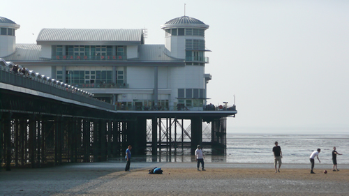
A few years ago, I used to live near Weston-super-Mare in Somerset, southwest England. In 2008, Weston-super-Mare's pier was destroyed by fire. A new pier was constructed and opened late in 2010. The picture below is of the new pier, taken on one of the first sunny spring days of the year.

westonsmare01.jpg

The Web in Beautiful Green

| 1 Comment | No TrackBacks
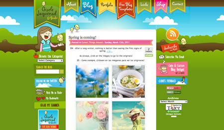
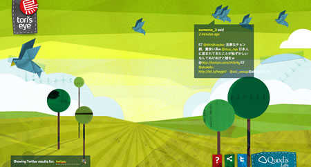
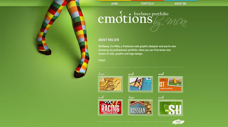
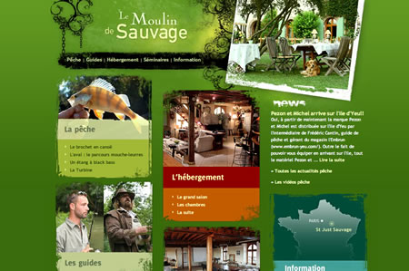
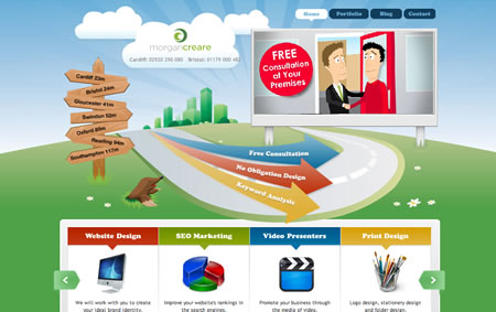
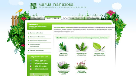
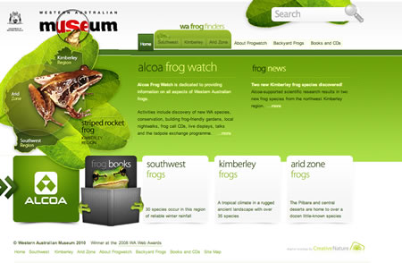
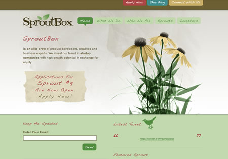
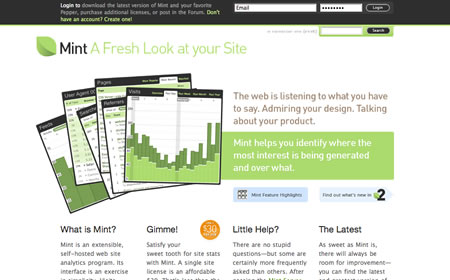
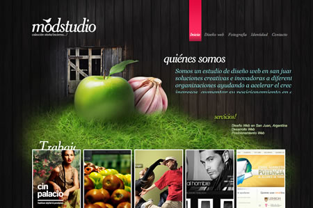
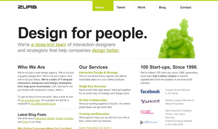
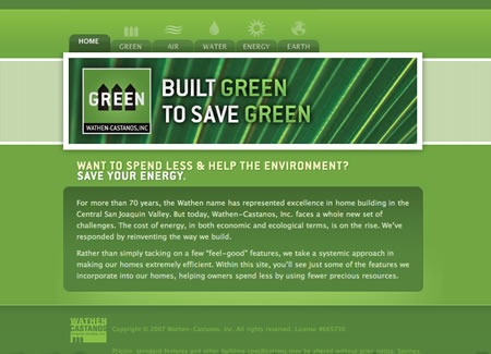
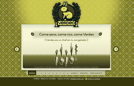
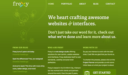
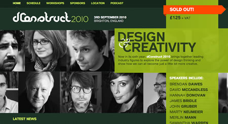
Green is a colour with a wide range of meaning - from nature to wealth to inexperience to jealousy. Green is created from mixing blue and yellow. It's also my favourite colour and the colour associated with Ireland. To celebrate St. Patrick's Day, I thought that I'd include some nice green designs.

green.jpg
1. http://www.giselejaquenod.com.ar/blog/

green02.jpg
2. http://toriseye.quodis.com/

green03.jpg
3. http://emotionslive.co.uk/

green04.jpg
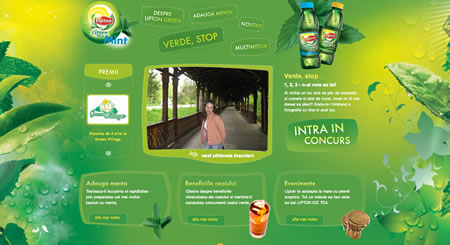
4. http://www.liptongreenmint.ro/

green05.jpg
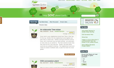
5. http://www.greenglobeideas.com/

green06.jpg
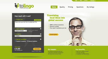
6. http://www.tolingo.com/

green07.jpg
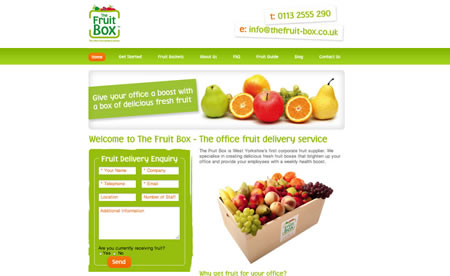
7. http://www.thefruit-box.co.uk/

green08.jpg
8. http://www.le-moulin-de-sauvage.com/

green09.jpg
9. http://www.webdesign-gm.co.uk/

green10.jpg
10. http://www.hrasti.com/plants.html

green11.jpg
11. http://frogwatch.museum.wa.gov.au/

green12.jpg
12. http://www.sproutbox.com/

green13.jpg
13. http://www.haveamint.com/

green14.jpg
14. http://www.modstudio.com.ar/

green15.jpg
15. http://www.zurb.com/

green16.jpg
16. http://www.wathen-castanos.com/green/

17. http://www.ricoverdeo.com/

green18.jpg
18. http://www.frexy.com/

green19.jpg
19. http://2010.dconstruct.org/

green20.jpg
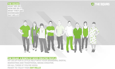
20. http://www.thesquad.com.au/

green21.jpg
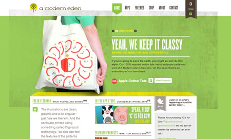
21. https://www.amoderneden.com/

green22.jpg
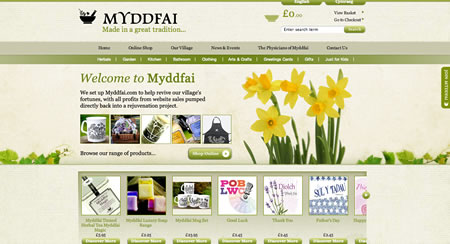
22. http://www.myddfai.com/

green23.jpg
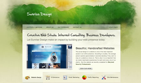
23. http://sunrisedesign.com

green24.jpg
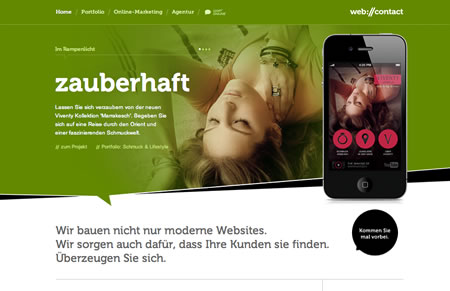
24. http://www.webcontact.de/

green25.jpg
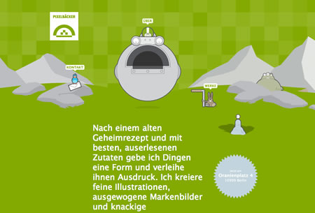
25. http://www.pixelbaecker.de/

green26.jpg
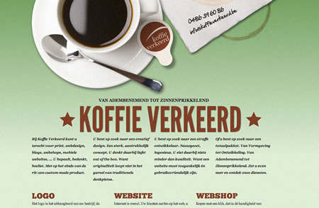
26. http://www.koffieverkeerd.be/

green27.jpg
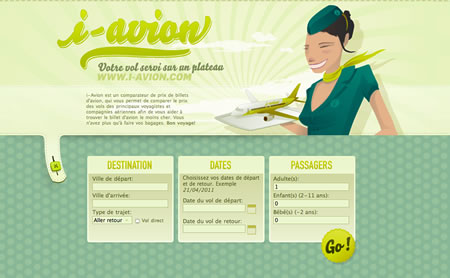
27. http://www.i-avion.com/

green28.jpg
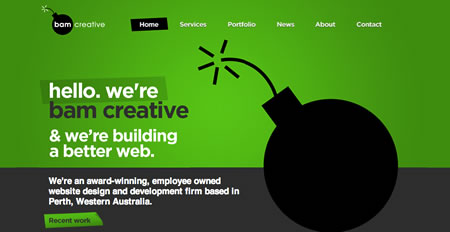
28. http://www.bam.com.au/

Design Review: The Jersey Cow Company

| No Comments | No TrackBacks
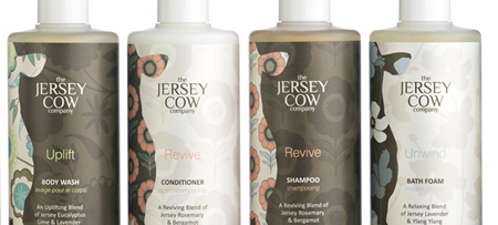
I have recently come across a new beauty brand (launched last autumn), which I discovered after it was featured in a magazine, and I absolutely love their package designs. The Jersey Cow Company, is based on the island of Jersey (part of the United Kingdom), and prides itself in creating natural beauty products (soaps, creams, candles, shower gel) which are free from artificial ingredients and suitable for vegetarians. And, if it's not beauty products that you're after, the company also have a few ceramic cups and other items for sale, featuring their branding.

I love the trendy brown and cream packaging, which also features a silhouette of a cow and floral designs and patterns. The design is modern, natural, and neutral. They also carry a range that appeals to men, and the designers cleverly maintained the floral cow silhouette and swapped the brown and cream colour for black and white (while removing feminine pinks and light blues). 

jerseycow_1.jpg

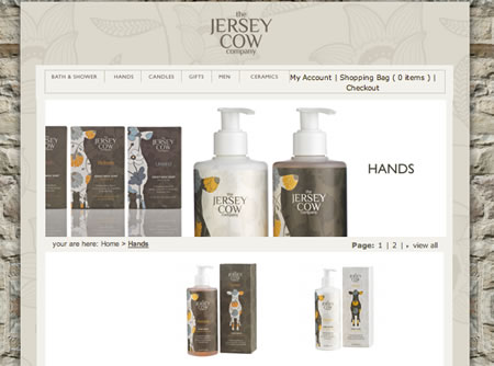
The website (http://www.thejerseycowcompany.com) is also done well and showcases the products. Florals are used in the background, and each page contains close-ups of the product. (It is an online store as well as an information website.) Overall, the website is simple and easy to navigate; social media is accessible from each page, and they have also included a cute favicon in the image of their cow silhouette. (Some of the company pages contain cute imagery and product placement to add interest when scrolling, and this makes the experience a little more personable.) The online shop is easy to navigate as they have kept the website simple, and the steps to placing an order and filling out the details form is on one page. 

jerseycow_2.jpg

I hope that you find their branding just as inspiring!

Starbucks - A rebrand?

| No Comments | No TrackBacks
This morning on my way to the office, I decided to treat myself to a drink at Starbucks. I read a little while ago about the Starbucks rebranding and how the rebranding would be launched in central London this week, so I was not surprised to see the new logo on cups this morning.

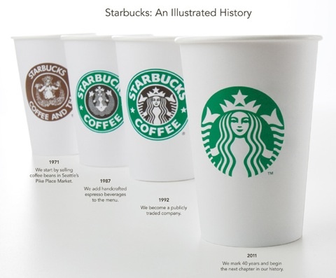
The new logo is not a far cry from the old branding. In fact, the new logo is simply a cropped version of their "siren" character, which has been an intergral part of the brand since the company was formed in Seattle. (The "siren" was inspired from the shipbuilding history of Seattle, and the character was inspired from a Norse woodcut.) The company name and "coffee" (and dark brown colouring) have been removed from the logo as well, creating a minimalist design. According to the article by Simon Manchipp, Starbucks did not want to limit their product range to "coffee" only, but as anyone who has ever been to Starbucks knows, Starbucks sell alternatives to coffee (1). Perhaps in this move, they wish to let potential customers know that Starbucks does not only sell coffee.

According to the comapny's US webiste, Starbucks is celebrating 40 years of existance, and in tune with this, the company have revisited their brand and have launched new products. The image below displays various Starbucks incarnations, since the early days.

starbucksrebrand.jpg

There have been some negative criticisim about the new branding, but I like it. It refreshes the brand, and it is not a major rebranding. I feel that the rebranding has been modernised and is still recognisable as the Starbucks brand.


(1) Manchipp, Simon. Caffeinated rebrand or misplaced froth? http://www.designweek.co.uk/home/blog/caffeinated-rebrand-or-misplaced-froth?/3022311.article [13 January, 2011].

Adobe Proposes Graphical Web Layout

| No Comments | No TrackBacks
Adobe have proposed a new technology to allow websites to be more graphically-focused. This technology describes additions to CSS, and it will allow web developers and designers to create more complex layouts, such as layouts often found in magazines. The new technology is detailed in a PDF, CSS Regions, which can be read here: http://lists.w3.org/Archives/Public/www-archive/2011Mar/att-0011/CSS_Regions.pdf

The web is certainly coming a long way from table-based layouts popular in the '90s and early '00s, and more flexibility into creative layouts would be much sought-after in the industry.

Adobe is venturing into this area and has also created Flash-to-HTML5-Converter (Wallaby) for devices that do not allow Flash or handle it well, such as Apple's applications (iPod, iPhone, iPad). This converter will allow Flash content to be created into websites with animation.

More on the topics mentioned in this article can be read here:

http://download.cnet.com/8301-2007_4-20040374-12.html
http://news.cnet.com/8301-30685_3-20041050-264.html
Microsoft has urged users to ditch the ten-year old browser (Internet Explorer 6) in favor of newer versions of IE. (Microsoft are planning on launching IE9 soon.) The website http://www.theie6countdown.com is monitoring the use of IE6, and Microsoft hopes that IE6's user base has fewer than 1% of users. According to the article, 3.5% of people in the UK use the browser, but 34.5% of people in China use it.

Warman, Matt. Stop using Microsoft's IE6 web browser, says Microsoft. http://www.telegraph.co.uk/journalists/matt-warman/8366194/Stop-using-Microsofts-IE6-web-browser-says-Microsoft.html [March 7, 2011].

Brit Insurance Design Awards 2011

| No Comments | No TrackBacks
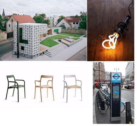
The Design Museum in London announced the best designs this year for the following categories: architecture, fashion, furniture, graphics, interactive, product and transport. According to their website, (http://designmuseum.org) these awards are the "Oscars of the design world".

The awards are as follows:
Brit Insurance Architecture Award: Open-Air Library Magdeburg
Brit Insurance Fashion Award: Uniqlo +J Autumn/Winter '10
Brit Insurance Furniture Award: Branca
Brit Insurance Graphics Award: Homemade is Best
Brit Insurance  Interactive Award: Flipboard
Brit Insurance Product Award: Plumen 001
Brit Insurance Transport Award: Barclays Cycle Hire

designawards2011.jpg

More information can be found here: http://designmuseum.org

Archives

Recent Comments

  • jenn: Thank you. read more
  • Murge: Amazing post. read more
  • Herbert: good post. site read more
  • Frank Quake: Hey, This is great when you said that I had read more
  • Chappy: You mention peptides here? I have had first hand experience read more
  • jenn: Thanks! I love the work. I have got more recent read more
  • Fanakapan: Thanks for the write up. This was some of my read more
  • jenn: Yes.... but that's only for the islands. Mostar and Montenegro read more
  • jenn: Hello, the code is not mine to hand out. I'll read more
  • pantich: More info about the best day trips from Dubrovnik can read more
OpenID accepted here Learn more about OpenID