February 2012 Archives

Recent Project: IG INSIGHT

| No Comments | No TrackBacks
Last summer and early autumn, I worked on a project that displays news and shares knowledge. The website can only be launched as a part of the dealing platform, so only customers who are able to log in will be able to see this website, which is known as INSIGHT. The project was developed in Adobe CQ5 CMS.

The knowledge section of the website is colour-coded depending on the category, and articles are displayed so that the user can learn the different terms. The 'news' section is the area that I developed on my own using Java, JSP, CSS, HTML, and Javascript in the Adobe CQ5 CMS platform. Simply, content editors can add news stories written by one of the analysts, and these articles are displayed and sorted. There's also a Twitter feed from the analysts and links to related areas in the 'knowledge' section. Most of the section for 'news' is automated, so this required a lot of coding to automate this and to display it as intended. The news stories are also organised by category, and there are areas that can be filtered, such as obtaining a list of all stories by author. There's also much more to it than the screenshots that I have posted.

This is one of the most exciting projects that I have worked on in a while, and I really enjoyed the mix of development in Java and translating the designs to HTML and CSS and Javascript. During my time at the company, this was the work I did for the "news and analysis" section was the most enjoyable.

The following image shows a news article. The image and first part of the text is obtained and displayed in the preview on the home page and category pages - as well as the author and the date.

ixi2.jpg

The following screenshot is a section under one of the categories, and I built the navigation section under the heading, which are anchors in the current page and sibling pages and the grey box, as well as contributed to the CSS. This is a large area of the website.

ixi1.jpg

Judging the Book By Its Cover Design

| 2 Comments | No TrackBacks
I am sure that each of us, rightly or wrongly, have judged a book by its cover. The design on the cover is the first impression that we have about the contents of the book, the genre, and an overall impression of the quality of the book. I know that I have been influenced by the cover of a book, and that has led me to purchase or not purchase the book. This article examines some of Waterstones' book covers and looks at Penguin Books. (Penguin Book's orange and white covers have become iconic in their own right, and the company have recently run a campaign to get readers to illustrate their own books.)

The cover designs to some classic books have been re-designed and are available at Waterstones' book shop. Some of my favourite new book covers are displayed below.

bookcoverdesigns.jpg

The cover design range "Vintage 21" uses typography in the book's cover design. The books are printed in a solid colour, and the spine of the book is the same colour as the cover. (The covers - grabbed from the Waterstone's website - are shown below, but these images do not really do the physical book justice.) Placed together, these books are colourful and brighten up any shelf.

vintage21cover.jpg

While you can buy some beautifully-designed books, Penguin Books offers readers the chance to buy a book with a cover that you can create yourself: http://www.penguin.co.uk/static/cs/uk/0/minisites/mypenguin/index.html

A few of the covers, designed by readers, have been uploaded to the Penguin Books website, and I have included a few of my favourites below. A gallery of covers designed by readers are available at: http://www.penguin.co.uk/static/cs/uk/0/minisites/mypenguin/gallery.html

bookcovers.jpg

Using CSS3, developers can add icons to a website without using images. The way to accomplish this is to locate a font that contains icons and using the CSS3 @font-face rule, or by using another font-loading method - requiring Javascript - to load the font. (Of course, you will need to ensure that you have permission to use the font on the website.) However, this method is only supported with browsers that use CSS3 and have Javascript enabled to read the font, so it may not work in all browsers.

iconfonts.gif

The advantages of using this method include not being required to maintain icons in image files and potentially quicker loading times, depending on the size of the image file containing the icon and the size of the file containing the font. 

Disadvantages include the inability to use multiple colours as the icon, as the icon is rendered as a vector font.

Others have discussed this topic on the following websites below:

http://net.tutsplus.com/tutorials/html-css-techniques/quick-tip-ever-thought-about-using-font-face-for-icons/

http://somerandomdude.com/2010/05/04/font-embedding-icons/

A Visit to Primrose Bakery in London

| No Comments | No TrackBacks
I've been wanting to try cupcakes at Primrose Bakery since I discovered it existed when looking at maps of London online (near where I used to work) and discovering many fantastic reviews. Primrose Bakery is located on one of the side streets running parallel behind Covent Garden (on Tavistock Street). Although I was based near to Covent Garden for approximately two months, I never tried the cupcakes. 

I had visitors at the end of November (my parents), and we ended up deciding to make an extra trip to London on one Monday, so I decided to make a trip to Primrose Bakery to try the cupcakes. I must say that I was impressed. The bakery itself is a tiny shop at the corner of the street, and there are only a handful of tables to sit on and enjoy the cupcakes. As it was a quiet Monday morning (nearly mid-day), we were able to sit at one of these tables to enjoy our cupcakes. I loved the cute and cozy shop, and it is perfectly-positioned for some fantastic people-watching with its large windows.

The cupcakes are among the best that I have had in London; I loved the texture, and the icing was not too sweet. (Hummingbird Bakery cupcakes are too rich/sweet for me, and the icing is too sugary and sickening for my taste.) I had a pumpkin cupcake, and I also tried the chocolate and the vanilla one. All were equally delicious. I am looking forward to my next visit.

primrosebakery3.jpg

primrosebakery4.jpg

primrosebakery5.jpg

primrosebakery2.jpg

primrosebakery1.jpg

Zesty Lemon - Websites and Artwork

| 1 Comment | No TrackBacks
The long days of winter are upon us, and I thought it would be good to add some yellow in my life to remind me of warm, summer days and sunshine. Lately, I have been feeling a little bit down after a few months of being very busy at work and not being able to take a break to relax or to stop and appreciate what is around me. I am looking forward to sunny days and new horizons, and the brightness of the colour 'yellow' really does make me feel content. The following websites and artworks/crafts feature this happy colour. I hope that it brightens your day as well as it has mine.

lemon_1.jpg
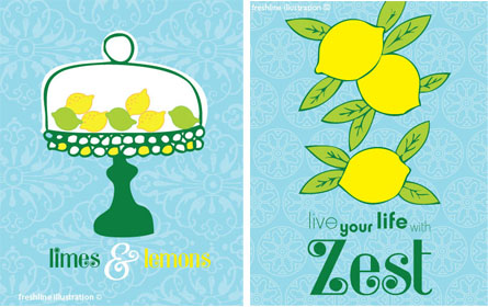
These whimsical drawings of lemons were created by Colleen (a.k.a. Freshline).
http://www.etsy.com/shop/Freshline

lemon_2.jpg
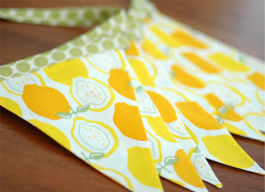
Fresh Squeezed Baby sells lemon bunting. This would brighten up the darkest of rooms.
http://www.etsy.com/people/freshsqueezedbaby

lemon_20.jpg
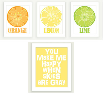
Marianne from ColorBee creates designs (using text, mainly). I particularly love the bright lemon, orange, and lime segments; the colours work so well together.
http://www.etsy.com/people/colorbee

lemon_21.jpg
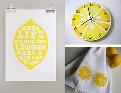
The lemon poster "when life hands you lemons, make a gin and tonic" was designed by Colleen (dearcolleen). I love this quote; I could do with a gin and tonic after a long, winter day.
http://www.etsy.com/people/dearcolleen
The painted-style lemon clock is available from bearlyart. 
http://www.etsy.com/people/bearlyart
The lemon towels are from Cindy Bazor (bazordesigns). She also sells many more items (towels, pillows, etc) in the same style.
http://www.etsy.com/people/bazordesigns

lemon_22.jpg
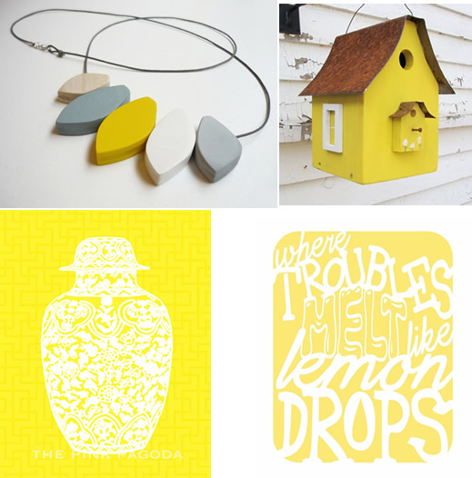
I love this necklace; the yellow with gray-blue work fantastic together. There are also more cute wooden items in the shop (from snugstudio).
http://www.etsy.com/people/snugstudio
The highly-detailed and floral vase in yellow adds a lot of colour to a dreary day (from thepinkpagoda).
http://www.etsy.com/shop/thepinkpagoda
Bason Square Farm sell many wooden crafts, and this lemon-yellow birdhouse is just one of their colourful items.
http://www.etsy.com/people/baconsquarefarm
Cassie and Allen Mitchell (tenderbeasts) designed the yellow "where troubles melt like lemondrops" poster and have many more designed text posters (including several song lyrics) in their shop.
http://www.etsy.com/people/tenderbeasts

lemon_23.jpg
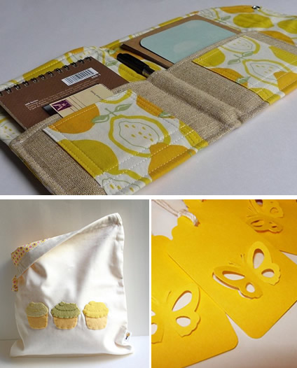
A cute case for your gadget (Touch) with lemon fabric is a must for the gadget-lover who is also appreciates good design. (There are many more styles and fabrics to choose from in downstairsDesign's shop.)
http://www.etsy.com/shop/downstairsDesigns
I love this lemon-y cupcake bag from Stephanie Monroe.
http://www.etsy.com/people/stephaniemonroe
These butterfly gift tags from 3creativesisters would brighten up any gift. 
http://www.etsy.com/people/3creativesisters


Websites
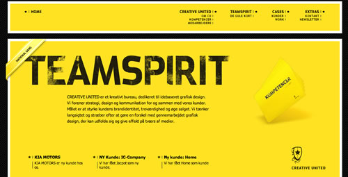
Yellow is not a very popular colour for websites, but I managed to find a few websites where lemon-yellow is the primary colour. In most of these websites, yellow is used with black. This combination usually signifies 'power', particularly when black is used a lot in the design as well. There's a variety of websites using the colour below, and a lot of these tend to be portfolio and marketing agencies; possibly experimenting with this colour. 

Since black is so commonly used, there are a couple of websites who replace the black with gray or brown and also introduce other colours to give a fresh edge on the use of yellow. (This does not make it so 'powerful' and 'bold'.) Other websites take the approach to make the website even bolder by combining black and yellow with large, bold text.

Yellow and black are colours mainly featured in the automobile industry, such as rental cars, cleaning products, and car recovery. Also, the YellowPages use these colours. These colours are powerful and more 'grown-up'. Take a look at the samples below.

lemon_03.jpg
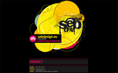
This website stands out, and the use of an organic illustration and a third colour (bright pink) and fourth colour (orange) are unique.
http://www.sebdesign.eu/


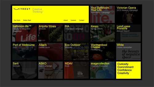
http://www.trout.com.au/

lemon_05.jpg
lemon_05.jpg
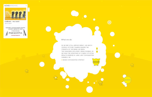
This bright yellow Flash website is highly interactive and uses mainly organic shapes and grinning characters.
http://www.paralotna.pl

lemon_06.jpg
Large bold text makes the website stand out even more.
http://www.glasgoweb.co.uk/

lemon_07.jpg
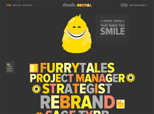
The use of colour here is excellent.
http://www.chunkdigital.com/

lemon_08.jpg
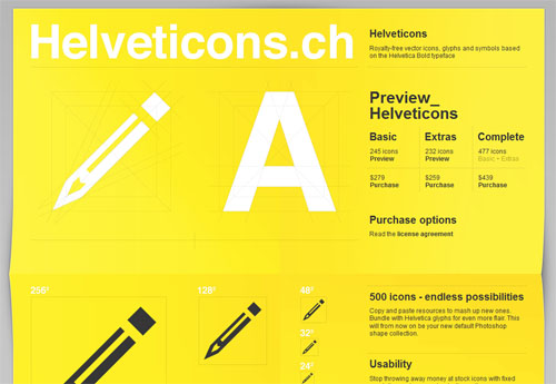
Mainly a yellow website with a simple design; however, I think the white text on the yellow background is difficult to read.
http://www.helveticons.ch/

lemon_09.jpg
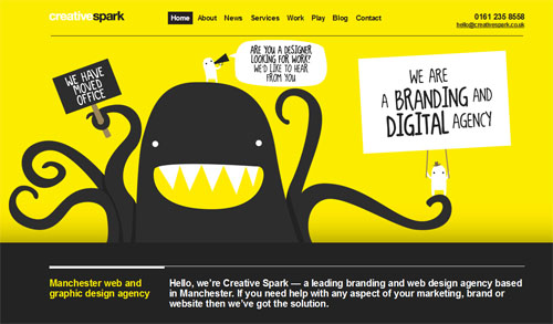
I like the illustration, and the colours are used well here.
http://www.creativespark.co.uk/

lemon_10.jpg
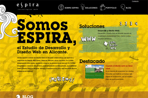
A grunge-style website adds a new dimension to the colours, but it still has the 'bold' feel with the large font and black and yellow used, particularly at the top of the page.
http://www.espiratecnologias.com/

lemon_11.jpg
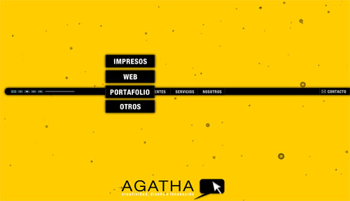
http://www.agathagroup.com.co/

lemon_12.jpg
Yellow and gray is used to illustrate this website. In fact, the website background is gray until the bottom of the page.
http://www.re-print.me/

lemon_13.jpg
http://www.bzzyapp.com/

lemon_14.jpg
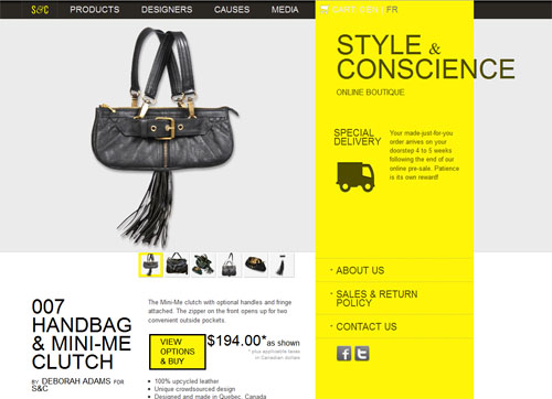
Another example of gray and yellow for a new take on a style website. (I'm not sure this really works for me, however. The colours remind me too much of automobile-related websites.)
http://www.styleandconscience.com/

lemon_15.jpg
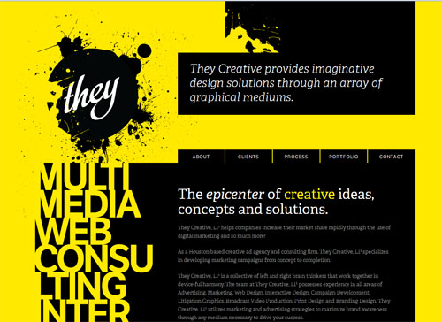
Bold text and bold colours are used for a simple and visually-interesting website design.
http://www.theycreative.com/

lemon_16.jpg
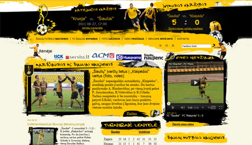
Not quite so lemon-yellow, but the grunge style and powerful black and gold are used for this sport-related website.
http://www.fcsiauliai.lt/

lemon_17.jpg
Another powerful website with text featuring a major design element.
http://www.creativeunited.dk/

lemon_18.jpg
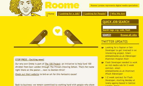
I like the use of brown instead of black. It gives a fresh look to a yellow website.
http://www.roome.co.uk/


lemon_19.jpg
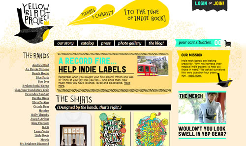
http://www.yellowbirdproject.com/
One way to test and view how a website would look on different browsers and devices (such as mobile phones and devices or different browser-specific operating systems)  would be to use a specific User Agent within your browser of choice. This way, you do not need to jump from computer to computer or device to device to test your websites. (Firefox has a User Agent Switcher "add-on" feature, and this can be downloaded along with your other development tools. Simply go to the "Tools" option in Firefox, then select the "Add-ons" link from the drop-down menu to search.) 

The 'User Agent Switcher' allows you to trick your browser into thinking that it is a different type of device or a different browser or Operating System by passing a string to define the type of device/browser. 

Once the Firefox add-on has been downloaded, you will need to create your User Agent strings, as these have not been provided. The following URL provides some 'User Agent' strings: http://useragentstring.com

However, if you do not wish to type in and save each one individually, the work has been done for you if you simple search the Internet for an XML file that contains a list of these already defined; this XML file can be imported into your "User Agent Switcher" tool. I found an XML file of these user agent strings in the forum of Chris Pederick's (developer of the 'User Agent Switcher' add-on) website, http://chrispederick.com/.

The tool allows the user agent strings to be backed up (as XML) or imported, so it's easy to back up your development environment.

Although the 'User Agent Switcher' does give you a very good idea about how your website will look in other browsers and give you the ability to test browser-specific code, keep in mind that it is not always accurate. (For example, the iPhone does not display an <iframe>, though this appears to look fine when viewing the website in the 'User Agent Switcher' with the iPhone option selected.) 

The tool is very easy to install and use, and new user agent strings can be added whenever you wish. I guarantee that you'll be using this tool a lot while developing your websites.

Cute Hearts for Your Valentine

| No Comments | No TrackBacks
To celebrate today (Valentine's Day), I have discovered the appropriate heart-inspired items (this ranges from jewellery to crafts to home decorations) on Etsy and have included some of my favourite items in this collection in this entry. I hope that these inspire you.

The following is a collection of jewellry featuring heart shapes.

2012hearts.jpg

1) http://www.etsy.com/shop/katinytis
2) http://www.etsy.com/shop/DrCraze
3) http://www.etsy.com/shop/ClassicKeepsakes
4) http://www.etsy.com/shop/jewelstreet

Chalkboard-inspired heart shapes would make nice wedding decorations. This includes table name placeholders and banners. The vintage heart ear rings also fit this style.

2012hearts2.jpg

1) http://www.etsy.com/shop/creativebyheart
2) http://www.etsy.com/shop/helenaCRAFTS
3) http://www.etsy.com/shop/creativebyheart
4) http://www.etsy.com/shop/2212jewelry

Wooden hearts, a heart painting, and wall decorations look nice.

2012hearts3.jpg

1) http://www.etsy.com/shop/oldnewagain
2) http://www.etsy.com/shop/aquaGirlArt
3) http://www.etsy.com/shop/hypsela
4) http://www.etsy.com/shop/oldnewagain

Heart lanters, name tags, a cloth bag, and paper banners fill another need.

2012hearts4.jpg

1) http://www.etsy.com/shop/DobleEle
2) http://www.etsy.com/shop/joBlake
3) http://www.etsy.com/shop/wendyjung
4) http://www.etsy.com/shop/paperPolaroid

The final collection consists of more ear rings and heart-inspired decorations for the home.

2012hearts5.jpg

1) http://www.etsy.com/shop/Omiya
2) http://www.etsy.com/shop/orlyDesign
3) http://www.etsy.com/shop/officina
4) http://www.etsy.com/shop/GreenJazzFace


The Best SuperBowl Commercials of 2012

| No Comments | No TrackBacks
SuperBowl XLVI was aired last Sunday, and it cost approximately $3.5 million for a 30-second slot. There were a couple of good commercials, but the majority were not as impressive as last year's, and many were average at best. This year, many of the advertisements features cars and technology. There were far less food items, beer, and some brands produced less commercials this year. (I think GoDaddy and Doritos featured more last year.)

My favourite advertisements this year were those by Chevy, Samsung, and the Coca Cola Polar Bears. The Volkswagen, Doritos, and Acura slots were a disappointment. I've listed my least favourite commercials at the end of this article. Directly below are a few of the commercials that were average or good.

Chevy
Chevy aired a few commercials during the SuperBowl. Two were Chevy stunt commercials, and they also aired two additional ones. In one, the Chevy pick-up is the only vehicle to survive the end of the world with references to other end-of-the-world and zombie films. In the other, a graduate's parents reveal a gift car, but the prank is on him as the car belongs to the neighbour.

Chrysler:
Clint Eastwood narrates "It's Haftime in America", which parallels the difficult economic times with the Chrysler company to give a message of hope and strength. (This is similar in format to the Eminem commercial from last year.) However, I was not the only one to think that the message sounds very much presidential-campaign. Many feel that president Obama and Chrysler were working together in order to produce this advertisement. It was a little bit too patronising and political for me, but it was emotional and consisted of a good use of imagery.

Doritos:
The brand follows up with the popular pet commercials from last year and produced a few different commercials for the SuperBowl. One depicts blackmail (in the form of Doritos) by covering up the missing pet cat. Another features a young child and a baby who takes the Doritos with his grandmother's help.

Volkswagen:
The company were responsible for the Star Wars theme in last year's SuperBowl, and this year's features a Golden Retriever losing weight to chase after a Volkswagen, then a cut to the Star Wars Cantina where we see shots of the Darth Vader and the Cantina characters discussing the commercial. Not as good as last year's, and the cut between the different scenes is awkward. (They mention last year's successful commercial at the end.)

Bud Light
The slot features a Rescue Dog (Weego) that knows how to fetch beer on demand.

Budweiser:
The company use the prohibition era to advertise their beer.

Coca Cola:
Coca Cola produced a series of animated commercials featuring the Polar Bears. The Polar Bears acts like football players with the Cola bottle as the football.

Samsung:
Samsung's commercial for their new mobile phone ridicules queues standing outside of stores (Apple, anyone?) to grab the latest technology. The commercial kicks off further with The Darkness singing to the crowd on the street with shots of the product's features.

Acura:
This advertisement features Jerry Seinfeld, Jay Leno, and other characters from Seinfeld. There's not too much advertising for the product, though, so it's not really memorable product placement. The advertisement features Jerry attempting to cut the queue by bribing another customer (George from Seinfeld) in the showroom.

Pepsi:
This commercial features Elton John as a king, and he watches auditions and provides the soft drink for those he likes.

H&M:
David Beckham sells clothes for the brand, but he's nearly naked. I do not feel that this was good product placement.


There were a few commercials that I found particularly annoying: Cars.com, Honda, M&Ms, and the Kia sandman commercial.

Cars.com:
A man walks into a showroom with his conscious, who sings about how much he wants the car. I found this commercial to be highly annoying with the signing.

M&Ms:
The commercial features a female-voiced brown M&M, and others think that she is naked. It features the red male M&M stripping off the red coat and dancing. If this was meant to be funny, it did not get any laughs from me.

Kia:
This commercial's message is 'the dream car', following the dreams of a couple to dream of the Kia when the sandman visits. I just found this commercial to be a little bit dull and the pacing to be off.

Honda:
This commercial stars the actor of Ferris Bueller's Day Off. In the commercial, he pulls a sickie and ends up driving around town and enjoying himself, in a parody of the movie. Perhaps if I was a fan of the movie, I would have found it funny, but I've never liked the film, and I found the character to be a little too annoying.
To protest SOPA ('Stop Online Piracy Act') and PIPA ('Protect IP Act'), two bills in the United States Senate and House of Representatives, Wikipedia have blacked out the English version of their website and have asked visitors to spread the word onto social media websites, such as Twitter and Facebook. To be brief, these bills seek to stop copyright infringement committed by non-foreign and foreign websites.

The PIPA bill calls for making websites that show 'illegal' material to be unresolved, and if a website links to them, the link will be unresolved. This would ban websites from displaying a significant amount of content, and is probably partly-created for the benefit of the media industry (to avoid copyright infringement on many websites hosting illegal copies of films, music, and media.) SOPA (Stop Online Privacy Act) is a similar bill, and it forces websites that show infringing websites off the web and calls for them to be blocked in search engines.

For me, this is not acceptable because it gives the government the ability to control what can and cannot be displayed on the Internet and takes away these freedoms. As an artist and one who appreciates the arts, I do not agree with people infringing on copyright. If passed, this bill would allow the government to monitor what you can and cannot do on the Internet, and I believe that the government should play less of a part in peoples' lives.

Also, if someone wants to illegally download content or infringe on copyright, they will find a way to do this. In many countries, it is not frowned upon, and illegal copies of DVDs and music CDs are made. If someone wants something and does not want to pay for it or pay a smaller cost for it, they will find a way to get it for less or to get it for free.

I also believe that if this bill is passed, then the government will gradually begin to control and monitor more and more aspects of our lives. I would rather the government play a much lesser part in our lives.

To protest these two bills, Wikipedia have decided to black out their website as they feel that they prohibit access to online information, and Wikipedia state,

"Small sites won't have sufficient resources to defend themselves. Big media companies may seek to cut off funding sources for their foreign competitors, even if copyright isn't being infringed. Foreign sites will be blacklisted, which means they won't show up in major search engines. And, SOPA and PIPA build a framework for future restrictions and suppression." (1)

The blackout consisted of using Javascript to hide the page and display a message.
The content of the page flashes up for a few seconds before slowly being replaced by the blackout graphic, which is set using Javascript. To access the content and not see the blackout message, the user could simply disable Javascript in their browser.

I hope that these bills will not be passed. I do not wish the government to play a role in what I search for online or be concerned about what I search for. I do condone copyright infringement, but I feel that these bills will not solve the issues that they portray and will affect everyone.


1) Wikipedia. SOPA Initiative Learn More. http://en.wikipedia.org/wiki/Wikipedia:SOPA_initiative/Learn_more [24 January 2012].

wikipediablackout.jpg
I found the perfect prints for Valentine's Day, for those of you who are looking for something more than a cliche (dozen roses or a box of chocolates, anyone?!) for your loved one.

I love this range of prints with red umbrellas, called "City Love Prints". Each features a different city (or university) scene with a couple standing with red umbrellas in the foreground. London, Venice, Paris, Washington D.C., New York, and Seattle are some of the cities that feature in this range. (See the images below for a selection.) In addition to prints, the drawings can also be purchased on moleskin notebooks.

These prints are artworks made by Megan Nolton, who owns art company Art Shark Designs and sells her artwork online (http://www.etsy.com/people/artsharkdesigns). Megan, who lives near Washington D.C., studied art and graphic design at university and has always been interested in art. A full interview is located here: http://matouenpeluche.typepad.com/matouenpeluche/2009/04/meet-megan-nolton-of-art-shark.html

cityloveart.jpg

artsharkdesigns.jpg

Latest Project: NADEX Website

| 1 Comment | No TrackBacks
I have been a very busy girl over the past three months. I have been the technical lead for the re-development of a website, including incorporating the new design into a new Content Management System (Adobe CQ5 CMS), which I have been developing in for nearly a year. In fact, another website that I spent the majority of the past year developing using the same CMS went live in January, so a lot has been happening this year.

This project certainly had some challenges, all of which were not surprising considering that the project was the first public-facing website (consisting of many additional dependencies) to use the new CMS, and the deadline was tight and had to be met in time. I have noted the following list of challenges:
  • The redevelopment of this website had to be achieved by 1 February. This meant that we only had approximately two months to spend for development tasks.
  • To meet the tight mid-week deadline, we had to break from some internal processes. Typically, releases are completed at weekends, and code was being redeveloped until two weeks before the go-live date, and bugs were being fixed up until the go-live date.
  • Many environment and infrastructure issues needed to be addressed, and new environments needed to be built. This was the first time that the new CMS was used for a public-facing website.
  • Other web-based applications use files that exist under the domain, and it was not always clear where the files were being used. These files, HTML pages, and links needed to be migrated and approprite RewriteRules needed to be written so that the changes would not affect these other web-based systems.
  • A new brand and designs for the website were being created at the same time, and the branding was received half-way through the design process. (Due to the tight deadline, designs had to be started before a new brand was created.) Additionally, the development process started at the same time as the designs were being created during the first two sprints. This, of course, meant that we needed to constantly make small changes to the CSS and HTML for design changes.
  • The development for the project was achieved in approximately two months, including bug-fixing during the final two weeks, and some earlier development work needed to be tweaked as unfinished designs were evolved. (We certainly did work Agile.)

nadex_home.jpg

Despite the mentioned challenges, everyone did a fantastic effort, and I largely enjoyed it. Many disciplines (such as development, design, QA, content writers, system developers, etc) worked well together to ensure the success of the project. 

With such a project, the low points were working long hours over the Christmas and New Year weeks while colleagues and most of the company were on holiday, working through most of my lunches throughout the past three months, and ensuring that the dependent systems were seemingly unaffected by the changes. The highs were speaking to the clients and being involved at a high level, developing new components in the CMS using Java, and working together toward a common goal to launch a complete website. Now that this project is finished, I think some sort of recovery is in order.
Several years ago, I was checking through my website's web logs and discovered that another developer (I use the term loosely here) had decided to hotlink to one of my images, and they set my image as the background of their MySpace website. In fact, it was a MySpace website for their band.

I was not happy, so I swapped out the image for another one, which promptly tiled across their MySpace website. This was a highly amusing result, and within a week, they had taken the website down and relaunched it a couple of days later with a new background image. (At least they did not steal my image, but the fact that they were using it without permission and putting their web traffic through my website with requests to my image, was annoying.)

Instead of humiliating others, I wish that I had known that I could have prevented the developer from linking to my image through making changes to the .htaccess file.

This can be easily achieved by putting a few lines into the .htaccess file. First of all, however, you will need to create an image that the users will be redirected to if they do link to an image. This image can include some text that asks users not to link to your image.

After you have created the image, simply write your redirect rule to the image you created above. You will need to check the HTTP_REFERER of the request, and ensure that your website can link to the images. Afterwards, add your RewriteRule so that all other websites not mentioned in the RewriteCond will obtain the created image. An example is below (1).

RewriteEngine On

#Replace ?mysite\.com/ with your blog url

RewriteCond %{HTTP_REFERER} !^http://(.+\.)?mysite\.com/ [NC]

RewriteCond %{HTTP_REFERER} !^$

#Replace /images/nohotlink.jpg with your "don't hotlink" image url

RewriteRule .*\.(jpe?g|gif|bmp|png)$ /images/nohotlink.jpg [L]


The example above will prevent any websites besides your own from hotlinking to images, but you may want some websites to see your images. To allow Google or other search engine sites to continue linking to your image (so that it comes up in results), simply add the following lines:

RewriteCond %{HTTP_REFERER} !google\. [NC]

RewriteCond %{HTTP_REFERER} !msn\. [NC]

RewriteCond %{HTTP_REFERER} !yahoo\. [NC]

RewriteCond %{HTTP_REFERER} !search\?q=cache [NC]


The above code can be adapted to meet your own demands and goals. 


1) How to protect your wordpress blog from hotlinking. http://www.wprecipes.com/how-to-protect-your-wordpress-blog-from-hotlinking

Archives

Recent Comments

  • jenn: Thank you. read more
  • Murge: Amazing post. read more
  • Herbert: good post. site read more
  • Frank Quake: Hey, This is great when you said that I had read more
  • Chappy: You mention peptides here? I have had first hand experience read more
  • jenn: Thanks! I love the work. I have got more recent read more
  • Fanakapan: Thanks for the write up. This was some of my read more
  • jenn: Yes.... but that's only for the islands. Mostar and Montenegro read more
  • jenn: Hello, the code is not mine to hand out. I'll read more
  • pantich: More info about the best day trips from Dubrovnik can read more
OpenID accepted here Learn more about OpenID